The Qantas livery (going all the way back to the 1950s) has always been one of my favorites. It’s one of the few airline brands in existence that has stayed true to its roots with each new iteration.
A visual history of the Qantas livery (1950’s to present day)
Just as I did with my visual overview of the Japan Airlines livery, I’m going to focus this discussion about the Qantas livery from the jet age to present day.
Qantas was formed in 1920, and there were many great liveries in the first 30 years (before the 1950s). I’ll sprinkle some of those in once I create side view templates for some of those earlier aircraft. But for now, let’s have a look at how the Qantas livery has evolved since the introduction of the Boeing 707…
1959-1961: Red Stripe livery
Qantas introduced the Red Stripe livery to the world with the Boeing 707-138B in 1959. It was predominantly what I like to refer to as a “pinstripe” livery, featuring two thin red lines that ran the entire length of both the fuselage and the vertical stabilizer. Sandwiched in between those lines were the Qantas titles. Not surprisingly, it was very similar to the Air New Zealand livery of the time.
Although visually rich with lots of neat little design details, this was the least colorful livery for Qantas over the past 70 years.
1961-1971: V-Jet livery
Things really started getting interesting in 1961. That was when the V-Jet livery was introduced, and in my opinion, it was a bold and daring evolution of the previous livery. FYI, “V-Jet” was a marketing name celebrating the introduction of the turbofan engines on the 707.
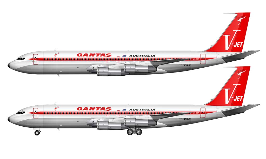
Although the V-Jet livery shared the same exposed aluminum lower section as the previous livery, all of the other design elements were enhanced to be more bold and vivid. A single red stripe replaced the two thinner stripes, and ran down the entire length of the fuselage (behind the windows).
The vertical stabilizer was painted solid red (brighter than even than what was used in the Virgin America livery), with a stylized V-Jet logo covering most of it. Bolder Qantas titles replaced the thinner typeface of the previous livery.
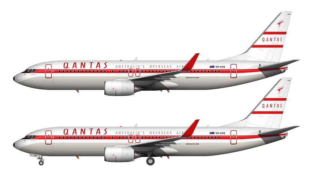
1971-1984: Flying Kangaroo livery
1971 marked the beginning of what we know as the Qantas livery of today. This was the year that they unveiled the first livery which featured the iconic Qantas Kangaroo (“Roo”) as the primary design element.
The vertical stabilizer was red, just like the previous version, but the kangaroo logo (the flying version of it with wings) covered the majority of it. The V-Jet was history.
Something else that was a strong departure from previous livery design was the thick orange (ocher) stripe that ran down the length of the fuselage. It ran right above the transition between the exposed aluminum bottom and the painted white top.
And all new custom Qantas typeface was used for the titles, which were placed closer to the nose of the aircraft.
1984-2007: Roo livery
In my opinion, the 1984 Qantas Roo livery was way ahead of its time – especially since other airlines at the time were still focused on cheatlines (the 1984 Korean Air livery is a perfect example). This is the base livery that is being used today (with only slight differences).
There were two major changes to this livery compared to the previous version:
- The exposed aluminum bottom was eliminated. The fuselage was painted solid white (all the way around).
- The kangaroo graphic on the vertical stabilizer was extended down into the body of the fuselage. Qantas was one of the first airlines in the world to do this, which is fascinating to me since it’s such a common design element still in use today.
One of my favorite design elements of the Roo livery was the thin gold stripe separating the red tail section from the white fuselage. Most people didn’t even notice it, and it was a neat little Easter Egg to point out to friends and family at the airport. They probably didn’t care, but it was fun pointing it out nonetheless.
2007-2016: New Roo livery
The 2007 redesign of the Qantas Roo livery was subtle, but very classy. It was a simple evolution of the previous version.
The most notable change was a redesign of the kangaroo graphic which extended from the vertical stabilizer and down into the fuselage.
Other notable changes included the elimination of the gold stripe separating the red from the white, as well as an all new typeface for the Qantas titles.
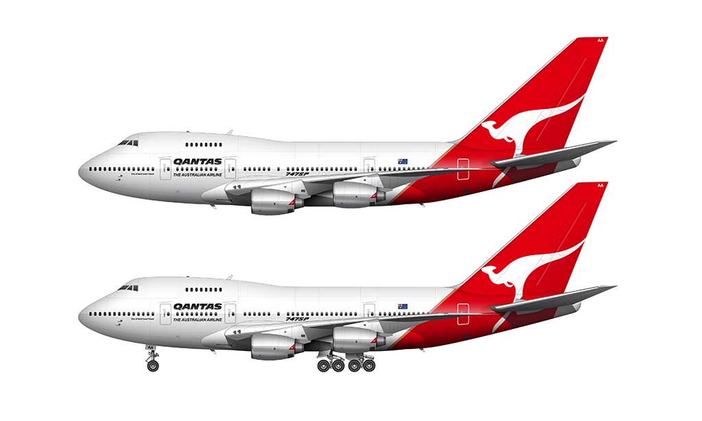
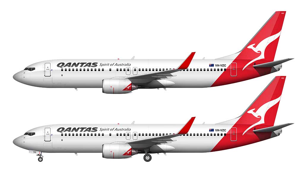
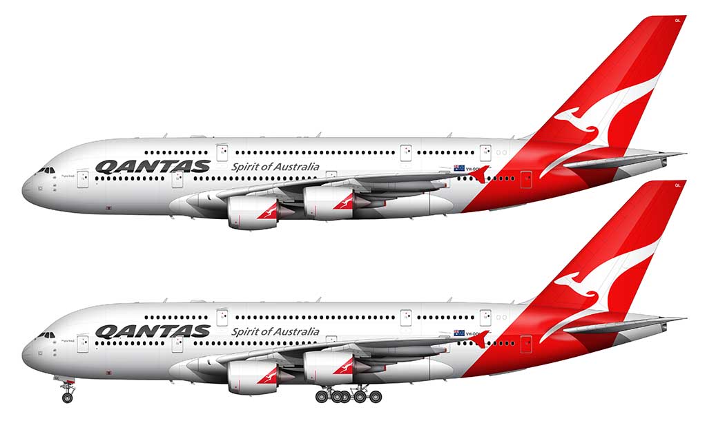
2016-Present: Silver Roo livery
Similar to how the 2007 livery was a subtle evolution of the 1984 livery, the 2016 redesign was a subtle evolution of the 2007 livery. Some may call it bland and unimaginative, but I like it. It was a much better than going overboard on something loud and overly complex (such as the new Etihad livery).
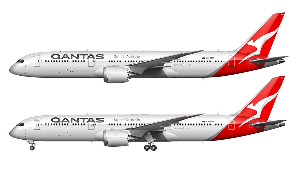
The most significant change was the addition of a slight forward arc to the red block of color as it intersected the fuselage. A sliver of silver (ha!) separated the red from the white, and it helped to add a bit of modern curvature and flow to the previous (more rigid) design.
An all new Qantas typeface was introduced, and the titles were increased in size ever so slightly at the forward section of the fuselage.