I’ve always said that less is more when it comes to airline livery design. The two most recent Korean Air liveries are perfect examples of how to create a sleek and sophisticated airline color scheme with relatively simple design elements:
- The 2025 Blue and White livery contains just two colors. It features metallic paint (which is stunning in bright sunlight) and curved elements to give it a unique character. At least compared to other Eastern Asian airlines.
- The 1984 Powder Blue livery consisted of four colors, and was considered to be a bold design for the time. Remember – the mid-1980s was all about neon and bright colors. Not pastels.
Blue and White livery: 2025-present
Korean Air’s new livery (launched on March 11, 2025) was significant. Not because of how complex it was, but because of how simple and monochromatic the overall design had become.
You could almost hear heads exploding worldwide (especially in Korea – and the KLM headquarters in Amsterdam) when the first leaked images of this livery appeared online.
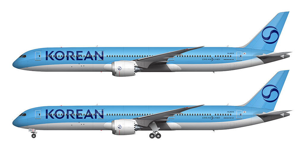
- The color palette was reduced from four colors to two (blue and white – though if you want to get technical, there are two shades of blue). Red and silver were completely eliminated.
- The new primary blue color is metallic – a first for Korean Air.
- The horizontal silver stripe dividing the blue and the white was eliminated.
- The horizontal division between the blue top and the white bottom remains, but that line is now curved at both ends (down at the nose and up on the tail section). Very similar to the new KLM livery.
- Instead of the Main titles spelling out “Korean Air”, it’s now just “Korean”.
- The Taegeuk (Yin Yang) symbol on the vertical stabilizer remains, but has become completely monochromatic.
The titles
An all new (and completely custom) typeface was created for the Korean Air titles. Unlike the previous version, it’s a modern san serif design with no hints of Korean-specific culture.
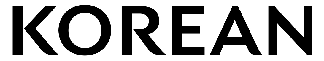
Switching from “Korean Air” to “Korean” allowed the designers to increase the size of the titles when applied to the aircraft. Although the space that the titles take up on the fuselage remains the same(ish) as the previous version, the elimination of “Air” makes “Korean” more pronounced.
The color palette
Who cares if red is one of the primary colors of the South Korean flag? Obviously not the designers of the new Korean Air livery. The elimination of red from the color palette was every bit as bold as the elimination of yellow from the new Lufthansa livery IHMO. I would’ve loved to have been a fly on the wall during the meeting when that decision was made.
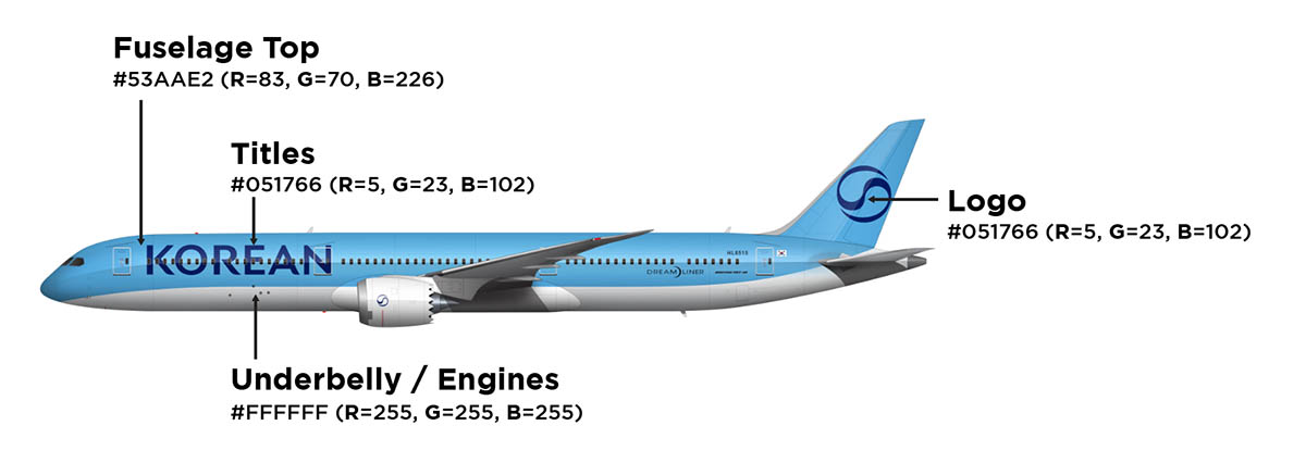
There are two main colors for the 2025 Korean Air Blue and White livery: blue and white (duh). There are two different shades of blue though, so it’s technically three colors:
- Metallic Blue: #53AAE2 (R=83, G=70, B=226)
- Underbelly / Engines: #FFFFFF (R=255, G=255, B=255)
- Titles and Logo: #051766 (R=5, G=23, B=102)
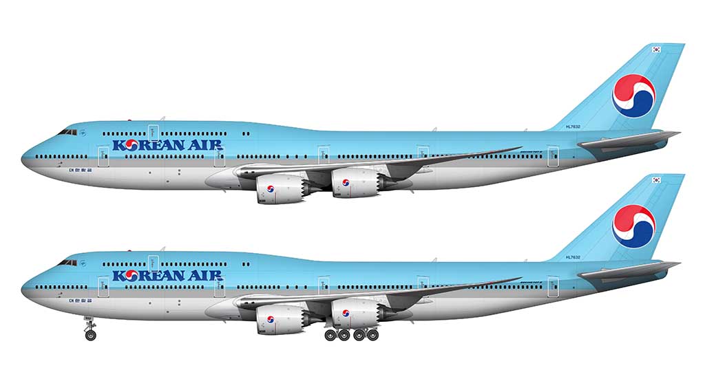
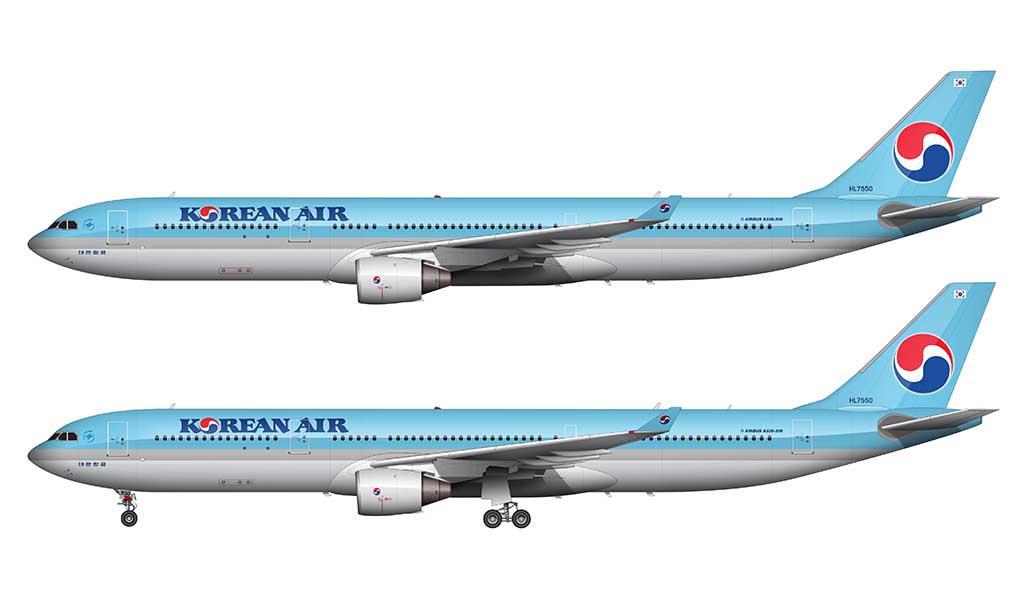
Powder Blue livery: 1984-2025
There were two major trends in airline livery design when the Powder Blue Korean Air livery was unveiled on March 1, 1984:
- Most airlines were moving towards “Euro White” designs (predominantly white liveries).
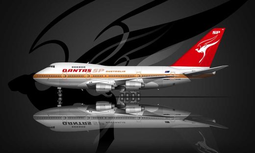
- Some airlines were just starting to embrace swoopy arcs and curves (as you can see in the Qantas livery and Emirates livery of the time).
The Korean Air designers considered neither of those things and stuck with a modern version of the tried-and-true “cheatline” style. Cheatlines were all the rage in the 1970s and 80s. For the youngsters who may not know: cheatlines consisted of linear stripes running down the length of the fuselage.
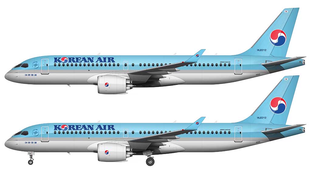
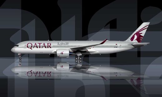
This version of the livery was essentially a cheatline style with a modern twist. Instead of thin pinstripes, the horizontal design elements were thick and substantial. It looked a lot like the Qatar Airways livery (which is a compliment), and I consider it to be a beautiful evolution of a very traditional airline livery style at the time.
The titles
The typeface used for the Korean Air titles on the forward section of the fuselage was completely custom. It’s a mix of old-style Korean lettering combined with modern typography standards. It was bold, extremely easy to read, and uniquely Korean.
Even though I appreciate how much time and effort they put into making it a traditionally Korean design element, I think there’s a bit of a mismatch between the old world Korean Air typeface and the modern block elements on the rest of the livery. It’s not bad though.
In comparison, Asiana Airlines (the other South Korean airline) went the easy route and used Helvetica instead.
Going even further, they wasted no opportunity in using the Taegeuk symbol – the same one found on the flag of South Korea – for the “O”.
The titles are very predominantly placed on all aircraft types, which technically classifies them as billboard titles (I guess). Billboard title styles weren’t all that common yet, so they were definitely leading the way (and/or copying the Pan Am livery).
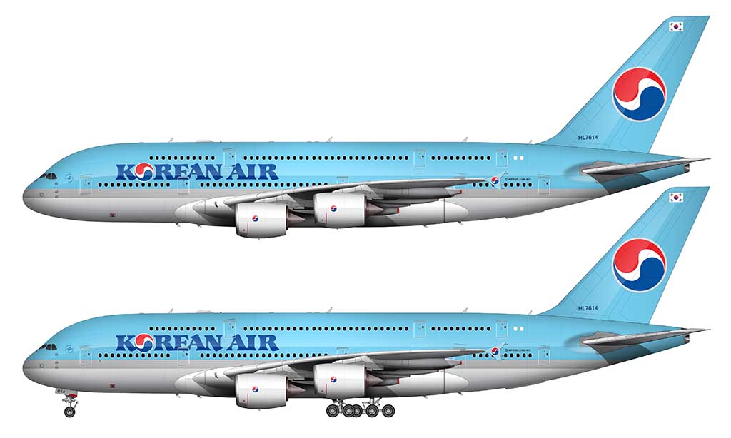
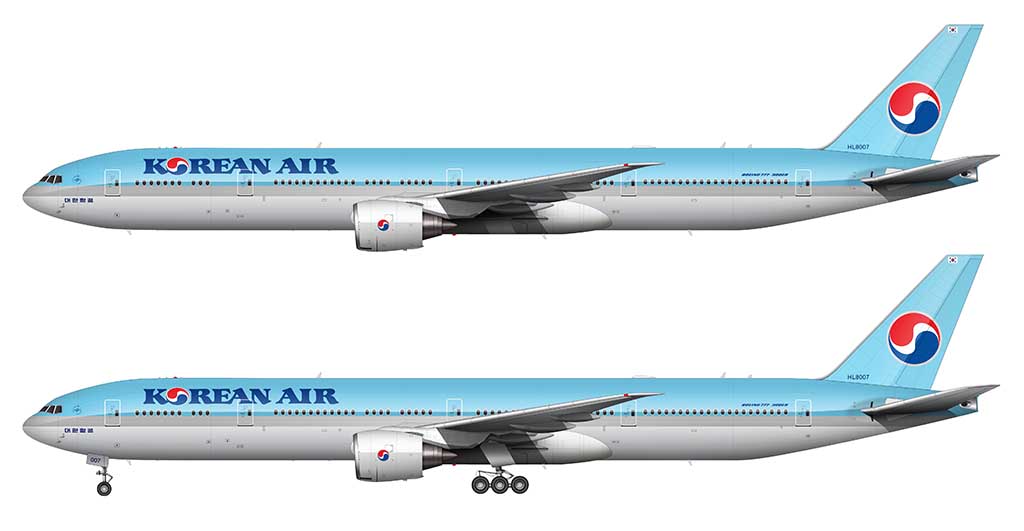
The color palette
To me, the most interesting part about the 1984 Korean Air livery is the color palette. Baby blue and silver weren’t exactly the flag colors of South Korea, but they plowed forward with it anyway. It was an extremely bold (and daring) choice, but over time, these colors defined Korean Air. I would also argue that they helped to define them as the colors of South Korea as a whole as well.

There were four main colors for the Korean Air Powder Blue livery (light blue, dark blue, silver, and white). The logo mark contained four colors (red, blue, white, and silver), but only two are unique:
- Blue: #71CBEB (R=113, G=203, B=235)
- Underbelly / Engines: #FFFFFF (R=255, G=255, B=255)
- Titles: #1C4E9D (R=28, G=78, B=157)
- Silver: #C6C6C6 (R=198, G=198, B=198)
- Logo Red: #EC172C (R=236, G=23, B=44)
- Logo Blue #1C4E9D (R=28, G=78, B=157)
One of the most interesting things about this color palette is the fact that they chose not to use the color red anywhere in the base livery design. Red is a predominant color in the South Korean flag, so I admire the restraint it took to leave it out. If it were me, I wouldn’t have been able to resist adding a few red accents here and there.
The biggest problem with this color palette? Most of the aircraft that wore it ended up faded and chalky looking. Powdery even. Pun intended.
Hey there, two observations:
Are there not three shades of blue in this livery? It appears that there is a second blue between the fuselage top and the silver strip.
Also – I’m sure it’s a typo where you mention that “the horizontal design elements are sick and substantial”
🙂
I guess I’m not seeing the third shade of blue. Isn’t it just the sky blue color (upper half of the aircraft) and the blue in the logo?
And yes, that is a typo, but technically, it is pretty sick. lol
I agree
There’s an error (and extra character) in the hex codes for Blue: #73CBEBF (R=113, G=203, B=235).
Going by the decimal numbers, the hex codes would be 71CBEB.
Shit. 🙂 Thanks for letting me know – I’ve updated the body text, but I’ll make a note to fix the image later.
What about the livery prior to 1984 color schemes?
I’ll add those eventually – I just wanted to cover the modern stuff first.
*depressed*
Just wait until you see the new livery in direct sunlight – I think you’re gonna like it!
Is cathay next?
It should be. I’ve been having a really bad craving to illustrate an old school Cathay Pacific L-1011 lately. 🙂 It might be a good excuse to just do an entire livery history overview…
Do they really use pure white (FFFFFF)? I, myself, generally use a slightly off-white color (E6E6E6).
This is a great livery; simple, bold, and unmistakable. Congrats to Korean for another fine livery.
Yeah, I wrote this overview just a few days after the livery was revealed (and I didn’t have any brightly lit press photos to work from), so I assumed it was pure white. But you are correct! I’ve seen some very detailed close-up photos of this livery since then, and I agree that it is slightly off-white. I need to update my illustrations…
awesome job again… looks pretty cool… one day I am getting there…
Thanks Bernie!
Great job, Norebbo)). Can you make templates and drawings of Soviet passenger planes such as the Yak-, Tu-, Il-, An- especially for me?
when are we seeing more russian aircrafts?
there’s only three….
So many aircraft, so little time. 🙂 I will most certainly do more. Eventually.
Hi Scott,
That is a great article on their color scheme, I really enjoyed it.
What I’d like to know however, is what paint matches the baby blue color, that is available to modelers? Xtracolor had X308 in their range but it appears to be discontinued. Are there any other options out there?
Kind regards, Keith Liotta
Theemodelstarter
Good question Keith. I’m not into building model aircraft, but if I was, I’d probably be happy getting as close as I can (without being perfect). I’d be surprised if there was a direct match for that color that you could purchase off the shelf. Perhaps you could have a custom blend made based of the hex code in this article?
Hi Norebbo!
I am a big fan of your work and have used your templates to make airliner art. I am starting to go digital and was wondering what you use for making your airliner art? Also, any tips for shadows?
Thanks!
The software or app you use doesn’t really matter. You just have to find the one you like the most. I use Adobe Photoshop and Illustrator by the way.
The most important thing is a drawing tablet. It’s really hard to illustrate complex liveries with just a mouse.
An iPad with an Apple Pencil works well too.
I have loved your airliner templates, and often use them for drawing and colouring fictional airline liveries.
I’m glad that you’re finding my templates useful Micah! Hopefully at least one of those fictional airlines becomes real someday.
Another victim of the blue-ification wave of the late 2010s. RIP Lufthansa Yellow, United Gold/Battleship Gray, and now Korean Red. I hope we get some color resurgence in the 2030s. Great article!
Glad you enjoyed it (I mean the article, not the livery lol). I fully believe that we’ll get to a point where technology will allow us to move beyond the oversimplification of livery design. Maybe they’ll figure out how to do more complex designs (with more color) with wraps instead of paint? Not sure. But I hope so.
I agree, especially considering that Gen Z hates minimalism, and prefers maximalist designs with more colours and distinct brand identity
You stated, “An all new (and completely custom) typeface was created for the Korean Air titles. Unlike the previous version, it’s a modern san serif design with no hints of Korean-specific culture.” With due respect, that isn’t necessarily so—at least not according the Dalton Maag Typeface Design Studio, the font’s creators. On their website, they state that the newly-designed Korean Air Sans font is, “…a custom humanist typeface that pairs clarity with character. Its minimalist forms with subtle traditional Korean calligraphic details reflect the brand’s fusion of heritage and modernity.” Surely, subtle traditional Korean calligraphic details (the characters’ terminals) reflect Korean-specific culture. That said, I’m enjoying your aircraft artistry very much; thanks for your work.
Thanks John! As a designer myself, it’s hard for me not to roll my eyes whenever a designer twists themselves into pretzels when trying to explain the reasoning and inspiration behind a rather simple design solution. I get why they do it (I’ve done it many times myself over the years), but I think I reached the age where a lot of this stuff just seems like total BS lol.
I do like the new typeface, and I have no doubt that it represents modern Korean culture. The previous one seems more traditional, which is my preference I guess.