Alaska Airlines has two new (primary) liveries at the moment. One for their 787s, and another for every other aircraft in their fleet. Both liveries draw inspiration from the northern lights. One quite literally, the other a bit more abstractly. Let’s have a look at both…
Alaska Airlines new livery (for the 787s only)
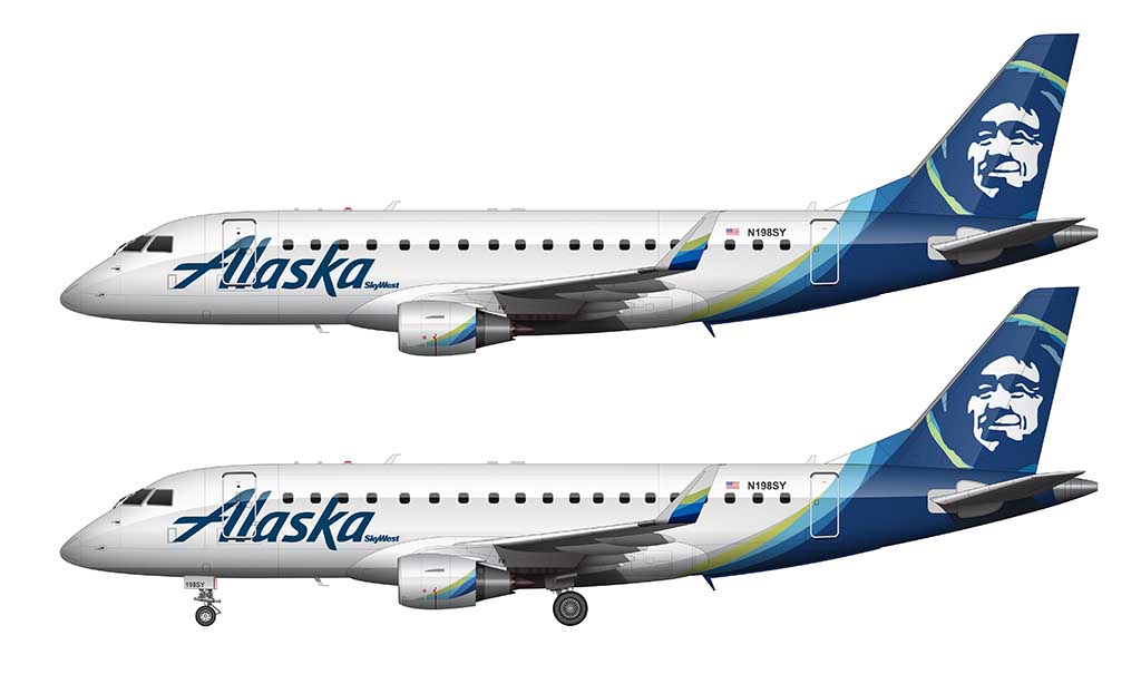
Alaska Airlines unveiled an all new livery for their 787 Dreamliner fleet on August 4, 2025. It features the same general color scheme as their latest livery (unveiled in 2015), but in a more fluid – and complex – way. The most significant change? The elimination of the Eskimo graphic on the vertical stabilizer. A first for Alaska Airlines.
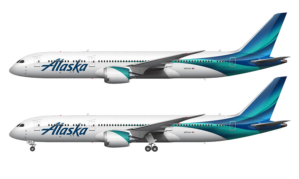
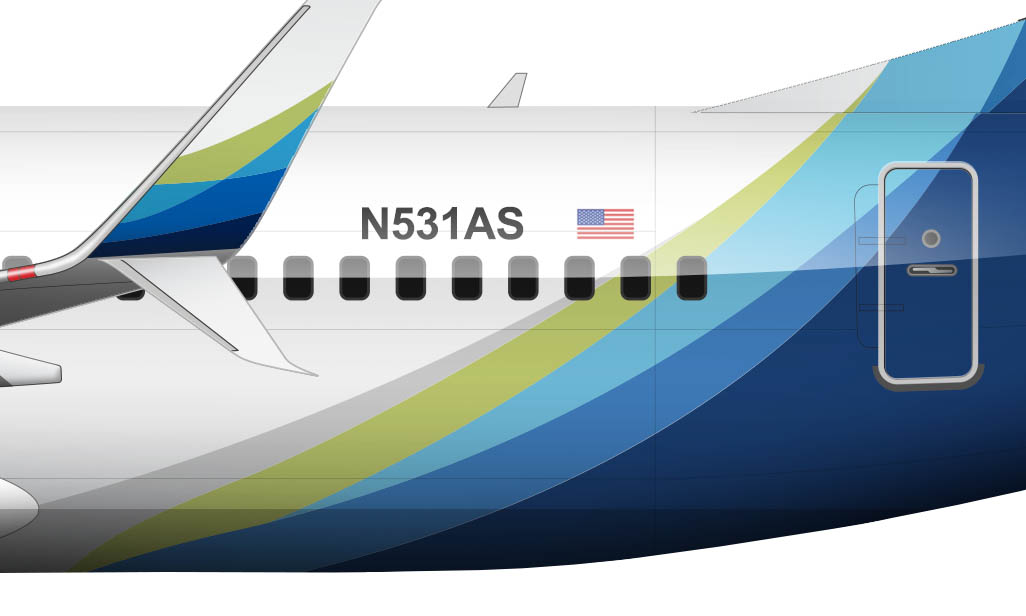
The inspiration for this all new livery design, of course, is the Northern Lights. The translucent blue and green colors overlap with one another as they expand to fill the tailcone and vertical stabilizer. Dark blues fade into light greens, with varying shades of dark green adding depth and texture. It’s an extremely complex (and beautiful) design.
Having two separate liveries to represent single brand is always a gamble IMHO. However, United did the exact same thing with the introduction of their 787’s (which you can read about in my detailed overview of the United Airlines livery). It actually worked out for them, as it was that 787 livery which became the inspiration for the new United livery in 2019.
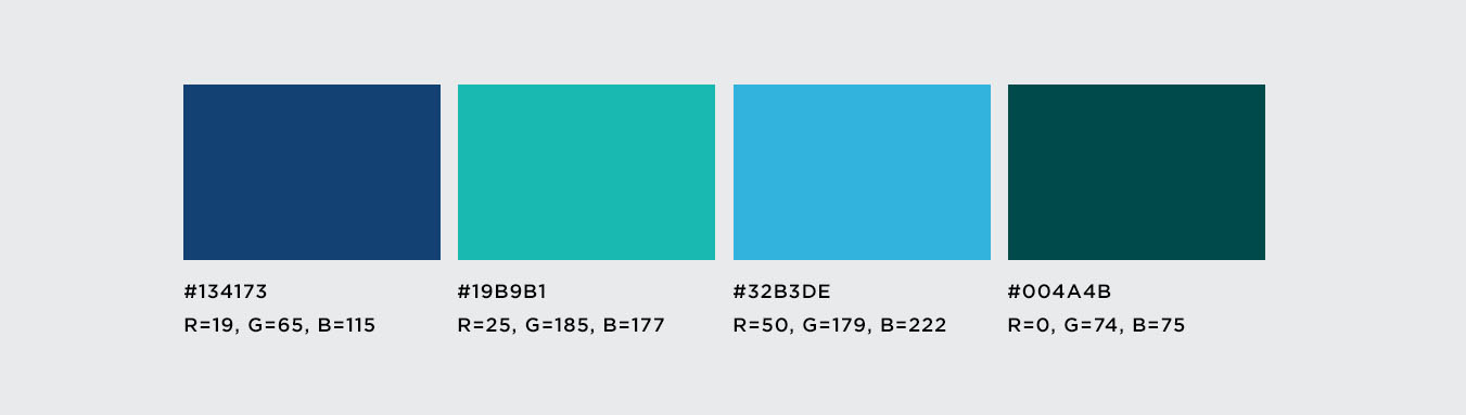
Color palette:
As far as I can tell, there are four primary colors to the Alaska Airlines 787 livery: two shades of blue and two shades of green:
Other notable details:
- The “Alaska” typeface on the front half of the fuselage is an exact match of the other livery (which I describe below).
- The engine nacelles get a splash of color as well. It’s mostly green with a slight dark blue gradient at the edges.
- Chester hasn’t made any public statements since the ousting. His whereabouts are unknown.
Alaska Airlines new livery (for the rest of the fleet)
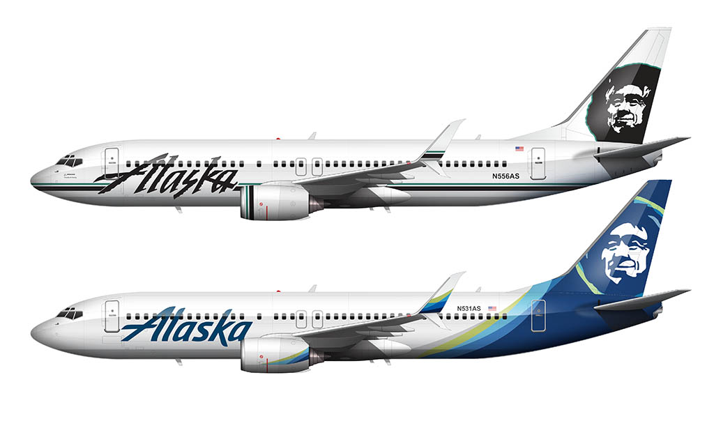
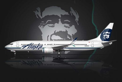
Designed by Hornall Anderson (now Sid Lee) and unveiled on January 25, 2015, this was the first major update the Alaska Airlines livery in over 25 years. The launch aircraft for this new design was the Boeing 737-800, which was fitting considering that the 737 was (and still is) the back bone of the Alaska Airlines fleet.
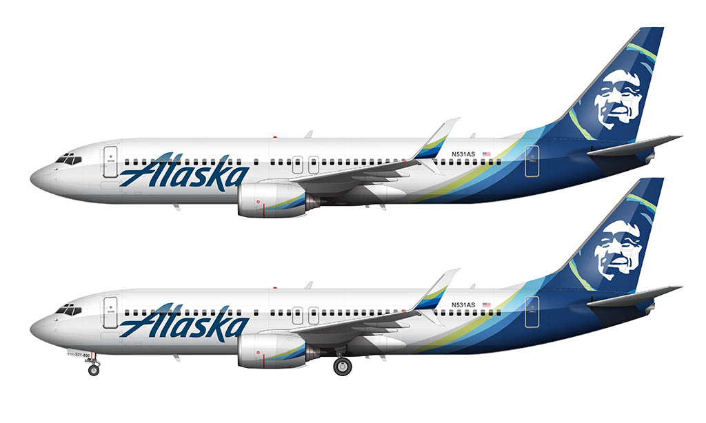
Considered to be an evolution of the Alaska Airlines livery rather than a complete redesign, there were three major elements to this redesign effort:
- The typeface
- The Eskimo character
- A new color palette
1. The typeface
To me, it was the simplified typography of the main title that was the biggest change. A refined style was created to replace the rugged theme of the old font, bringing it more in line with current styles and trends. This was an incredibly important change, because it reflected the growth (and evolution) of the Alaska Airlines corporate culture over the years.
Gone are the days of this being a scrappy little airline from the north whose sole purpose was to serve a small niche of customers to and from Alaska. Alaska Airlines is growing into a more global brand with every passing year, and having a typeface which reflected modernism and sophistication was key.
2. The Eskimo character
To Alaska Airlines, one of the biggest challenges to their brand refresh was the modernization of the face of their iconic Eskimo graphic (who has been gracing the tail end of Alaska Airlines airplanes since 1972). The goal in this redesign was to make him appear to be more warm and friendly than he already appeared to be, which if you ask me, wasn’t all that necessary. He already seemed like a decent dude to me!
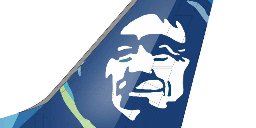
The general face structure is still the same, but you’ll notice that he’s smiling just a little bit more than he used to be. They also made him appear to be slightly younger, which was no doubt a result of cleaning up and smoothing out the hard edges.
However, most people won’t even notice the difference within the face itself unless you compare to aircraft side-by-side. The designer in me loves these little Easter egg style differences that most people never notice. If anything, it gives me a lot to talk about in these blog posts…
Anyway, for those of you who use Adobe illustrator, you’ll understand me when I say that it’s like they used the Auto Trace feature on the old logo and then simplified it by toning down the threshold and reducing the number of corners. I can sense some of you nodding your head in agreement…
Wait – was the Eskimo graphic modeled after a real person? Or not?
Nothing would satisfy my curiosity more than having Alaska Airlines unveil the identity of the model for their iconic Eskimo figure. They’ve never publicly stated if he was a real person or not. Regardless, most of us in the AvGeek community simply refer to him as “Chester.” And until Alaska Airlines unveils his true identity, he will forever be named Chester in my mind.
Now the question is: who came up with the name “Chester”?
3. A new color palette
Brighter colors across the entire brand was the third big change. The color palette was updated to include tropical hues which reflected some of their newest destinations. They are also what I consider to be an abstract representation of the Northern Lights.
A brighter color palette was exactly what what was needed to inject this brand with more character – which makes it far easier attract a more global customer base.
What makes this livery so great?
Alaska Airlines’ new livery is utterly brilliant in my opinion. Not because of the cleaner typography and the refined color palette, but because of the way that the colors were applied asymmetrically to the aircraft.
Most airline liveries in this day and age (such as the new American Airlines livery) are mathematical and precise, completely symmetrical from one side to the other. This one is a little bit different.
Yes, the livery is applied exactly the same way on both sides of the aircraft. However, it’s the overlapping of the shapes from the fuselage up into the vertical stabilizer that seem to have been applied with no rhyme or reason.
Very much like how the color palette was chosen to mimic tropical tones and hues, it appears as if the colors are applied in a way which mimics flowing water. The transition from white to blue along the aft section of the fuselage is extremely free-form and random, which creates a very nice upward flow into the Eskimo graphic on the vertical stabilizer.
This free-flowing design was extremely difficult for me to illustrate by the way. I suspect it was quite easy for the original designer, since he or she likely just overlapped transparent shapes of color until a balanced and visually pleasing solution was found.
However, when trying to re-create that exactly for myself, it was extremely difficult because there are no set proportions or specific measurements to adhere to. It was basically just a free-for-all – and was heartburn inducing for real…
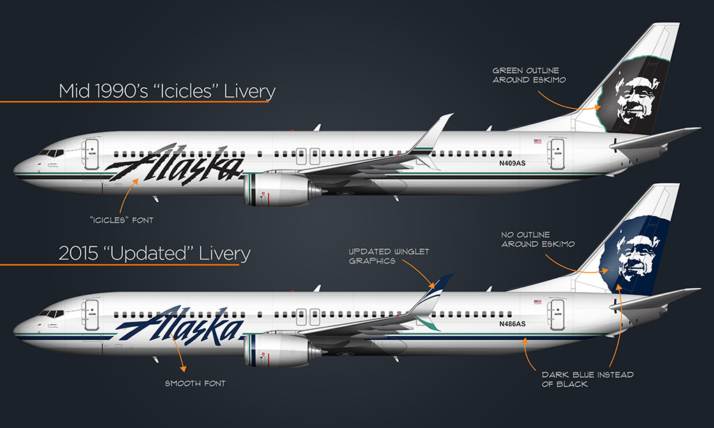
Comparing the new “main” Alaska Airlines livery with the old
When compared side-by-side, the new Alaska Airlines livery is so much better than the old “Icicles” version. Don’t get me wrong – I’ve always been a fan of the old Alaska Airlines livery because of its simplicity and attention to detail. I’m not sure how many people will agree with me, but I really liked the ruggedness and sharp edges!
What’s interesting to me is that there was actually a “transition” livery unveiled back in 2015 which slightly modernized the old livery – but didn’t go quite as far as this new one did. The modifications were so subtle that most people didn’t even notice (including me).
Anyway, I wrote a complete blog post about this transition livery several years ago, so I recommend reading that if you want to learn more.
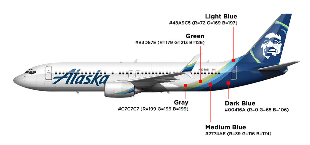
Color palette
Because I thought it might be helpful for anyone out there who wants to create their own illustration of the Alaska Airlines new livery (using my 737-800 templates of course), here is a list of all the colors are used in the new palette. Following that is a graphic showing where those colors are applied.
- Fuselage: #FFFFFF (R=255 G=255 B=255)
- Title font: #00416A (R=0 G=65 B=106)
- Dark blue: #00416A (R=0 G=65 B=106)
- Medium blue: #2774AE (R=39 G=116 B=174)
- Light blue: #48A9C5 (R=72 G=169 B=197)
- Green: #B3d57E (R=179 G=213 B=126)
- Gray: #C7C7C7 (R=199 G=199 B=199)
I genuinely thought you were dead, in the sense that you quit making templates. Glad to see you back!
Not dead! Just busy with other projects. 🙂 I also admit that I’m procrastinating ever so slightly on the 707. It’s on the drawing board though!
And there has another funny change between new livery and old livery: the text “Probability all Boeing” under the cockpit window has been removed since Alaska Airlines acquires Virgin America in April 2018 (Virgin America only had Airbus A320).
Haha, yeah, I was wondering when they were going to remove that. It’s about time!
In the coming years, chances are there to remove the iconic Eskimo face!! Because even Aerolíneas Argentinas removed their iconic bird.
Hope they won’t do that !!
Really?! I haven’t heard of that. I hope it doesn’t happen either, since it’s such an iconic part of their brand.
Yeah,
People say that, because Alaska airlines keeps making special liveries which are actually amazing than the regular one
Thank you for the color palette. I fly Alaska on the average of every 4 – 6 weeks and I’m usually yarn-crafting in the air. I’ve been wanting to either knit a scarf or crochet a witch’s hat (I like witches — go figure) of the new palette that I could wear on my flights.
You’re very welcome, and that sounds like a really fun idea!
I just realized that you were the SANspotter guy who comments on how clean your jetBlue Mint Suite is! hahaha.
Haha, yup, that’s me!
So is Alaska just painting over the Hawaiian Airlines logo or is this the color scheme of new 787’s?
That’s the new livery for the 787 only. All of the other aircraft in the fleet will continue with the existing livery.
Hello, Everyone!
There are times when I think one must be an Alaskan to remember the “Alaskan/Arctic/Boreal” tidbits of information about these liveries. Our dear Norebbo speaks of the “new” tropical colors that enter the scheme, but the truth is much more genius! The designer actually chose colors that were both Tropical AND Boreal! While most in the world can close their eyes and see the tropical green of the forest and the tropical blues of the shallow, beach-ringed seas, those of us in the Arctic regions see those colors as well, in the Aurora Borealis, green and blue splashed across the night sky. Hence, there was no better way to illustrated, literally, how Alaska Airlines is the link between these two extremes, and everywhere in between. So, whether dancing across the fuselage (at random)(I guarantee, one of the first things you think of when you see the aurora is that they are “random!”), or swirling around our Inupiaq friend’s parka ruff, the colors of Alaska speak to everyone, no matter where they fly.
This new livery reads very “budget” to me. I associate bold swooshy graphics with value airlines. The complete elimination of Chester and the 2015 refined typeface and you have pretty well eliminated all the character and uniqueness from this once distinct company. What’s next? Changing the name to appeal to a global audience?
Hi Scott, this is RobMiami787 from YT.
My years flying alaska were 82 thru 1993, so i consider myself an originalist, and in my inflated self esteem consider myself to be an expert on all things related to alaska airlines lol!
Ditching the Chester image is a critical error. It’s an historic image, widely
recognized throughout the west and increasingly throughout alaska’s network as they have spread across the u s canada mexico hawaii.
The comparison to united and they’re rolled out livery on the 787 is not quite apples to apples.
Many years ago in the mid 70s, in PHX my grandmother arrived from IND via DFW. She was an old lady and the last person I would ever expect to comment on an airplane that she had seen, but she was so captivated by the eskimo on the tail… I of course knew about Alaska so I knew what she was talking about.
Personally I think their 787s, if indeed they are successful with their european expansions, the Chester face is so distinct and unlike any other carrier in the world
Not to mention they are ditching yet another historic Face from Hawaiian.
Maybe, for shits and giggles in your spare time could do a proper Chester rendering on a 787 template, just for comparison sake. Oh, the double livery across a fleet is a fools errand, IMO.
I’m so glad there’s someone in the world.
Takes the time to evaluate , analyze and share their opinions, but cause we know that airline Liveries are maybe the most important thing in the world! Lol
Carry on the good work my friend!
Hi Scott. Since you asked about the identity of the face on the tail, the answer is almost certainly Oliver Amouack. He was part of a cultural show Alaska Airlines produced as part of a marketing campaign. A b&w photograph of him on the poster, when rendered in solid black and solid white, is an exact match to the livery. See here, at the very end of the post: https://runwayrunway.tumblr.com/post/729463151096201216/the-man-on-the-tail-an-alaska-airlines-whoisit.
The original Chester was also a real person and well loved in his community, and it’s unsurprising to see people who knew him insist he was the inspiration. Ultimately the name wasn’t recorded when the livery was made, so it remains officially unknown, and perhaps it works better for the face to remain anonymous yet very familiar to the people whom it represents.
Thanks Eric! It’s been fascinating to learn more about the history of Chester (and how he ended up as the face of the Alaska Airlines livery). I really need to do an update to this article and include some of this information.
You are absolutely correct that there is someone in Anchorage fuming at what Alaska Airlines is doing to its. My take is they obviously did no market research in Europe. First, I guarantee someone at corporate said, “The Europeans won’t understand he’s an Eskimo.” Being an Eskimo myself (Yup’ik), and having performed at many venues around the US and Europe, I can tell you, without fail, that Europeans know more about the indigenous people of the North American Arctic than any random American. I promise, if the Eskimo travels to Europe, European cities will start courting Alaska to fly to their city. “We want the Inuit.” They also know better than to call him an Eskimo. Second, The Aurora is not Alaskan, it is Circumpolar and Circum-Antarctic, it could represent several different countries. The Eskimo is quintessentially Alaskan, though Inuit live also in Canada and Greenland. And third, Alaska Airlines corporate obviously doesn’t understand the European market. In North American, there really aren’t very many airlines for The Eskimo to compete with, the majors, some low cost carriers in most cities. In Europe, every country has a national airline, along with way more low cost carriers. Alaska will be competing with with dozens of airlines and their liveries at every airport. While the Aurora fades into nothingness, The Eskimo stands out, because it is just so darn unique! Alaska Airlines is crazy to give up something that has proven classic, striking and quintessential!
Curious, do you have any thoughts on the fact several sport mascots have changed from Native American to other mascots? Is Alaska airlines livery ok with the Eskimo culture being displayed? The livery is definitely iconic! I’ve thought the Alaska livery should be a rendering of Denali!
No comment about the sports mascots (because political lol), but I’d be willing to bet that the Eskimo graphic will eventually be replaced. Their new 787-9 livery may end up being the future for Alaska Airlines. Time will tell…
Hello, again, friends! There are five indigenous cultural groups, made up of 13 culture, 25 languages and over 250 tribes in Alaska. “Eskimos”, or Inuit, now, make up about a third of the indigenous, or Alaska Native, population and are represented by three language groups, Inupiaq, Yup’ik and Sugpiaq (each meaning “The Real People”). I would bet my total worth that our friendly Inuit guy on Alaska Airlines tails is Oliver Amouak, an Inupiaq man featured in a tourist stage show. His face was printed flyers for the show. Find that flyer and you found the greyscale version of the high contrast logo (easily created in Photoshop with that picture) down to highlights in the ruff and the folds of his eyelids, carried through to the logo today. Of course, Alaska doesn’t want to admit it. That would lead to royalties for the family. To me, that would be a tiny cost for a huge PR dream. A real person, proud of his culture, sharing it cheerfully with visitors, now sharing it with the world. Then combine that with the hospitality customs of Alaska Native people and you have the epitome of “Alaska Spirit”, the center of Alaska’s award-winning corporate culture. Besides, “Oliver” is a way better name than “Chester”. “Chester” was Chester Noonwook, a reindeer herder in Kotzebue. I don’t think a single one of his pictures match at all. As for cultural appropriation, I doubt you would find a single Alaska Native person who doesn’t beam with pride that Oliver is the face of “our airline”. In the 80s, Alaska had a long-running, brilliant ad campaign, “Fly with a happy face,” a double entendre that is still catchy. Oliver is not a caricature, which is why you can see the original picture so easily in all iterations. He was a real person with a genuine love of sharing his homeland with guests. While based in Seattle for so long, I believe wherever you board and Alaska jet, you are stepping into Alaska, and you are so, so welcome. Could we change from “The Eskimo” to “The Inuit” or “The Inupiaq”? Sure. But let him do the awesome job he has always done, in life and in logo.
I think Alaska should go with a future unified design similar to Qantas or Air France – putting Chester on the engines, and leaving the tail with the Northern Light colors. Like how Qantas has the kangaroo on its A330 engines and Air France with the horse.
Hey Scott, I am faced with an urgent dilemma of the utmost challenge for my inner avgeek nerd. I can only pick one model—should I go for either Hawaiian Airlines B787-9 or Alaska Airlines B787-9 in 1:200, or get two 1:400 models like Etihad Cargo B777F, Saudi Arabian B787-9, Qantas B787-9 “Yam Dreaming”, Alaska B737-900ER “Our Commitment”, or United B787-9 “The Future is SAF”? Which would you recommend?
Oooooh. That’s a tough one! If it were me, I’d get the 1:200 HA 787-9 (just for the nostalgia). I think I saw a news article earlier this week saying that they had all been repainted into the new Alaska livery. Very sad.
Alaska’s new livery is making me to vomit. The tail livery looks kinda like the windows 10 default background. Which made me having nightmares about it. Scott, I know that in you opinion it is good, but to me this livery spoiled the whole entire airline.
Oddly enough, the feeling of needing to vomit was strong as I was illustrating it. Not because I don’t like it. It’s just that it’s really (really) complex lol.