If there’s one thing to be learned about the Air New Zealand livery, it’s that all of them are an evolution of the same primary purpose: to celebrate the rich culture of New Zealand.
Air New Zealand is a relatively conservative airline – at least from a design perspective. That’s a good thing IMHO, as it has helped them to create some of the most iconic liveries in the history of the airline industry.
Every livery of Air New Zealand (1965-present)
Tasman Empire Airways (TEAL) was officially renamed to Air New Zealand on April 1, 1965. This livery analysis covers Air New Zealand liveries only. Someday I may go back and add in Tasman Empire Airways to this, but for now, it’s all about how the Air New Zealand brand has evolved throughout the years.
1965-1973: Transition from TEAL to Air New Zealand
The 1965 livery was the very first one to feature Air New Zealand Titles. Although the name of the airline had changed, this particular livery was a minor evolution of the one that preceded it. It was the same type of subtle evolution happening with the Qantas livery of the time as well.
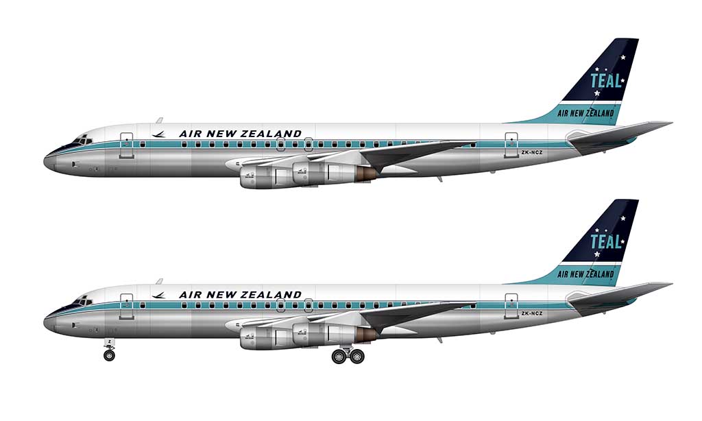
- Teal and dark blue were kept the primary colors, as they were a representation of the natural beauty of New Zealand.
- White was used as the base color for the top of the fuselage, while the bottom of the fuselage was exposed aluminum.
- This livery was very typical of the time. Horizontal stripes (known to AvGeeks as “cheatlines”) were the primary design elements on both the fuselage and the vertical stabilizer.
1973-1981: Introduction of the Koru
Air New Zealand unveiled in all new livery in 1973, which (at first glance) looked nearly identical to the one that preceded it. However, there were some important differences.
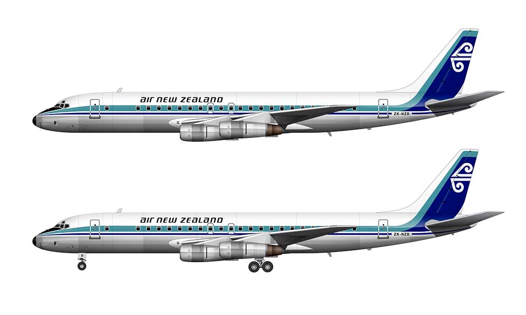
- The stripes on the vertical stabilizer were redesigned to be vertical instead of horizontal. This allowed them to be blended into the horizontal stripes on the fuselage.
- The horizontal stripes on the fuselage were modified. Instead of a thicker teal stripe sandwiched between two thinner dark blue pinstripes, the teal stripe was placed above a single (thicker) dark blue stripe. The vertical space (negative space) between the stripes was increased.
- The typeface for the Air New Zealand titles was changed.
- An all new Air New Zealand logo was added to the vertical stabilizer. If it wasn’t obvious, it’s an abstract representation of a silver fern frond (Māori Koru).
1981-1996: Simplification
Air New Zealand introduced a new livery in 1981 that had the same evolutionary style to it that the previous one did. All of the familiar design elements remained, with a handful of minor changes.
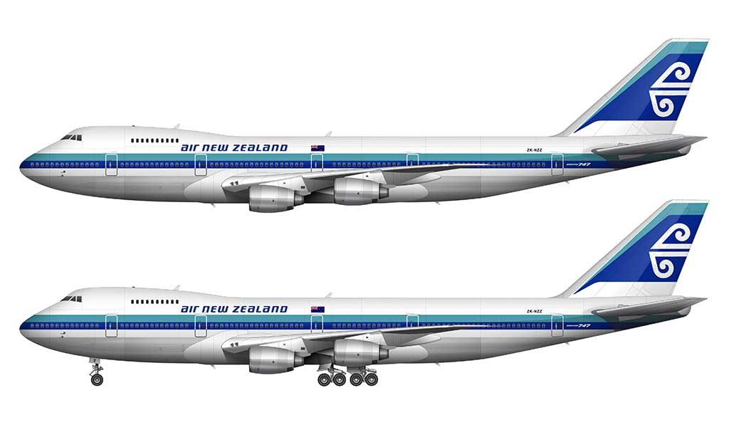
- The vertical (negative) space between the teal and dark blue stripes on the fuselage was eliminated.
- The stripes on the vertical stabilizer were detached from the stripes on the fuselage. They now ended at a point (with negative space between them and the stripes below).
- The colors were brighter. More specifically, the teal was tweaked a bit to appear more green.
- A graphic of the flag New Zealand was placed next to the Air New Zealand titles.
- The black nose cone was eliminated. The stripes now wrapped around the cone as a single element to the other side of the aircraft.
1996-2012 Pacific Wave
The 1996 Air New Zealand livery was a bold new direction for the brand. Created by Zambezi, it featured all of the same colors of the previous livery, with all new design elements.
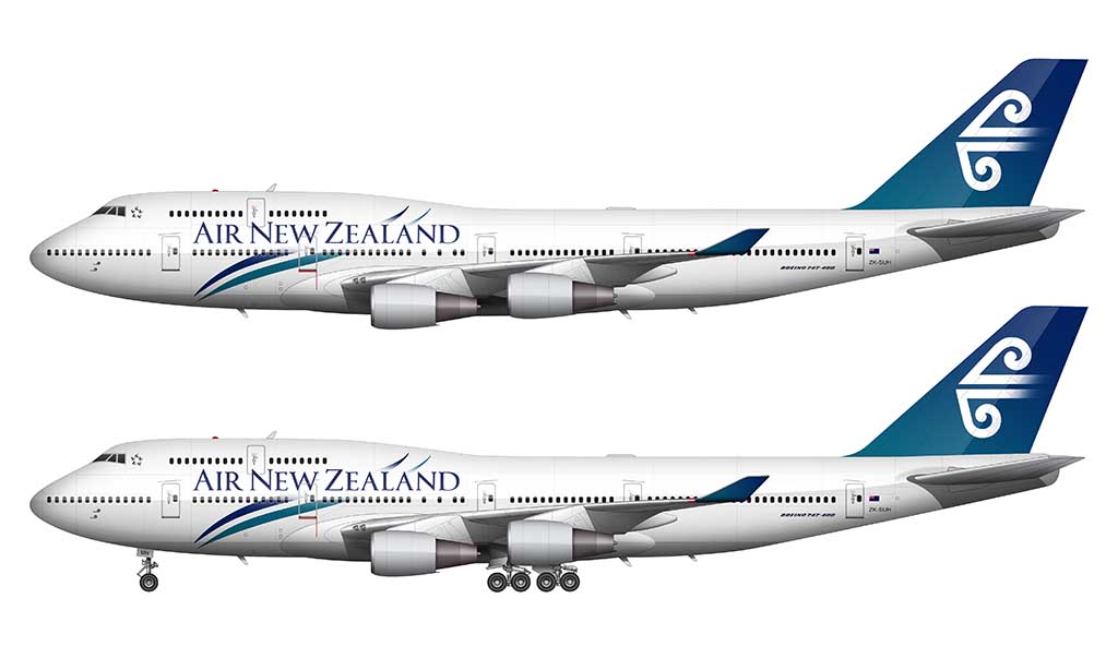
- The horizontal stripes of the fuselage were replaced by stylized “wave” graphics (in both teal and blue). These parallel stripes intersected the Air New Zealand titles.
- The Air New Zealand titles were switched to a lighter (and much larger) serif typeface.
- The engines (and the very bottom of the fuselage) was painted in light gray. For for the first time in the history of Air New Zealand, exposed aluminum was no longer part of the livery.
- The vertical stabilizer featured the same koru logo as before, but it was placed over top of a teal-to-blue gradient.
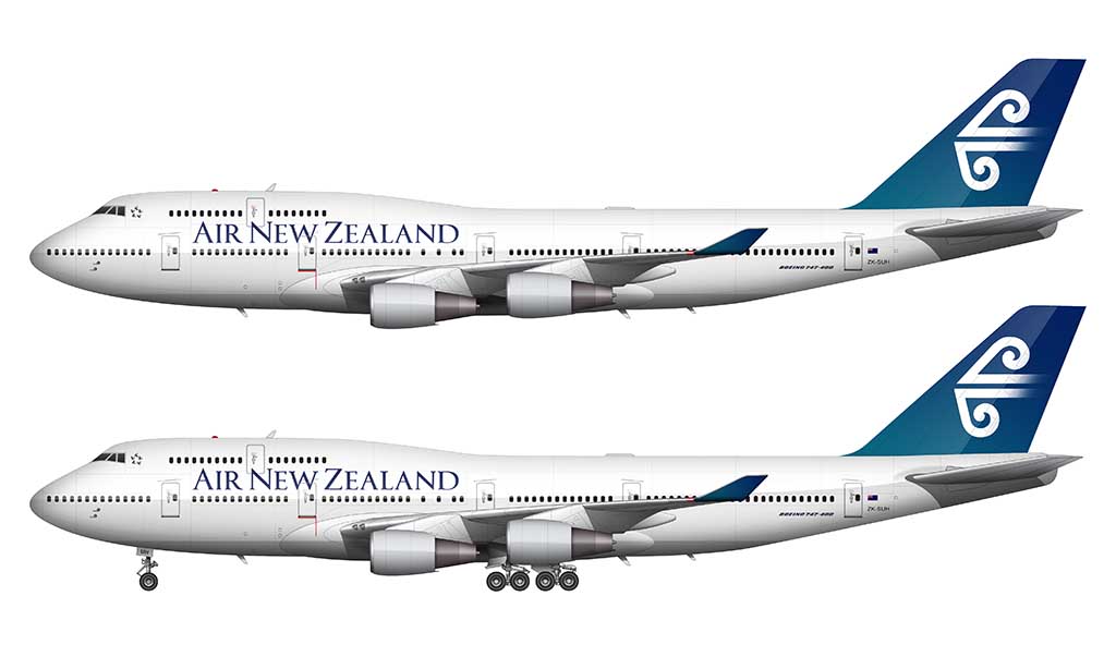
Modified version in 2009
There was a slightly modified version of the Pacific Wave livery which started rolling out in 2009. Much like how the Sun Country Airlines livery went from awesome to “blah” in 2016, I consider this 2009 livery revision to be just as disappointing. It was essentially was same livery as before, but with the elimination of the most interesting elements (the wave graphics intersecting the titles).
2012-present: Black and white ferns
Air New Zealand introduced another all new livery in 2012 with the help of Designworks. Again, this was a completely new design direction for the brand, and a bold one at that. For the first time in the history of Air New Zealand, teal and blue were not used anywhere in livery.
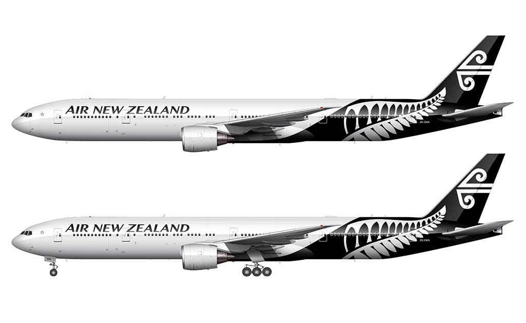
- Black became the primary color – which wasn’t all that controversial of a decision considering how important black is to New Zealand culture.
- Influencing the decision to replace the teal and blue was the positive response to their special All Blacks livery in 2011. That special livery promoted their sponsorship of the All Blacks rugby team, and it was a huge success.
- Tourism New Zealand granted Air New Zealand permission to use the New Zealand Fern Mark, a logo used by them and NZ Trade and Enterprise. This became the primary element of the livery, and I have to say that it helped to create one of the most unique airline livery designs ever.
- The Air New Zealand titles were displayed in an all new typeface. Kris Sowersby (of Klim Type Foundry) is the designer credited for the redesign.
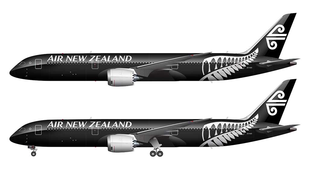
One of the most interesting things about the 2012 livery is that there are two versions of it. The white version (as seen above) is painted on the majority of the fleet. The second version (which is predominantly black) was unveiled in 2013 on the Boeing 787-9. Only a select handful of aircraft wear this version of the livery.
Minor pedant note: you’re missing the even-more-boring ‘black tail’ livery: https://www.airliners.net/photo/Air-New-Zealand/Airbus-A320-232/2296913
The fallout from that livery is thought to be what pushed the creation of the actually good 2012 fern liveries.
Several A320s, both new and existing, were painted in the black tail livery. It never hit the long-haul fleet except as a base for Hobbit wraps on two 77Ws.
Interesting, thanks for the info! For some reason or another I always consider those to be special liveries – I had no idea that is actually the precursor to the current version. I’ll make a note of it the next time I update this post.
Grumpy old (NZ) man here…the Koru livery coincided with and was best showcased on the introduction of the DC10-30, the first of which was delivered 27 January 1973.
There weren’t that many liveries that looked bad on the DC-10. That first Koru livery slathered all over it would have been amazing to see in real life.
The launch livery looks like Frontier Airlines got into the laundry detergent business.
I love it!
Haha, best description of it that I’ve ever heard! #chefkiss
Just an FYI, You’ve used the old Koru on the Pacific Wave and Silver Fern Liveries
Old Koru (with a bit at the end cut off):
https://airlinelogos.aero/classic/AirNewZealand01.jpg
New Koru:
https://encrypted-tbn0.gstatic.com/images?q=tbn:ANd9GcQZGLNyxduXwFff8itbOUqyUEzs78DeiwUTRw&s
They may look the same at first, but if you look closer, it will become clear that the newer one is more pleasing to look at. This might be an easy mistake to make, so others might not notice, but I can;t unsee it I’m sorry. Still, great illustrations.
Thanks Lachlan! I never even would’ve noticed if you hadn’t pointed it out. I’ll be sure to make the fix next time I update these illustrations.
Hi!
I got this photo today at LAX. No fern at all!
Hey Jason – the link you included didn’t work (so I removed it). Could you correct it and then re-add it to your comment? I’d love to see it!
Does this link work?
https://www.dropbox.com/scl/fi/z05u1dvjvdyfmoldsfl44/Minimalist-Air-New-Zealand.jpg?rlkey=m1na9osdlvbz1ilgrhjo13v9r&st=j1xu1s76&dl=0
That worked! That looks really cool actually – though I wonder if it was just a leased aircraft or something.
It is a second-hand Cathay Pacific 777 purchased by Air NZ to cover their 787-9 engine issues.
I am not sure but when looking at flightradar it lists the plane as “Minimalist”
It’s certainly a fitting description!
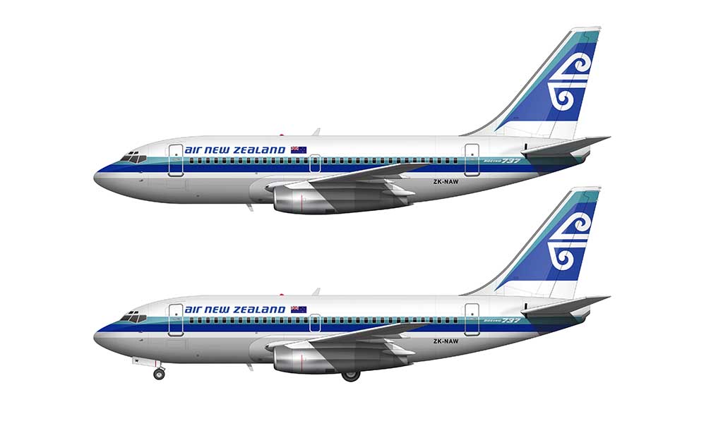
When NAC merged with ANZ in 1978, NAC 737-200’s received the ANZ titles and the Koru but retained their basic NAC livery. It looked sharp for the era.
https://www.aussieairliners.org/b-737/zk-nac/4625.051l.jpg
Do you have an article on the LOTR and Hobbit liveries? They’re spectacular! I remember seeing multiple of the LOTR at LAX on my way to Fiji and then flew in one on the way home.
No, but I agree. They are amazing! They’d be awfully difficult to illustrate though, so that’s one of the reasons why I haven’t done it yet.
As a Kiwi who loves colour I am sad that they have ditched the teal colouring. Black is a negative colour – not beautiful or attractive at all. I hate it and I hate that it has become our ‘national’ colour! To me it looks like the good old days when I see the colours in the 70s and 80s and 90s.
I loved the teal livery , thought it captured the colours of the country and Pacific islands it flew to. The silver fern livery really bothers me as the Koru is a symbol of an unfurling silver fern frond and then it is repeated differently in the silver fern on the fuselage. Two variations of the same thing essentially on the aircraft, it should be one or the other but the Koru is a beautiful logo.
You should mention the “Flying Fish” logo that was carried on the aircraft after the merger as it is a reference to TEAL
Who came up with that black livery?
It’s totally absurd to paint a plane with a color that signifies death and evil.
“That’s black magic!”, “He has a black eye “, etc.
The 2009 livery was the best.