As far as I’m concerned, there is no better airline livery in existence than the new Etihad livery. It’s clean, classy, and far more interesting to look at then all of the other euro-white liveries that seem to be all the rage these days.
Every time that I look at this livery applied to any aircraft type, I always see something new that I hadn’t seen before. It’s a brilliant design that is busy without being overly complex. Colorful without being gaudy. And it fits so well with the spirit of the airline and the vibrant culture of the United Arab Emirates.
A brief summary of the stunning new Etihad livery
Launched in September 2014, the official name for this delivery is “Facets of Abu Dhabi”. It was inspired by the colors and tones of the United Arab Emirates, as well as the geometric architecture of Abu Dhabi. If only the Emirates livery could have been this bold…
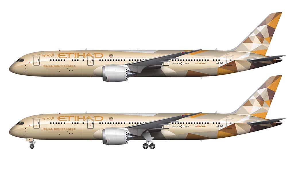
The colors themselves are the most interesting to me, since they literally tried to match the colors of the sand of the surrounding deserts of the region. For example, the darker brown is a reference to the sand color of the Liwa Desert, while the lighter colors pay homage to the brighter sand colors found in the north. It almost reminds me of some of the vintage Continental Airlines livery designs.
As a visual designer myself, I love hearing stuff like this. Do you really think that the designers of the new Lufthansa livery put as much time and effort into the color choices for that one? I bet you anything they didn’t.
Anyway, Landor Associates were the ones responsible for this the beautiful Etihad livery. Like they’ve done with so many great airline liveries of the past, they absolutely nailed this one. Personally, I think it’s their best creation yet.
How was Etihad’s new livery created?
The process of illustrating the new Etihad livery must’ve been a time-consuming (and head-scratching) process. Based on my own personal experience, complex designs tend to take longer to finalize since there are so many ways to tweak and modify it to get it looking just right.
Looking at this livery on the 787-9, it’s likely that the designers started in the vertical stabilizer and worked their way down into the fuselage. The triangular shapes are almost pixel-like, which leads me to believe that this design started out as a computer-generated series of abstract facets and triangles. It was only after they had something to work with that they manually went in and adjusted the shapes to flow correctly into the rest of the aircraft.
This is just my personal opinion of course. This design may very well have been illustrated by hand, puzzle piece by puzzle piece, with great thought given to each shape. Who knows? All I’m saying is that I see the origins of computer-generated patterns and shapes when I see this livery.
If you’re curious, here is a detailed video showing how I created the Etihad 787-9 illustrations for this article:
Pros and cons of this livery design
Shortly after the unveiling, James Hogan (the president and CEO of Etihad) stated that this new this redesign “continued their tradition of breaking norms and doing things differently.” I can agree with that statement 100%. This is a literally unlike any other airline livery in existence, and I applaud them for the amount of time, effort, and money they put into it.
However, it’s not perfect. Below are the pros and cons of the Etihad livery – both from an objective and subjective point of view.
Pros
- The design is so bold and unique that it’s unmistakably Etihad. There’s no mistaking this livery for any others, which is a hard thing to achieve in this day and age of similar all-white livery designs.
- In my opinion, this design is so unique and interesting that it makes it a real treat treat to see in real life. I mean, when’s the last time you got really excited about seeing a Delta or United airplane up close at your local airport?
- It makes me happy to see in airline take so much pride in their culture (and translate that into a great brand image). It couldn’t have been cheap to decide to go in this direction, and I applaud them for their efforts.
Cons
- One of the first things that I see whenever I look at an Etihad airplane is dollar signs. After all, the amount of time and effort it must take to paint a single aircraft can’t be insignificant. I suppose this is OK when times are good, but as soon as the economy tanks, it has to become a liability and burden on them to keep throwing significant amount of money to maintain a fleet of loudly-painted aircraft.
- I’ve heard people criticize the new Etihad livery for being too dull and not colorful enough. I don’t share those feelings though, but I could see how the monochromatic tone of this design might seem boring to some.
- There’s something to be said for clean and simple airline liveries (the Qantas livery is a perfect example of that), and this Etihad paint scheme ain’t it.
Color palette
As I mentioned above, the inspiration for this color palette came directly from the deserts in and around the United Arab Emirates. It’s basically the opposite of what the Qatar Airways livery is, and it’s nothing short of stunning.
Although I’ve been unable to find an official color palette from Etihad themselves, I did a little research into their brand colors. Here is what I’ve determined to be the full list of colors used in this livery:
- Fuselage (Metallic Paint): #F1E2C6 (R=241, G=226, B=198)
- Titles: #BD8921 (R=189, G=137, B=33)
- Title Drop Shadow: #72534E (R=114, G=83, B=78)
- Sub Text / Script: #BD8921 (R=189, G=137, B=33)
- Engines: #FFFFFF (R=255, G=255, B=255)
- Fractal Color 1: #92643C (R=147, G=101, B=61)
- Fractal Color 2: #C6B7A0 (R=199, G=184, B=161)
- Fractal Color 3: #FFFFFF (R=255, G=255, B=255)
- Fractal Color 4: #DB9336 (R=219, G=147, B=54)
- Fractal Color 5: #72534E (R=114, G=83, B=78)
- Fractal Color 6: #FDE7D6 (R=253, G=231, B=214)

Note: I may be off in my assumptions a little bit. Trying to find photographs which depict these colors accurately was difficult (due to many of them being metallic), but I did what I could with what I was able to find. I also cross-referenced these photos with official marketing materials from Etihad (printed and digital) to come up with this list.
Tôi mong trong tương lai gần bạn sẽ làm về Vietnam airline
I actually did a few Vietnam Airlines renderings a couple years ago (but I never posted them). It might be fun to write an article about their livery…
Tôi thực sự đã thực hiện một vài kết xuất của Vietnam Airlines cách đây vài năm (nhưng tôi chưa bao giờ đăng chúng). Có thể rất thú vị khi viết một bài báo về tình trạng thiếu thốn của họ …
The geometric shapes remind me a lot of the public transport liveries from PT (Public Transport Victoria) in Australia.
You’re right about that! I had never seen the PT liveries until just now and it is indeed similar.
Thanks for your time, building the Etihad Color Palette
You’re very welcome! I hope it was helpful.
Any chance of a history of the Flybe livery?
Very little chance over the near term unfortunately. I’ve got some others that I’d like to do first…