Of all of the airline liveries that I’ve illustrated over the years, the Air India livery has been one of the most memorable. Basically, I give Air India props for doing something different than all the other airlines. I wouldn’t go as far to call their livery elegant (or cutting edge), but it is unique, and I think that deserves a lot of respect.
A brief overview of the Air India livery
The current livery was unveiled on May 22, 2007 (shortly after Air India and Indian Airlines merged). The majority of it is white, with the primary accent color for all design elements being a very deep shade of red (I’ve listed out the exact color values below).
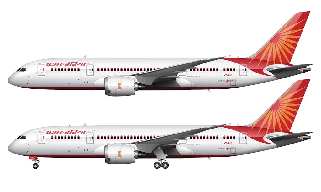
The vertical stabilizer features a “sunburst” graphic that reminds me a lot of the Allegiant Air livery. The background is entirely red, and it extends down into the fuselage by wrapping around the leading edge of the horizontal stabilizer.
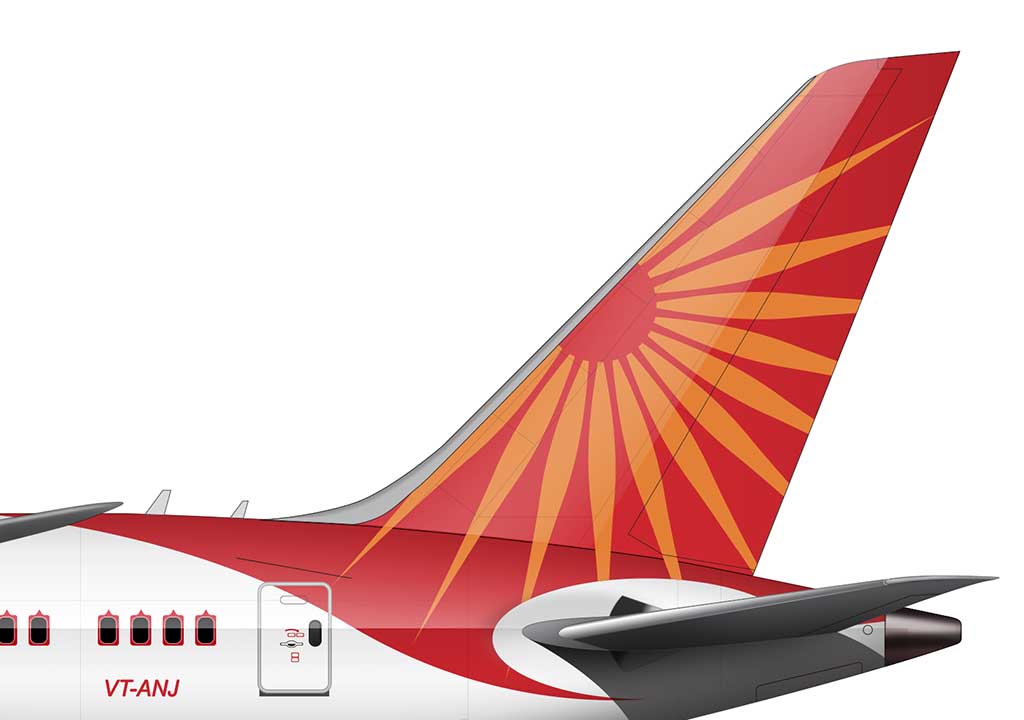
It looked a bit forced (and somewhat awkward) when I first saw it, but over time, I’ve come to appreciate it as neat design element that is truly unique. I also like how the arcs and curves are almost birdlike, giving it a visual sensation of flight.
The underside of the fuselage is painted in the same vivid red as all of the other design elements. It’s hard to see from the side profile, and I admit that I had never even noticed it before doing the illustration of the Air India 787-8 that you see here.
Interesting design details (stuff you may not have noticed)
The thing that I like the most about livery of Air India is how fantastically different it is from any other airline livery. It’s truly a beautiful extension of Hindi culture, which as we all know, it’s so very different from western culture. Here are all the little design details that I’m willing to bet that most people don’t even notice:
- The titles are in English on the starboard side of the aircraft, and Hindi on the port side.
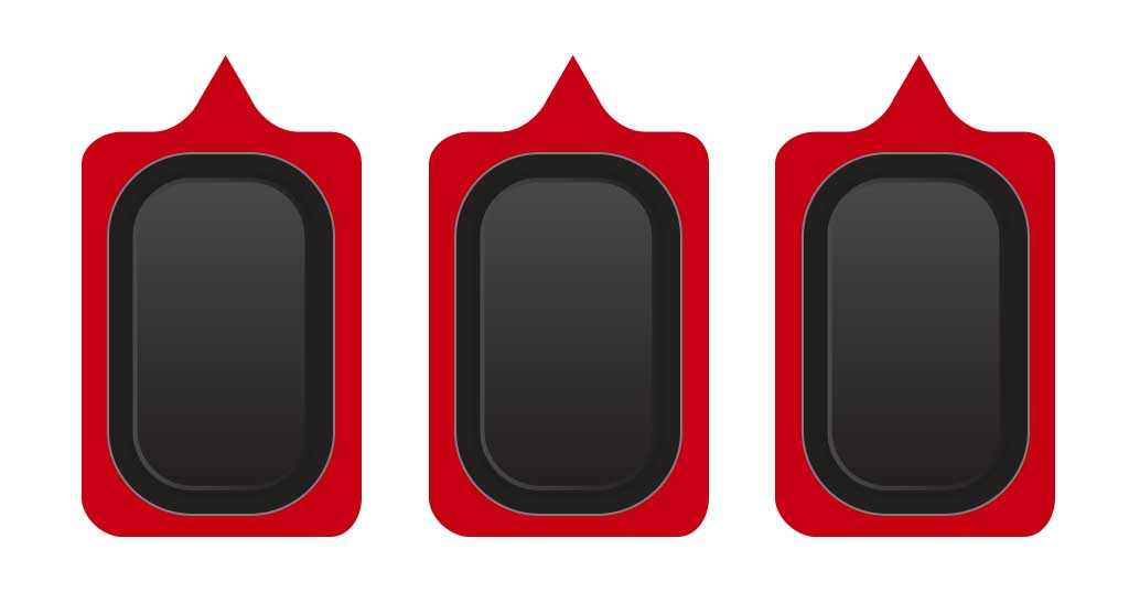
- There are ornate arch graphics around every window (which act like visual frames for each one). I can’t think of any other airline in this day and age doing that.
- The fuselage isn’t actually white! Well, it is technically, but it’s an off-white with a slightly warm tone to it. I’ve listed out the exact color specifications below.
Color palette
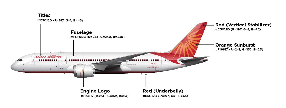
At first glance, Air India’s livery seems relatively simple. It’s not until you look at all the little details that you start to notice all the different colors that make up this highly unique paint scheme: Here are all the colors used:
- Titles: #C5012D (R=197, G=1, B=45)
- Fuselage: #F5F0EB (R=245, G=240, B=235)
- Engine Logo: #F19817 (R=241, G=152, B=23)
- Underbelly: #C5012D (R=197, G=1, B=45)
- Orange Sunburst: #F19817 (R=241, G=152, B=23)
- Vertical Stabilizer: #C5012D (R=197, G=1, B=45)
For the record, I illustrated the 787-8 you see above in a way which makes the fuselage look completely white. In bright sunlight, it does look completely white. But in real life (especially during sunrise and sunset), it’s easy to notice the warm tones.
Pros and cons of the Air India livery
Can you tell that this is a livery that I’m somewhat torn on? In some regards, I consider it to be one of the best airline color schemes in the air. On the other hand, some of the little details look rushed and unfinished. That said, allow me to list out a bunch of things that I like and don’t like about it:
Pros
- The orange red colors are rich, vivid, and they work very well together. They provide a lot of great contrast with the light-colored fuselage.
- Making the Air India titles in English on one side of the airplane, and in Hindi on the other makes this a very unique livery. I can’t think of many other airlines that have been bold enough to use different graphics from one side of the aircraft to the next.
- The yellow “sun” graphic is nice. It adds a nice splash and style to an otherwise simple livery. Yes, it does remind me of Allegiant Air a bit, but that’s OK (because I like that livery too).
Cons
- The way the red color of the vertical stabilizer “wraps” around the horizontal stabilizer still feels slightly awkward to me. In and of itself, it’s a nice treatment. My problem with it is that all airplanes are built differently with wildly different dimensions, so it will look different depending on which aircraft it’s painted on. Is that really a smart thing to do when trying to build a consistent brand identity?
- The red frames painted around each window adds a lot of unnecessary visual complexity IMHO. I like that they did it, but if I was the designer of this livery, I would have advised against it.
- Speaking of the window frame graphics, I would imagine that they add a lot of cost and time to paint each aircraft. It’s a design detail that most other airlines would skip (for very good reason).
Hi Norebbo!
Greetings from India. I was going through liveries on the internet, and it was great to find out that somebody had done an Air India livery! Great job! Let me answer some of your doubts.
The wrap- around of the red splash on the tail has been practiced in Air India on
B747-400:
https://www.planespotters.net/photo/221858/vt-eva-air-india-boeing-747-437
Airbus A320/321/319
https://www.planespotters.net/photo/068324/vt-ppa-air-india-airbus-a321-211
Boeing 777
https://www.planespotters.net/photo/216950/vt-alh-air-india-boeing-777-237lr
It would be interesting to know your views on these other applications of the livery.
Oh and the windows- that design over the windows is the very famous and very old ‘Palace in the Sky’ livery of Air India. It has been around since AI got its first 747-200 in ’74, and has become a hallmark of AI, like the color red for Coca Cola. Even though AI’s chief log has changed from The Centaur logo to the current sun- wheel, the Palace in the sky livery has stayed the same. Here are some old photographs from the internet:
https://www.planespotters.net/photo/169123/vt-efu-air-india-boeing-747-237b
https://www.planespotters.net/photo/185580/vt-ejl-air-india-airbus-a310-304
and about your last query- Why did AI get the 787-8- that has a deeper answer. And I came to know it when I used to work at Air India’s A320 maintenance division in New Delhi. Tthe simple answer is- Politics.
AI has a very diverse fleet. We have got A320,A319,A321,B747,B777,B787,CRJ-700,ATR-72. Any mechanic will tell you the glaring problem this entails- ‘x’ different types of a/c mean ‘x’ different types of spares, ‘x’ different types of mechanics.
In one word- EXPENSIVE.
Air India is a flag carrier- it is fully government owned, the employees are all pensioned govt. employees. All a/c are government property.
And so it is used as many other arms of government are used- for political/ diplomatic purposes.
The general view back at AIESL was that the purchase of the 787 was diplomatic in nature, and had not much technical reasoning behind it.
Partly because it directly competes with AI’s own B777-300ER, most of which have a lot of service life still left.
At the same time, AI is not in a very healthy financial state- it has not made a profit since the 1980s, there are frequent strikes and unionization, flight delays are common. But since it is government owned, it is regularly injected with cash.
One then wonders the rationale to spend nearly a billion dollars on a new 787-8 when you have a 777 that can already do the job- flying NY to Delhi non- stop, which is AI’s longest route.
Thanks for the really good info Pranay! I hope to create more airliner art with the Air India livery (past and present) in the near future – they’ve all been quite striking IMHO.
Air India, Etiopian, TUI, Qatar Airways,
Norwegian is some of the airlines that we
see at my airport (Arlanda, ESSA, ARN) in
Stockholm with 787-8/9.
Even i am an Indian and I saw your air india livery and you have done a great job on it i am your big fan and draw all of your liveries that you upload
Thank you Advait! The Air India livery is beautiful (especially on the 787-8), and I really enjoyed illustrating this.
Hi
How much does Air India spend on changing ( painting) the livery on its airbus 321- aircraft’s?
I’d love to know the answer to that as well. It can’t be cheap!
The red tail design, ending in the wrap-around next to the horizontal stabilizer, is called the Flying Swan with the sunrays representing the Wheel of Konark. It’s all very much part of India’s religious culture.
Hi! Nice job on this. Could you please make an air India livery history since the new one came out recently? Thank you!
Thanks Vihaan – I actually just illustrated the new Air India livery on the A350-900 for another project, so it’ll make its way into this article eventually. I need to illustrate more of the older liveries before I can do that, but I do think it would be a fun thing to write about.
Hiii!!!! Could you do a similar ‘case study’ on the livery – but for the new Air India brand? which includes their silent update (tail shadow)?
Would really love to see it!!
Thankxxxxx
Oh yeah. I have a *lot* to say about the new Air India livery lol. Maybe!