It’s always a pretty big deal when an all new United announces a new livery. And you know what? I don’t actually hate the latest version. That says a lot coming from a guy who hasn’t been happy with the United Airlines livery since the Saul Bass design. United Airlines has been dinking around with their livery designs since the 90s so I was thrilled to see them finally get it right(ish).
A brief summary of the new United livery
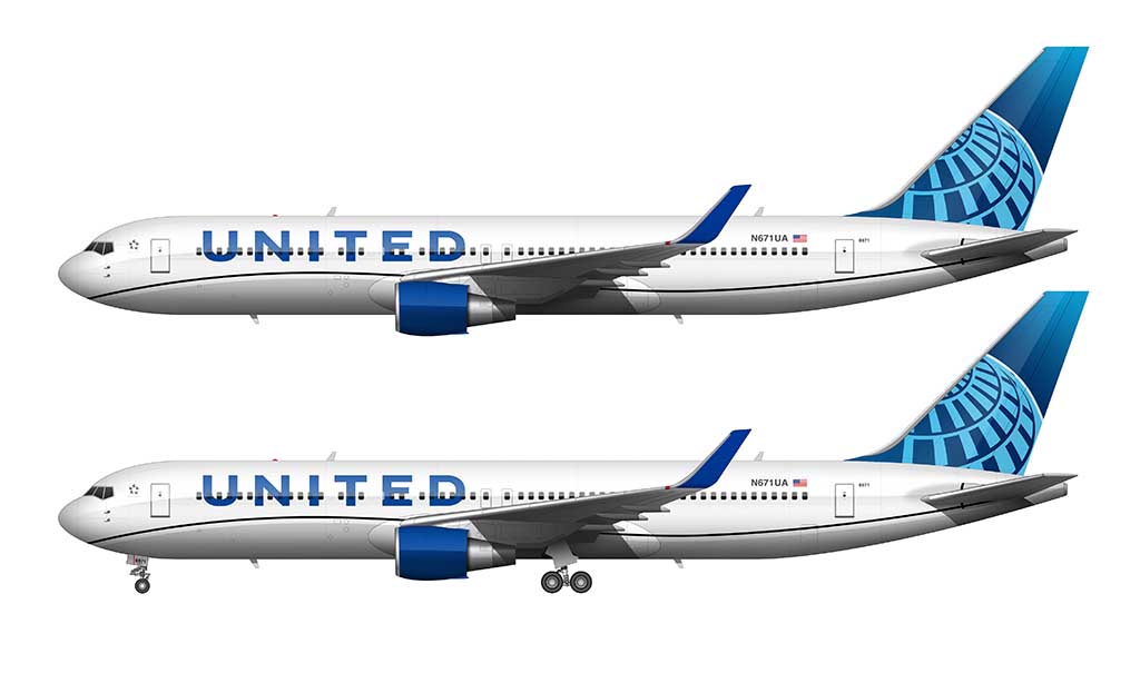
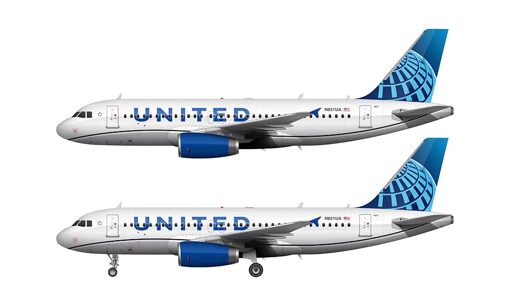
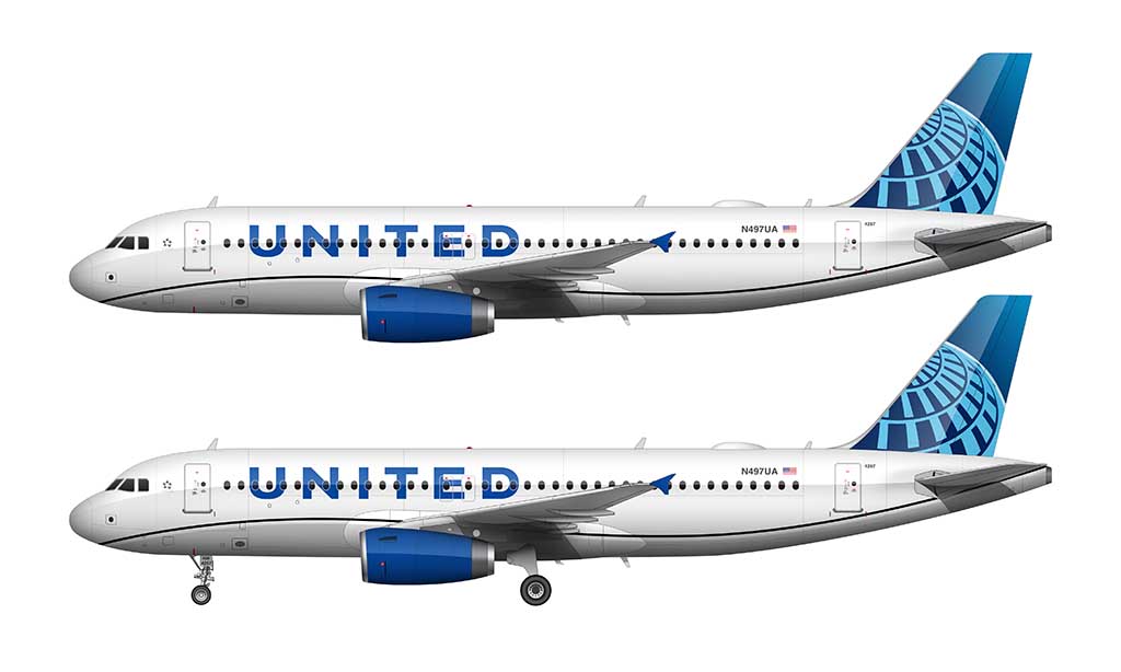
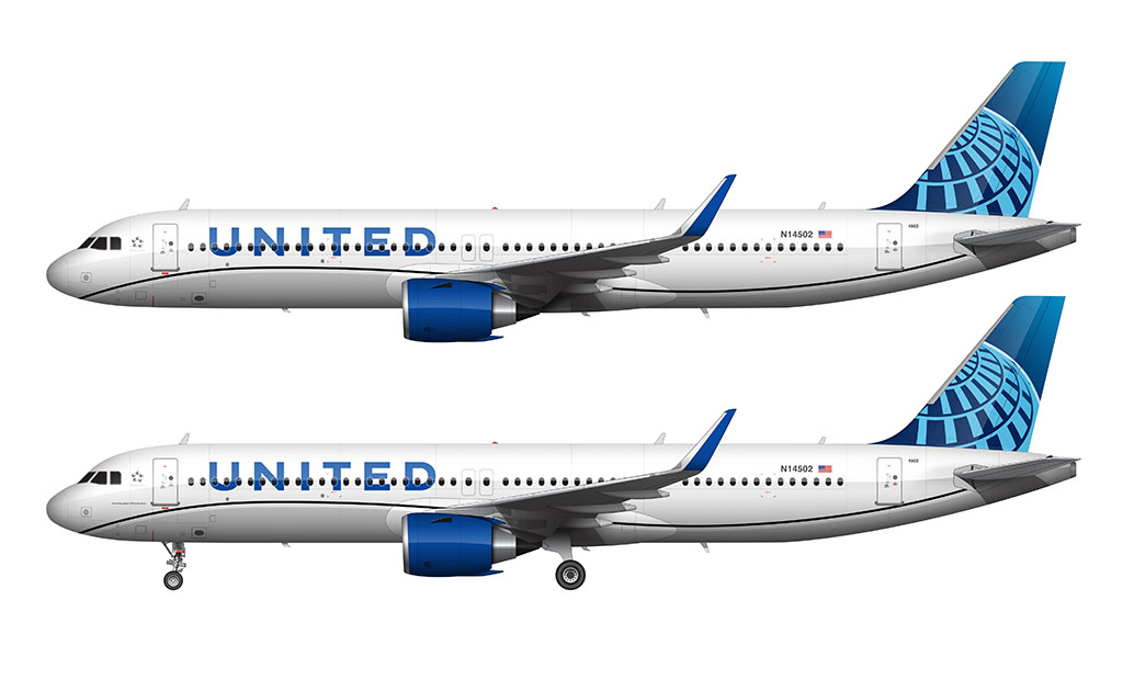
Unveiled on April 24, 2019, United’s new livery is an evolution of the previous design. Not only does it borrow elements from its previous United liveries, it also introduces a new design language unlike anything that United has identified itself with before.
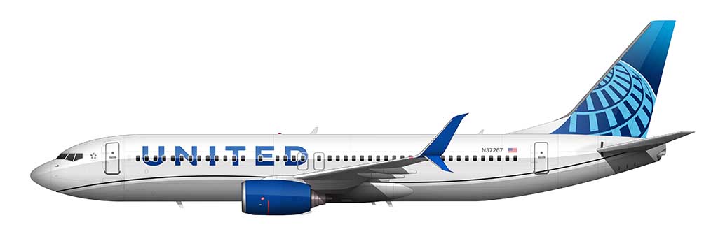
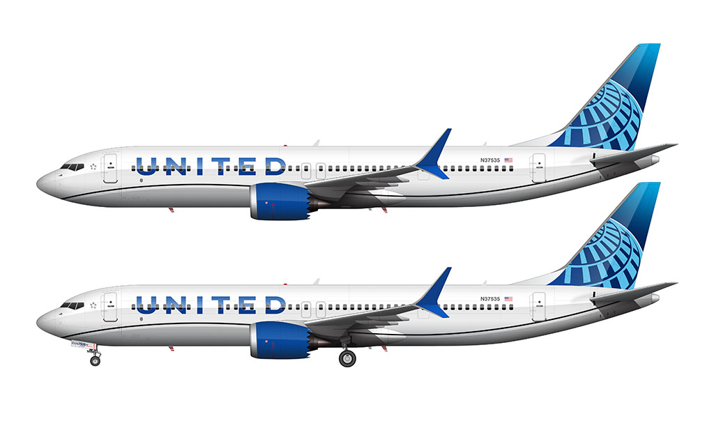
Familiar elements such as the segmented globe on the tail and the block letter UNITED titles remain. However, both have been strengthened with thicker line weights and a more vivid color palette to help promote the idea of strength and solidarity.
Prior to the launch of this new livery, rumors were circulating within the aviation community that United would be ditching the globe icon and reintroduce their iconic “tulip” logo. That didn’t happen obviously, which begs the question:
Is the globe icon now the official symbol of United?
Back when United Airlines adopted the Continental livery (after merging with them in 2010), it only seemed natural to hold on to the legacy of Continental Airlines in any way possible. Adopting the full Continental livery while keeping the United name emphasized the importance of keeping the legacies of both airlines alive. That’s just my opinion anyway.
I always thought that United would eventually revert back to the “tulip” logo. Especially since United has fully absorbed Continental’s assets into its daily operations without any regard to paying respect to the brand they destroyed. Sure, that’s a harsh way of saying it, but it’s also the best way I can summarize how it all went down.
With the unveiling of this new livery, it appears as if United does have a heart after all. They could’ve easily gone back to the tulip as the icon to represent the brand, but instead, they chose to stay with an updated version of the Continental globe. Considering that this is likely to be the livery for the next 20 years or so, I think it’s safe to say that the tulip is dead. For now.
If you want to read more about this, be sure to read my visual history of the United Airlines livery.
A closer look at the iconic globe graphic
One of the most interesting and most overlooked elements of the new United livery is the iconic globe graphic painted on the vertical stabilizer of every aircraft.
In the previous livery, that globe graphic was taken directly from the Continental livery when the two airlines merged in 2010. Most people were split on that decision:
- Continental employees were thrilled to death that United chose to use the Continental Airlines livery elements. That globe graphic was the symbol of Continental Airlines. Painting it on a fleet of hundreds of aircraft made a lot of people very happy.
- Diehard United fans (and employees) were disappointed in United’s decision to drop the iconic tulip logo in favor of the globe. For the record, I’m fairly neutral when it comes to the United and Continental merger, but I too was a bit surprised that they axed the tulip logo so easily.
Despite your own personal stance on the issue, it is what it is. I quite like how United evolved the design of the Continental globe into the new livery.
The overall design has stayed pretty much the same. There are two very important differences compared with the previous design:
- It’s all one color (white) instead of two (white and gold). Making the entire logo white gave it a much thicker and bolder look.
- The vertical lines in the globe (Y axis) are now broken instead of solid. This is a much better look in my opinion. However, it was an absolute nightmare to illustrate in my renderings.
Speaking of the vertical stabilizer in United’s new livery, The blue background color is different as well. More specifically, it’s now a top-to-bottom 3-color gradient instead of a solid color.
- Top color: #02A6E1 (R=2, G=166, B=225)
- Middle color: #02255A (R=2, G=37, B=90)
- Bottom color: #315EA1 (R=49, G=94, B=161)
It should be noted that the majority of the tail is painted in the middle HHH color (in other words, it’s not an even gradient). Only the very top and lower section of the vertical stabilizer is painted in the other colors.
How does the new livery compare to the previous one?
When viewed side by side with the previous color scheme, the new one looks absolutely brilliant IMHO. I’d even go as far as to say it’s one of the best new livery designs we’ve seen from any airline in the past 10 years.
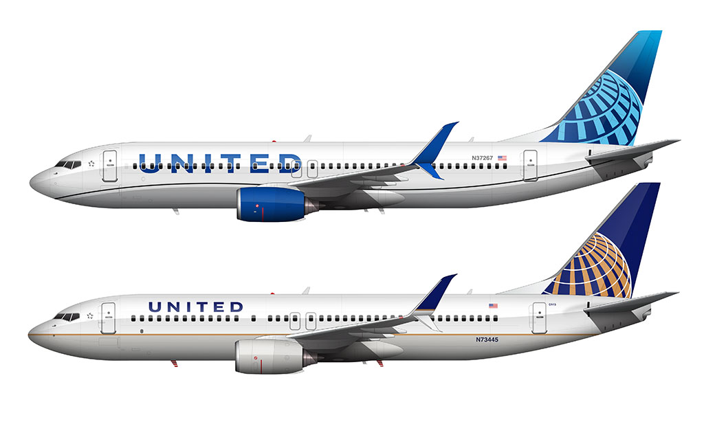
- The United title font is bolder and slightly more stylized. However, it’s still features the same classic san-serif block letter design from previous generations.
- The fuselage of the aircraft is still split into two halves (top and bottom) – just like the last three UA livery designs. However, this new design features a wavy line running the length of the aircraft separating the two halves. It’s very similar to the line in the special livery they painted on their 787‘s.
- The globe graphic on the tail of the aircraft remains. However, it’s a much simpler design with bolder lines and one color instead of two.
Video of the livery painting process (how I did it)
The new United livery was one of the most difficult I’ve ever done (but not as tough as the Alaska Airlines new livery). I think I may have even cursed more than I did when I illustrated the American Airlines livery a few years ago. Anyway, the entire process of creating the illustrations for this article took about 2 1/2 hours to do.
Of course, I started with my Boeing 737-800 template, which saved a ton of time. However, the process of creating all of the individual elements (globe icon, titles, etc.) took quite a bit of time. Applying those elements to the template itself took about another hour or so. This livery is a lot more complex than it looks!
The full color palette
In my opinion, the color palette is one of the very best things about the new United livery. It’s bright, clean, and I personally feel as is if it’s going to stand the test of time. Well, for 10 years at least.
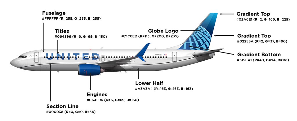
I didn’t even realize how stodgy and stale the colors of the old livery were until I saw the new and the old together for the first time. I guess it makes sense since that livery was originally created by Continental Airlines in the early 90’s. It was definitely time for an update! Here is the full color palette:
- Fuselage: #FFFFFF (R=255, G=255, B=255)
- Fuselage lower section: #A3A3A4 (R=163, G=163, B=163)
- Wavy swoop line: #000038 (R=0, G=0, B=56)
- Titles: #064596 (R=6, G=69, B=150)
- Engines: #064596 (R=6, G=69, B=150)
- Vertical stabilizer gradient top: #02A6E1 (R=2, G=166, B=225)
- Vertical stabilizer gradient middle: #02255A (R=2, G=37, B=90)
- Vertical stabilizer gradient bottom: #315EA1 (R=49, G=94, B=161)
- Globe graphic: #FFFFFF (R=255, G=255, B=255)
Pros and cons of this new livery design
There’s a lot to like and dislike about United’s new brand image. As a designer myself, it’s extremely hard for me not to criticize the way something looks. I know, it’s a horrible way to go through life, but I just can’t help it. Therefore, here we go with all of the things that I like and don’t like about the way United Airlines is painting their aircraft now.
Pros
- I love the colors. While I’m not a huge fan of the majority of the aircraft being white, the vivid blue accent colors balance it all out quite nicely in my opinion. The gray and navy blue accents on the lower section of the fuselage are a nice touch as well. This is basically how I wished the Breeze Airways livery (which is too blue) was balanced out.
- I always found it odd that United painted their 787‘s with a wavy line instead of the straight line like they did on all of their other aircraft. Now, with this new livery, United has a consistent look across all aircraft types.
Cons
- As much as I like the swoopy section line splitting the upper and lower half of the aircraft, it doesn’t jive all that well with the tail graphics. Personally, I would’ve loved to see the blue colors in the vertical stabilizer (and maybe even the globe) come down to meet that swoopy line in the tailcone somehow.
Interesting article! I’ve always loved the “Batteship” livery and the tulip logo of United, when the new livery came out I was a bit dissapointed, but it doesn’t seem horrible to me, I’m just happy to see a change. Thanks for the Illustration and sharing your opinions!
I agree with most of what you say. I do think this blue livery is a vast improvement over the prior one. It is much more colorful, vivid and alive. The gold never offered enough contrast to a white and gray fuselage. I also agree that the swosh is too thin and too black. I would love to see it in the bright blue or purple or possibly a duel color. It looks like the designers lost their creativity when they did the swosh line. Why they would chose black is hard to fathom. One other thought, since United is going full steam with environmental concerns, ,I wonder how it would look if they added a few touches of that kelly green here and there like on their eco-friendly livery.
I’d love to see a “green” version of this livery. Good idea actually!
I love reading your articles Norebbo!
Would it be possible to make an article about SAS new livery or perhaps Atlantic Airways?
Both got a lot of praise in the scandinavian medias; SAS for the new details on the engine nacelles and Atlantic Airways for portraying a Whale silhouette on the belly.
I would love reading your thoughts on them.
Best regards
Thanks Morten! I’ve been wanting to do some illustrations of the new SAS livery, but I haven’t had much free time lately. I’ll get around to it eventually!
If United was going to keep Continental’s globe, which they shouldn’t have, then this new and improved refreshed version is still a missed opportunity. Taking a cue from American, the tail logo should have been dropped down the side of the fuselage, or better yet wrapped under and around ala Alaska (which currently has the best livery of any U.S. airline). Furthermore, the wavy cheatline doesn’t jive with anything and should have been cut. The billboard lettering works, but needs to be slanted evoking the flow of air. However, United’s updated livery still marks an improvement, primarily because of the vivid hues which carry into the cabin and airport branding. Hopefully the tulip will one day reappear to claim its rightful iconic place in aviation history.
I completely agree with you Chris! It seems all they did with this new livery was to update the old Continental livery. There’s not much that’s “new” about this one other than some color and general styling updates. And don’t even get me started on how the wavy line doesn’t integrate with anything else. That really bugs me!
I am just reading my comment on 12/27, and your response. I keep thinking I would love to see how a green globe would look against the blue background. Probably pretty neat, although the blue is such a beautiful color, I would probably opt to stick with what they have. But it would be nice to compare. That kelly green they use on the eco livery is quite powerful, but a few splotches here and there might be a great way to offset the blue. Just a thought.
That is a pretty good idea actually – it would probably have to be a light green in order to have enough contrast to stand off the blue, but I can imagine it working really well.
I think if they made the light blue horizontal lines on the globe white, it would give it more contrast, especially in low light conditions. The old globe popped, especially against the darker navy blue tail. Overall it’s an improvement from the 2010 design, but make those horizontal lines white!!!
The worst thing about this livery is the billboard UNITED name on the sides … it looks cheap and unprofessional. In fact the whole color scheme matches the scheme used for generic foods in the 1980s, which had the same cheap looking large block letters. (Google generic beer and you’ll see what I mean.). So while it pops, the image conveyed is bad.
I hate to admit it, but you’re absolutely right. I never made the association with those generic labels before but I can totally see it now.
I really have to agree with this being a change for the better compared to the prior copy paste, slap a new name, call it a day CO/UA livery. That said, this has several massive eye jarring design flaws – one of which multiple people go running to – the cheatline to nowhere. I also agree that it seems a strange design choice to have it a different unrelated color.
One area though that bugs me the most is the tail “fade” of color. Why is it dark foreground to light in the distance?!?!
Most Star Alliance advertising and even branded check in counters feature a black backdrop with earth super imposed (like the UA logo) but with a sun just appearing to rise on the horizon… This would have been a perfect opportunity to incorporate that motif in the new livery.
https://mikespassport.com/wp-content/uploads/star_alliance_gold_checkin_thai_munich_airport_2012_may.jpg
Hi Scott
Big UA fan here.
Saul Bass livery will always be one of the best ever.
Battleship livery, while it’s very heavy literally and figuratively it was gorgeous.
My 1st 777 flights in 1996 were on this sexy plane.
The post merger livery was not terrible IMO. It was a big job to rebrand a new airline post merger and they did it well enough to keep everyone ?? happy. It was a little staid, but looked crisp and professional.
The latest paint job is OK, alot of blue, maybe too much.
As for the debut 787 curved line, well, ugh.
How many airlines threw a similar curve on to their dreamliners?
Sadly the Tulip is long gone, to bring it back later would simply be strange.
I just wish united would come out with some great heritage liveries, honoring both CO and CA. And I mean authentic renderings, not the half done attempts by AA
This livery and the new Korean livery are two of my new favorites. They’re both unmistakable; the big and bold titles leave no doubt who the aircraft belongs to.
I’m a total retro commercial aircraft/livery enthusiast, but these two (UAL, KAL) definitely got my attention.
Well done, Scott!
As a fellow Airplane dork and as a designer, what do you take on the 737 tail fin and how united left a small portion of the forward part as just white rather than continue the design?
I’ve always wondered why they did this. Seems like other airlines have colored it in to match the tail
That doesn’t bother me nearly as much as the fact that they didn’t extend the globe down into the fuselage to meet the top of the stripe. There’s no design consistency between what’s painted on the vertical stabilizer and what’s on the fuselage IMHO.