The United Airlines livery has always been iconic and trend-setting, and to this day I still cannot decide which one I like the best. Part of me is drawn to the Saul Bass livery of the 1970’s. Another part still has a thing for the Battleship Gray design from the 1990’s. At the rate that I’m going, I may never be able to declare one the winner over another.
My goal for this post is to document all the liveries of United Airlines as fast as I can illustrate them. One thing that you’ll notice right off the bat is that there is definitely a “United” style which shines through in each of the liveries. Let’s have a look:
The blue and white wedge livery: 1957-1963
The livery that launched United Airlines into the jet age was the iconic blue and white design (which was unveiled in 1957). It was a relatively simple livery, featuring an all-white top and a blue cheatline that ran the length of the fuselage and through the windows.
The vertical stabilizer featured a slim blue and red “wedge” graphic, which was divided by large “United” titles in a thick serif font. Note that there were several versions of this livery over the years, featuring different thicknesses of the red stripe as well as a completely different typeface for the United’s titles.
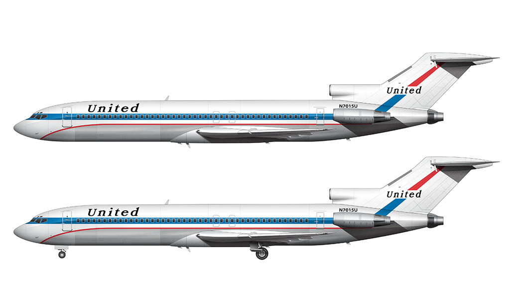
Friend Ship livery with four stars: 1972-1974
This was an evolution of the wedge livery. It featured a thicker red stripe, four blue stars on both the vertical stabilizer and fuselage (near the titles), and a modified “United” typeface. This was the last United livery before the iconic Saul Bass design was unveiled in 1974.
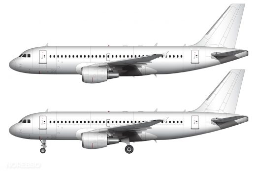
The United Airlines Saul Bass livery: 1974-1993
Immediately after completing my McDonnell Douglas DC-10-30 template, I chose the United Airlines Saul Bass livery as one of my first painted versions of it. This color scheme, combined with this aircraft, is pretty much exactly what I think of when I think of “United Airlines” to this day.
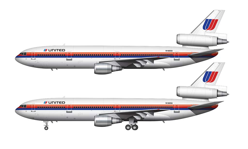
Personally, I think this is a great livery. The cheat line is so 1970’s and 80′s, and the colors are borderline tacky by today’s standards. But that’s what makes it so great! It’s iconic, highly representative of it’s time, and it helped build a strong identity for one of the largest airlines in the world. It’s a significant part of Untied Airlines history.
On a side note, there were two versions of this livery. As you can see below, the first version featured smaller “UNITED” titles with the cheat line higher on the fuselage. Later, the cheat line was lowered to allow for larger titles:
United Airlines Battleship Gray livery: 1993-2004
The gray color scheme (better known as the “Battleship Gray” livery) was a complete and total departure from the Saul Baus design that preceded it. Most notably, it took on a dark and almost sinister look compared to that bright and colorful scheme that was synonymous with the brand for decades. This was bold new direction for United.
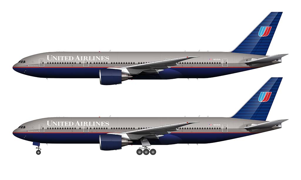
Unfortunately, we all saw what happened to this dark livery after years of of being exposed to blazing sunshine. Some of the aircraft wearing these colors had faded horribly and looked downright bad, with dull and peeling paint that even made me think twice about boarding one of those tired birds.
Pentagram swooped in for the rescue in 1998, with their new blue and white update featuring brighter colors and a (shocking) departure from the traditional blue/orange/red color treatments that had become synonymous with the United brand.
The United Airlines Blue Tulip livery: 2004-2010
Designed by Pentagram and introduced in 2004, this blue and white United Airlines livery was a refreshing departure from the dull and drab “Battleship Gray” livery that preceded it. It was unveiled at a time when United was still making money and had not yet entered bankruptcy, so I disliked the fact that it didn’t seem to have the rich sophistication of those dark and rich colors they were replacing.
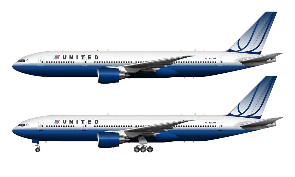
I guess I sort of saw United as the global airline at that time, and going to an Euro-white color scheme with bright (almost obnoxious) blue accent colors didn’t seem to fit my high mental perception of the airline.
The United / Continental livery: 2010-2019
This is the livery that resulted in the merger of United and Continental in May of 2010. In my opinion, both United and Continental missed a great opportunity to pay tribute to the United brand and evolve the tulip design forward into the future. Instead, we got the entirety of the old Continental Airlines livery with United titles plastered on the front.

While I’m sure they saved a ton of money by re-using this livery, the new company was essentially reborn at that time and it would have been the perfect opportunity to press the “reset” button on their brand image and come up with something new and unrelated to those old and tired corporations.
Both of which, by the way, desperately needed to shed years of bad publicity (bankruptcy, poor service, etc) and emerge as a fresh new brand. Why they chose to save a few dollars and stick with the old look is beyond me.
I actually don’t mind this livery all that much. The straight horizontal cheat line through the center of the fuselage is somewhat dated, but the light colors compliment the vivid blue and gold in the logo nicely.
The “wavy” version of the Continental livery:
There was a modified (“wavy”) version of the Continental livery that was only used on the Boeing 787 and 737 MAX. In my opinion, this livery seemed like such an afterthought. They created it to help celebrate the significance of the aircraft it was painted on, but it was disappointing to me that they didn’t modify the tail graphics to integrate with the “wave” elements.
Despite not being a very big fan of it at first, I grew to like it. The gold stripe flows from the front of the aircraft very nicely from front to back, with really nice tension and weight. And if you look really closely, you’ll notice that the thickness of that gold stripe goes from thin to thick as it moves along the length of the fuselage.
They did a really good job there. But (there’s always a “but”) why on earth didn’t they flow that gold ribbon into the tail? It wouldn’t have worked well with the globe logo, but this livery was such a drastic change from the existing one anyway so I don’t know why they didn’t do anything with the tail. We may never know…
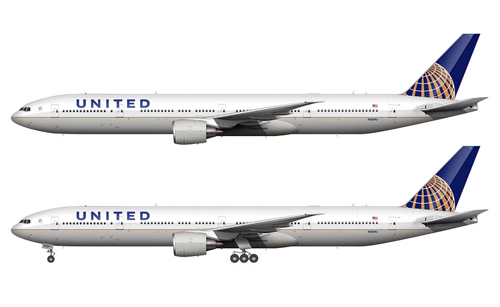
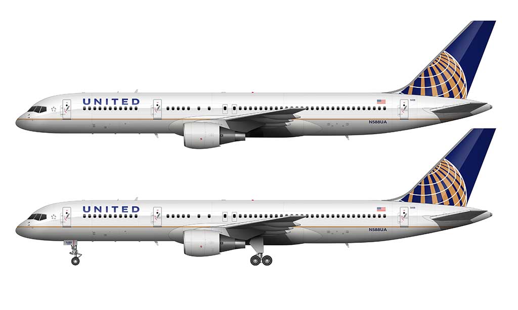
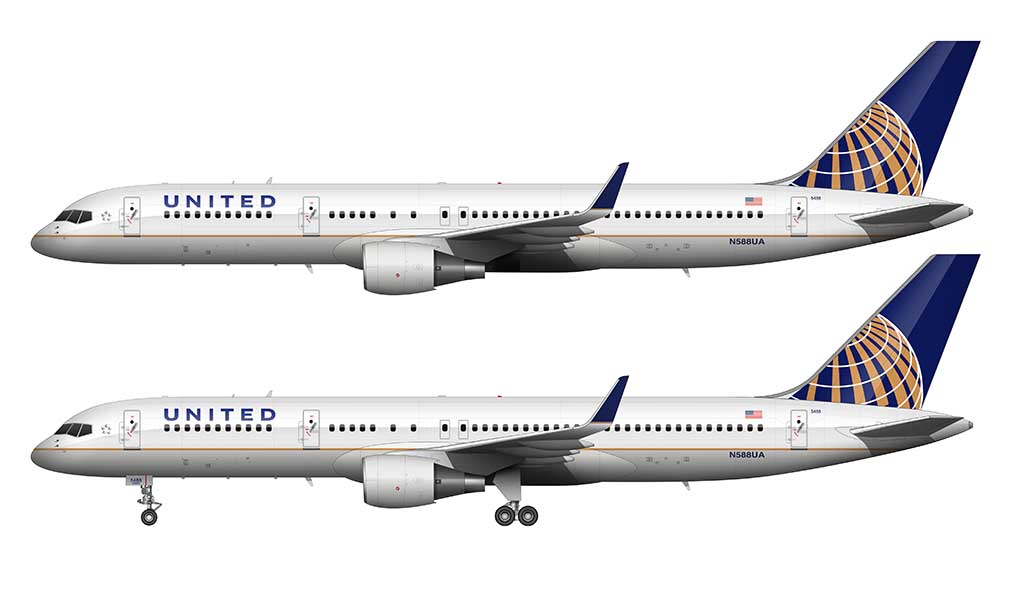
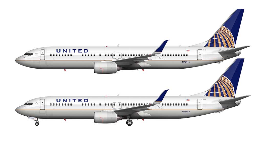
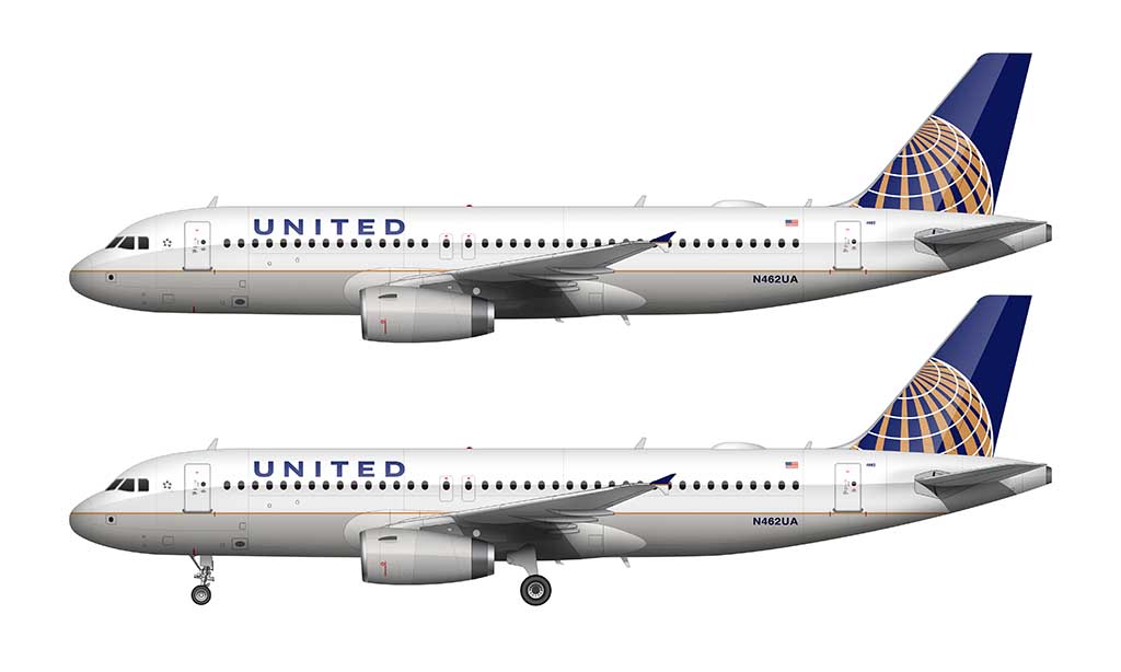
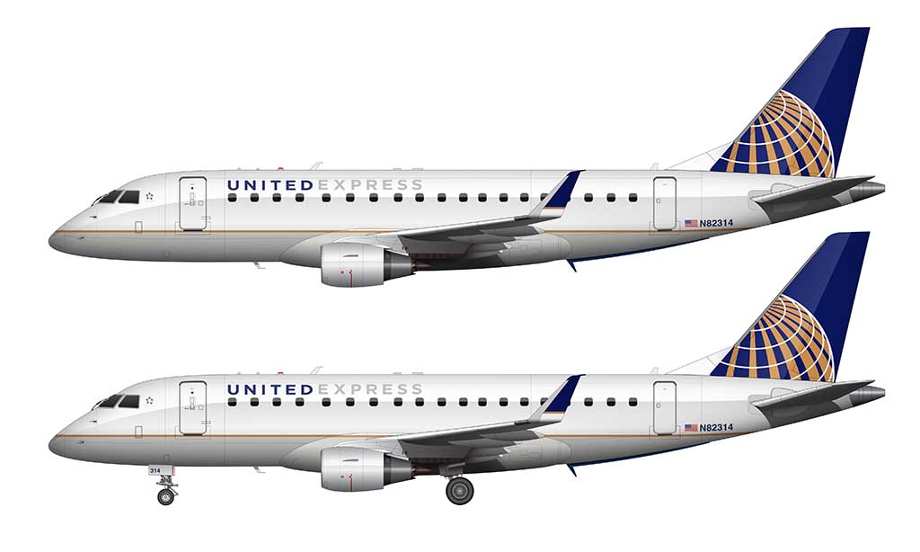
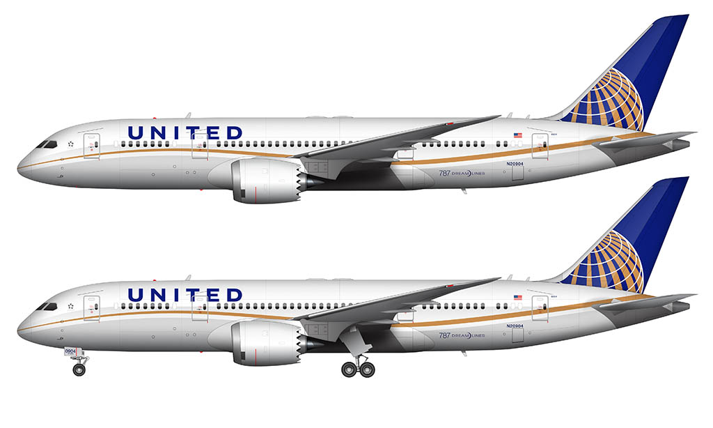
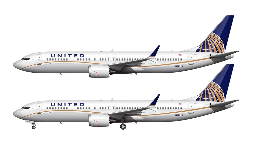
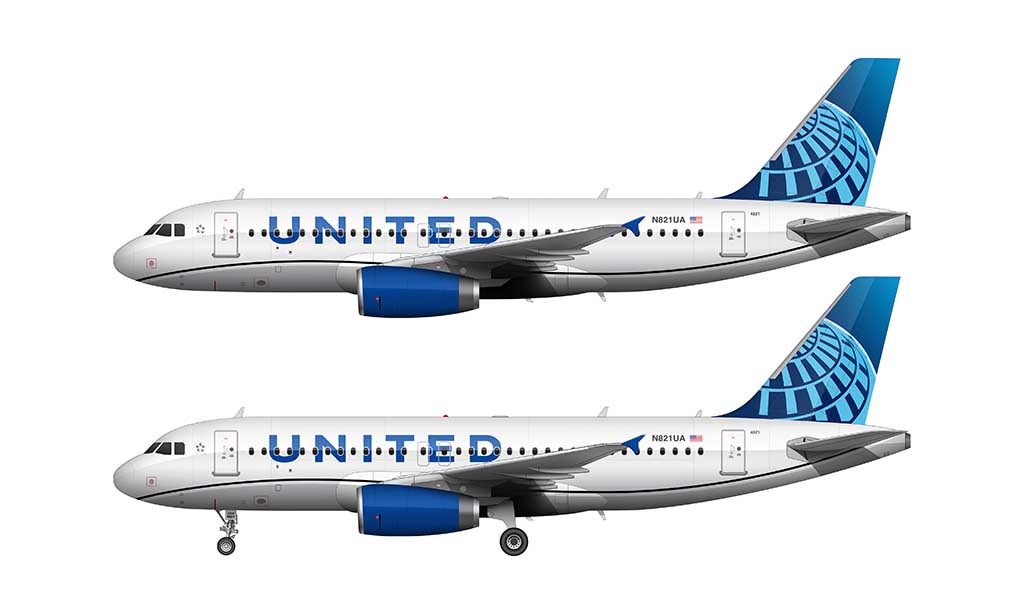
The new United livery: 2019-present
The all new United livery was such a big announcement that I gave it it’s own dedicated post. Head on over there to read all about how (and why) it came to be…
United Airlines Special liveries
United Airlines has never been known to paint their aircraft in special liveries, but it happens from time to time. Here is a partial list of some of the more significant special paint schemes:
Star Alliance livery
I’ve never been a big fan of the white and black Star Alliance livery, mostly because I think they are too plain and unimaginative. My perception has changed slightly after applying it to my 777-200 blank illustration template – primarily because it was necessary to really study this design (more than I ever have in the past) and I started to see details that I never saw before.
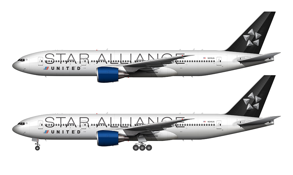
First, I think the Star Alliance font is simply beautiful. It’s the perfect weight and thickness for a billboard-style use such as this, and it’s san serif style oozes class and professionalism. Second, the Star Alliance logo is well-crafted.
Yes, I’ve seen it a million times before, but it wasn’t until I recreated it myself for this illustration that I realized how elegant it really is. The subtle gradient and silver tones really pop against the black tail color.
This particular United / Star Alliance livery was based on the 1998 United color scheme designed by Pentagram (in the section above), so that’s the reason for the blue engines (which would otherwise look out of place if it weren’t for that relationship).
On a side note, I think it would be interesting if the Star Alliance liveries had a lot more silver and black in them. The white fuselage is clean and simple, yet oh-so-boring. These are special liveries after all, so I think they should have went all-out and done something really different. Perhaps a silver fuselage with a black tail? I know, that’s probably too similar to the SkyTeam special liveries – but it is really sharp.
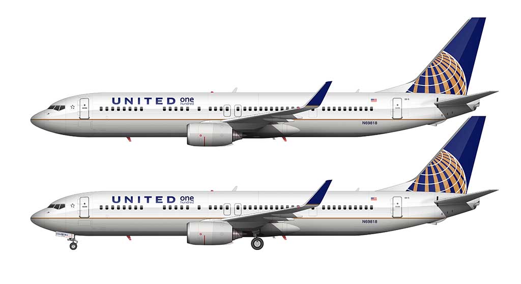
The “One Hundred” livery
This particular illustration depicts a very special aircraft in the UA fleet. It’s the “One Hundred” airframe, meaning that it was dedicated to 100 exceptional employees (as voted by their peers) who went above and beyond. The markings for this are subtle, with a small decal next to the main titles on the fuselage, as well as a plaque mounted inside that is visible upon boarding.
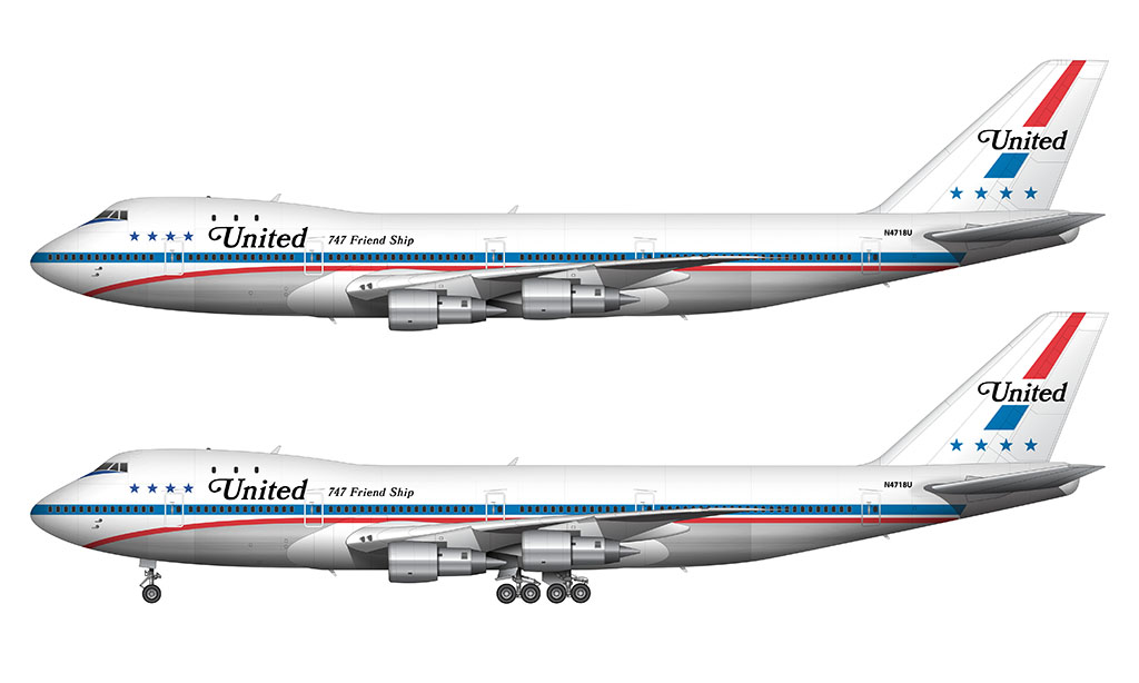
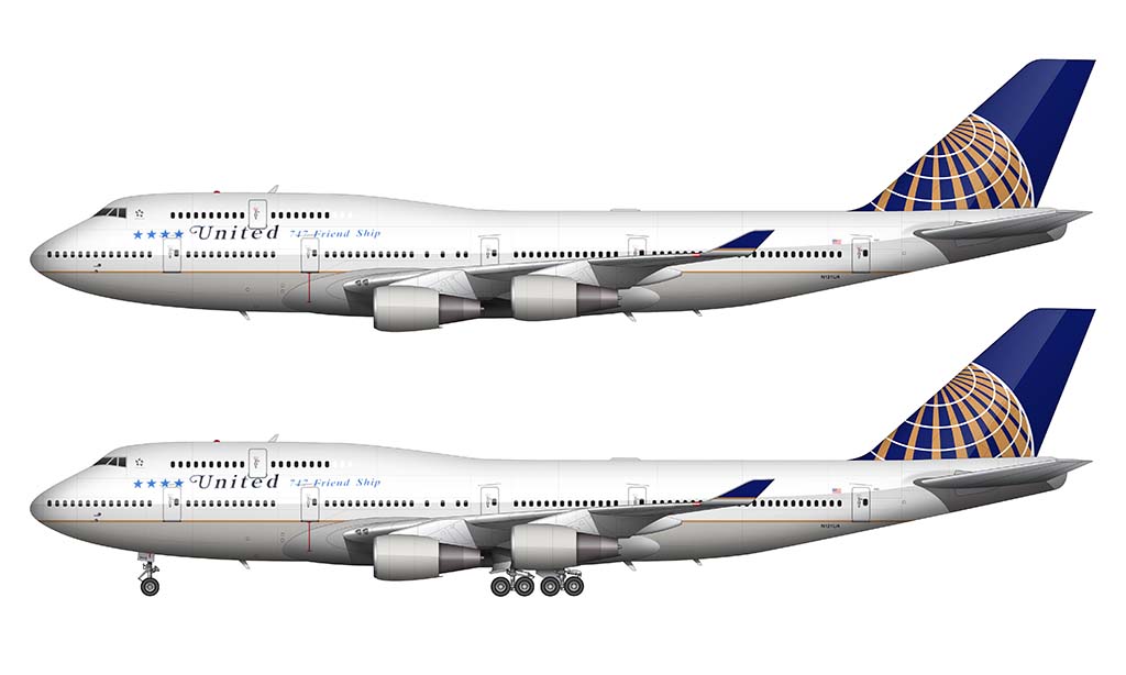
The 747-400 “Friend Ship” retirement livery
Prior to the retirement of the 747 in late 2017, United payed tribute to the queen of the skies by applying nostalgic “Friend Ship” titles to two of the remaining 747-400’s. This livery was short-lived, as it was only applied just several months before the retirement. It’s a shame they didn’t do it sooner!
I wanted to fly the 747-400 before it went away and managed to fly LAX-SYD-LAX on the beautiful bird. One way coach, then on the way back first class – it was sweet!
Beautiful artwork!
Thanks Mike! Yeah, the 747 is becoming a rare species these days so fly them while you can! First class on a long leg like SYD-LAX must have been nice. I did that in coach once and there’s no way I’d do it again. Business class or better from here on out! Haha…
Awesome article, United has been one of my favorite airlines of all time and also the one that I flew on the most. I remember flying on the battleship gray livery 10-20 years ago on the 777(and some other planes) for multiple times, always thought how the livery and the plane seems to go together perfectly. I also managed to fly on United’s 747-400 for the first and last time about 4 years ago, from ZSPD-KORD, I didn’t even know it’s getting retired back then, but still memorable nonetheless(first time flying the 747 afterall). I’ve flown on every major type of United’s liveries except for, well, the Saul Bass livery. This article brought back some really nice memories, Thanks Scott!
Thanks Alan! Your memories sound similar to mine, though I am old enough to have flown on a few UA aircraft in the old Saul Bass livery: 727-200, 737-300, and 757 (-200, of course). I feel nostalgic when I put these kinds of posts together as well, and because I enjoy it so much, I’ll keep adding to them as I create more illustrations of the different liveries.
I still think United ‘s Saul Bass livery the one of my Favorites , the Tulip shaped U gave a modern and powerful with a touch of a flower look later painted in the entire tail after the (cold grey) unhappy battleship,with blue shades ,i still between these two United’s as my favorites
I totally agree Gilberto! The Saul Bass livery is probably my all-time favorite (of any airline) at this very moment. A true classic indeed.
I hate that ugly continental livery. Airline not the same as the good old days.
It won’t be much longer until that livery is gone for good. Maybe just another year or so…
Thanks for the reply! I also noticed a small mistake regarding the Battlship Gray and Blue Tulip liveries, that being the engine pylons are actually painted in the same color as the engine cowlings, this is quite minor although seemingly common mistake among model airplanes and flight simulator liveries as well, not very important but I think I should just point it out, your drawings are still very good looking regardless, thanks for that!
Thanks for pointing that out Alan! I had no idea. I’m eventually going to have to update that illustration…
Beautiful website and article on United, but I have to take exception to one of your dates. The “blue tulip” livery was introduced in 2004, not 1998. The first aircraft in that livery was B777 N775UA and departed the paint shop in Victorville, CA on 02/16/2004.
Thank you! Yes, that was a goof on my part (and I just updated the post). I forgot how short-lived the blue tulip livery was!
Excellent post! Just wanted to note that it does still seem to say 1998 instead of 2004.
Thanks! The dates have been updated…
I believe they were referring to the last bit of text in the Battleship Gray section:
“Pentagram swooped in for the rescue in 1998, with their new blue and white update featuring brighter colors and a (shocking) departure from the traditional blue/orange/red color treatments that had become synonymous with the United brand.”
1993 Battleship Grey was like the whole airline had to start dressing “Business Professional.”
Haha, yup! It was definitely a lot more stuffy and corporate compared to the Saul Bass livery.
funny that the DC-10-30 Illistration’s reg was of a United DC-10-10
Haha, I never even noticed that. Good catch!
United filed for bankruptcy in December 2002. I wouldn’t say the airline was profitable in 2004 when the Blue Tulip livery was introduced. The company didn’t exit bankruptcy until 2006.
Thanks clarence! Yeah, my dates were wrong, so I went back and made update.
The original Raymond Lowey design had a gold lower stripe, not red.
Thanks Jess! I’ll have to look into that – every photo that I’ve seen of that livery makes it look as if the stripe is red.
I grew up with the Saul Bass livery, and flew more on United in the battleship gray years (was in college not too far away from ORD in the 1990s) than probably any other airline/livery.
I barely remember the blue tulip look – and I can absolutely understand why it was a jolt at the time; but looking back… damn, that’s just beautiful. Especially on the larger aircraft where there’s sufficient white space to let the design elements breathe. I love how they incorporate the blue & red “U” with the United title, and blend it seamlessly with the updated color palette. Just lovely.
Same here! The Saul Bass livery was my childhood UA livery. I remember being completely flabbergasted when the battleship gray livery was unveiled in the mid 1990s. 🙂 I hated it at first, but it grew on me quick.
I was never a fan of the blue tulip livery though. I think that’s my least favorite.
Thanks for the nice pictures and clear opinions. You confirm the majority of my biases :). Saul Bass United, the old bare metal American, Air Cal 3 colors over white, any Southwest and any KLM with a blue top are big favorites. Japan Airlines all white with black crane on the tail are also very nice. And BA’s Tartain tailsl!
Calder’s 727s don’t quite connect for me, My child was an avid Lego builder, and as they got older, their confidence grew and they abandoned symmetric designs. I’m still gobsmacked by it. I wonder if there will ever be non-symmetric airline markings. Its been tried on racing cars, plenty of other objects, with mixed results, IMHO. I loved the original Mobil 1 markings on the 1996 Porsche GT1, but the mango / papaya orange McLarens of the 1960s are the finest example of trade dress I can think of. As good as sunburst on GIbson and Fender electric guitars/basses.
Cheers!
Bill
Saul Bass é a melhor!!
I can’t help but notice you left out the “TED” paint scheme on the Airbus fleet.
It’s coming! I actually started a TED illustration a while back, but never got around to finishing it. Gotta get that done…
Fun Fact: United would’ve gone out of business if Continental never merged with them.
Possibly. Continental wasn’t all that healthy either IIRC, so the merger was probably equally beneficial to both.
I’ve always wanted to go on the 747 400 and 300, But no luck. What I think is very koo koo is that I’ve been the 747-8 on Korean air in 2017 or 2018
Chefs kiss!
You should do a make livery where you have the Blue Tulip Livery combined with the latest United livery’s text and fuselage wave. The fuselage colors from the Blue Tulip would be integrated into the wave, and the tulip logo would just be there. I honestly think that should’ve been the direction United took for their new livery, and it would look really good.
Scott, I’m so happy I stumbled into your awesome site!
My day worked for United from 1953-1987 (LAX, DTW, HNL, SFO) and I then did from 1986-1995 (OAK, SFO).
I’ve flown on a lot of planes over the years and have always enjoyed the branding of airlines. So many take me back to “the good old days”.
Small **typo** alert:
United Airlines Battleship Gray livery: 1993-2004
The gray color scheme (better known as the “Battleship Gray” livery) was a complete and total departure from the Saul **Baus** design that preceded it.
Glad you’re enjoying the content Tom! And I’m totally jealous that you and your father got to work with United during their best years. Those were the days!
Isn’t it Saul Bass though? Here’s his Wikipedia page:
https://en.wikipedia.org/wiki/Saul_Bass