As a visual designer, one of the things I liked best about the Northwest livery (all versions) was the signature red tail. It was certainly the brightest color choice among the US majors, which made it easy to spot and identify Northwest aircraft at any busy airport.
I also liked their final logo (which you can see at the bottom of this post) – which consisted of a simple ring with an arrow pointing to the Northwest. Simple. Clean. Good.
Anyway, I grew up about an hour away from a Northwest Airlines hub (DTW) so they will forever be my “hometown” airline (even though they don’t exist anymore). Maybe that’s why it hurts me to admit out lout that they were never known for being one of the world’s best airlines? They did have a rather respectable route network by the time they were absorbed into Delta Airlines in 2010 though.
As a matter of fact, they were the world’s sixth largest airline prior to that merger – and the top US carrier in for international passenger traffic and domestic cargo operations. I’ve personally logged tens of thousands of miles with them to points all over the world, and it was a total bummer to see them (and their livery) disappear from the skies for good.
The pre-merger Northwest Orient livery
Airline livery design is a fascinating subject for me, and the pre-merger “Orient” livery was the one in use when I first started becoming interested in airplanes as a young boy in the 1980’s. The Northwest Orient name was created just just as the airline started transpacific service in 1949.
The name lasted until just shortly after the merger with Republic airlines. FYI, the merger was in 1984, and they dropped the name by 1986.
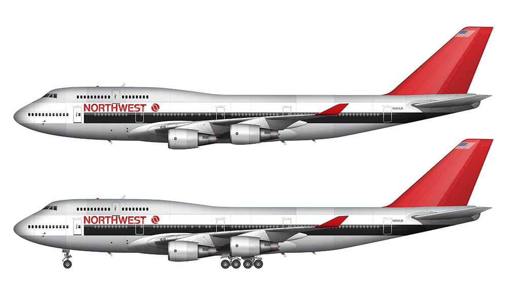
One interesting thing to note about this particular Northwest Airlines livery is that it was the launch color scheme for their 747-400. There were only a few of these painted in these colors, since the “bowling shoe” (described in the next section) was unveiled shortly after Northwest introduced the -400 series into the fleet.
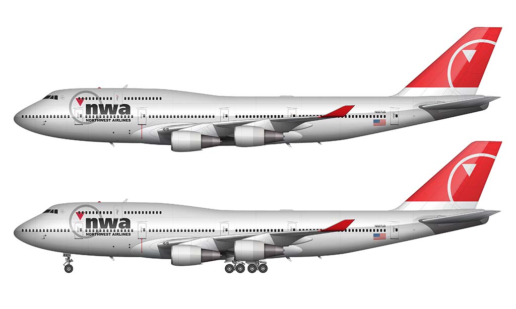
The Bowling Shoe livery
This particular livery is better known in the aviation circles as the “Bowling Shoe”. Does it really need to be explained? I didn’t think so. Designed by Landor Associates, it was introduced in 1989 as a clean and modern evolution of the previous color scheme. IMHO, it’s a well-done red and gray version of the iconic KLM livery.
The red and gray colors of the Northwest brand were retained, but they were arranged in a slightly more stylish way which accentuated the circular cross section of the airplane. An example of this would be the dark blue “cheat line” which extended the entire length of the aircraft.

Instead of keeping the dark blue line constant width all the way across, the designers chose to increase its thickness towards the rear. This created a nice wrap-around effect on the tail section and it was a very nice detail. It’s basically a more stylized version of the TWA livery of the time.
Also unveiled with this livery was a new Northwest Airlines logo, which featured a stylized “N” in a circle with an arrow pointing in the “northwest” direction. Clever, eh?
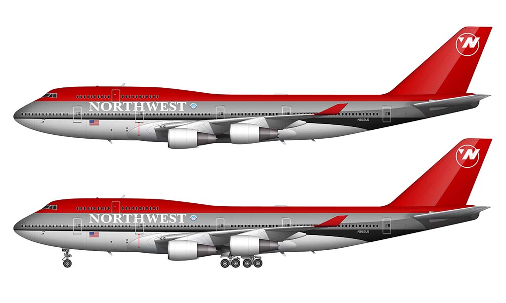
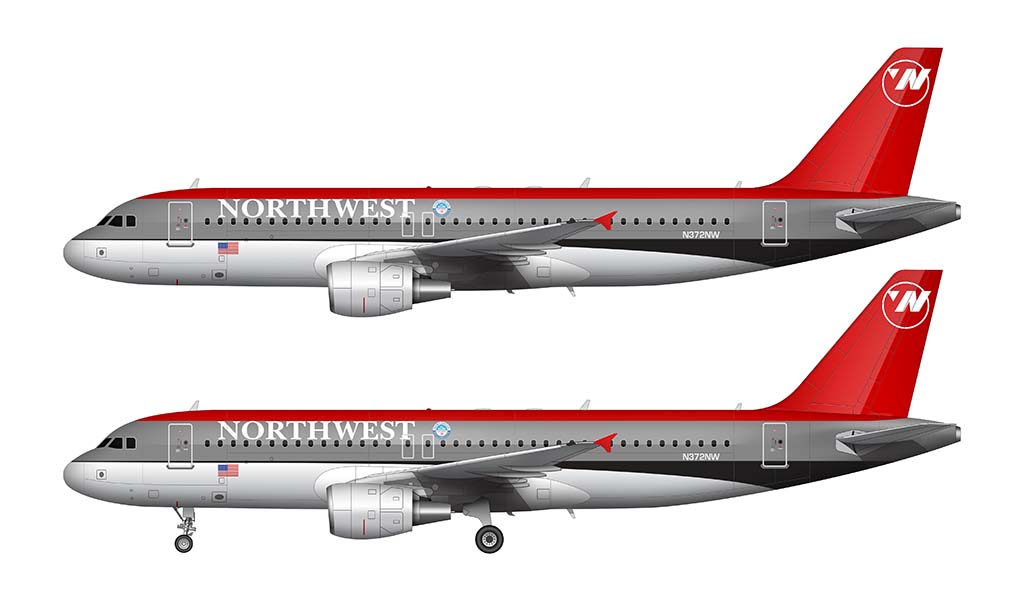
The Silver livery
This was their last livery, and the best looking of them all IMHO. The only thing that might have made it look better would have been to have a polished aluminum fuselage instead of painted silver. I get why they did that (many aircraft these days are made of composites, not metal), but it really could have been stunning with a bit of polish and shine.
I was never a fan of the painted silver NW livery, nor the “nwa” titles. Made no sense and looked awful. The first livery was still the best. I always wondered what the logo represented and who designed it. It looked great at their ticket counters, on ticket jackets and at gates, even though it was represented in a small fashion on the planes themselves. Very unique.
I tend to agree about the silver livery. Although it may still be my favorite to this day, it was a HUGE departure from the NW branding I grew up with. It definitely took a while to get used to.
I find it interesting to hear different points of view on a livery. I thought the bowling shoe design was really clever and made their airplanes stand out on dull gray airports around the world.
Thanks! Yeah, I love talking about this kind of stuff. Especially the old Northwest liveries (as I grew up just north of DTW in the 80’s).
In your comments on the ” bowling shoe” liberty, you mention the colors red, grey and black. There was no black. It was a dark blue
I had no idea that was blue! Thanks for letting me know – I have updated the post.
Do you remember some of the experimental NWA paint schemes from the 1990s? I remember seeing a few of them when I was flying for TWA at that time. Check out this link:
https://www.yesterdaysairlines.com/airline-history-blog/northwest-airlines-199495-experimentals
Yeah, some of those were really cool. I wish more airlines did experiments like that!
One of my favorite parts of the bowling shoe livery is the logo – the stylized N and the arrow in the corner came together to almost form a W. It’s a shame that part got lost with the ‘nwa’ livery
Yeah, that little design element was brilliant IMHO. That will forever be the best Northwest livery for me!
I always felt the N-circle was too small – almost an afterthought, or apologetic – which is especially ironic at a time when other airline logos were getting more brash and bold (and given the brash and bold red tail they’d already had for years!) I would’ve rather seen them keep the stylized “O” (presumably for Orient) and put that on the tail in plae of the N-circle.
(And to be honest… until this article I didn’t realize it was supposed to be an arrow pointing northwest – probably because it’s off-center from the center of the ‘compass’ circle. I always just thought it was an arrow pointing down, as some random style juxtaposition to the circle.)
Now that you mention it, I think you’re right about the size (and placement) of that circle graphic. It does seem odd by current day standards. At least they got it right with the final livery IMHO.
You are absolutely right that a W is implied to form the airline’s code NW, not only that but the arrow also points Northwest
Yup. I remember when I first figured out the new logo had:
= An N and…
= A W and…
= An O and…
= It pointed towards the North West
Brilliant!
Can you show me what the display on the nose cone of the NW Flight N95425 , Flight 2501 that is missing in Lake Michigan? I have a debris image that shows the numbers that add up to 95425 but, very distorted . I will be happy to email the image to you. Thanks
Hi Alan! I guess I’m not totally understanding what you’re asking for, but yes – you can reach out to me at norebbo @ gmail dot com and I’ll have a look.
When I was a kid, the Northwest Orient named evoked such exotic locales… Tokyo, Hong Kong, Minneapolis (ha!). I loved that big, blank, red color field on their 747 tails. I wasn’t a big fan when they switched to the bowling shoe livery (too drab and grey for me), but it did introduce that GENIUS logo mark with N, W, and compass pointer to the northwest all in one, the remnants of which can still be seen in Delta’s widget canted to point northwest.
Today was the day that I realized that the current Delta widget logo points to the northwest. lol! I can’t believe that nobody has ever mentioned that before. Maybe they have, but is the first I’ve heard of it.
Long live Northwest Airlines!
The silver livery is way too plain for my taste. It’s my least favorite. My favorite is a variant of the original. In some planes – and I looked up photos to make sure it wasn’t a Mandela effect – but in some photos the black on the Northwest Orient is a navy blue. I really liked the aluminum, white, red and navy blue coloring. Otherwise, I prefer the bowling shoe version.
Bowling shoe FTW!
I worked for Northwest Airlines for 37 years as an aircraft mechanic. The first A320 was delivered new with the original 1970s livery with area that was originally bare aluminum painted gray. It was immediately put in a hanger and painted in the Bowling Shoe levery. It was never flown in revenue service with what it was delivered with. Boeing delivered about two 747-451s in the original bare aluminum livery. They were flown in revenue service until they could be repainted in the Bowling Shoe livery. Northwest had started painting the republic DC-9s in the aluminum levry but had to paint the bellys gray. Republic and maybe when were North Central or Southern and of course Air West would shot peen the aircraft to strip the aircraft paint of the old paint. This left the fusulage with a rough metal skin and meant the whole aircraft needed to be painted to present a smooth surface after being painted. That is when they had Landor come up with the Bowling Shoe livery. United used Landor to come up with the Battleship livery.
The Bowling Shoe liverey had one major problem. Especially the grey faided fast and the red fuselage did fade almost as fast. It was not that big of a deal to paint the tail red which held up better and was easier to repaint.
Northwest’s final livery was the Silver Livery which was difficult to apply as it took several coats of metalic paint including a clear coat but the entire fuselage was one color with a red tail. It was more durable than the Bowling Shoe livery and had the arrow pointing forward on both sides.
I disliked the Bowling Shoe livery as it looked good when new but the GRAY and RED faided fast and then was not very appealing. Unfortunately the original liverey from the 1970s, especially the upper of the fuselage was not kept polished and looks quit dull. That livery along with the Silver livery I like very much.
One final note, I wished Data would have used Northwest’s Silver with appropriate tittles. Delta’s widget on their tails does point forward but Delta claims it has nothing to do with the merger with Northwest Airlines. Also Delta saw the benifit of Northwest Airlines of buying used aircraft.
Thanks for the memories James! I actually had no idea that the first A320 arrived wearing the 1970s livery.
The “Orient” livery will always be closest to my heart as after my Mama moved us out to Philly in the late 70’s NWO was the airline I always flew the most when going back to Detroit to see family. My Mama’s side is from the Windsor-West Detroit-Livonia area and my Papa’s side was from Westland-Ann Arbor. My Uncle Paul still lives in Warren.
I have many fond memories of my Papa and I visiting Metro over the years and I truly miss all those Red and Herman the Duck tails of Republic back in the day. Would have died for a chance to fly in a Convair 580. Honeywell used to have one at Paine Field in Everett that I would get to see while attending EVCC for my A&P. They used it to test new avionics.
Great Page, Love the History. Keep it Up!
I was a die-hard NWA fan and platinum World Perks member. Needless to say,I’m not a Delta fan.
Where else could you select such iconic aircraft as the DC-9 and DC-10 in your travel plans well into the 2000’s? DC-10 from DTW to AMS?Every single time!
Yeah, Northwest was the best. The DC-10 was my nemesis though – something would always happen whenever I booked a flight on one of them (aircraft swap, canceled flight, extremely inconvenient schedule change, etc). I did get to do it twice though: once MSP-LAX and another time AMS-MSP. Diesel 10’s were the best!
Hi, it is mentioned here that the cheatline of the “Bowling Shoe” livery was blue. Is that really true? On all pictures I can find it is clearly black. In the former Northwest Orient schemes it was a dark blue but later not, as far as I can see. Can you or anybody verify that?