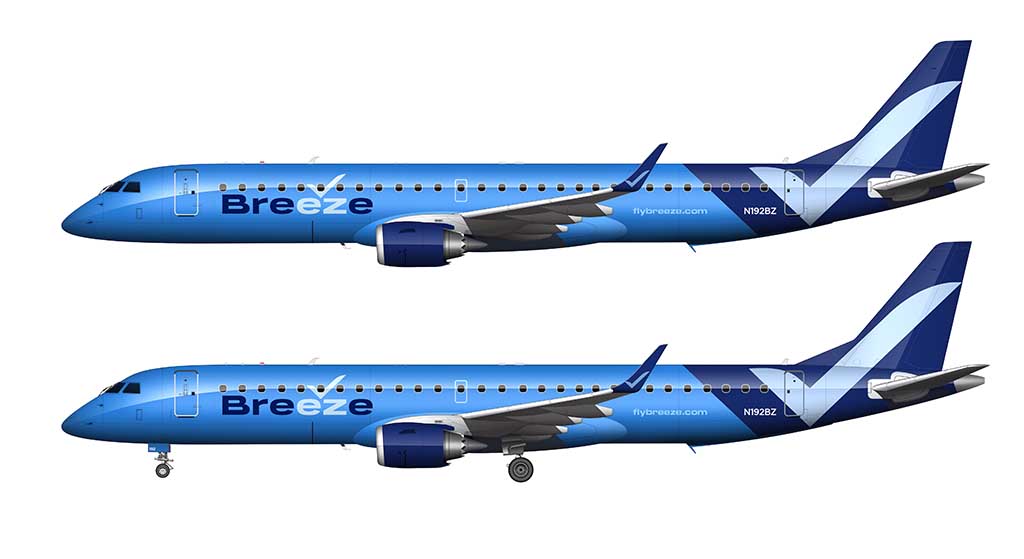
The Breeze Airways livery is one of the most unique of all the US airlines. From the pearlescent paint (which changes color in different lighting conditions), to the bold checkmark on the rear section of the fuselage, it’s like nothing else out there.
David Neeleman, the founder (and longtime veteran of the US airline industry), made it a point to brand Breeze Airways in a way which would make it stand out from all the rest. In my opinion, he succeeded magnificently.
A brief overview of the Breeze Airways livery
Unlike most other US airlines, the Breeze Airways livery is classy but bold. In comparison, the Delta Air Lines livery is classy but boring. The United Airlines livery is bold – but not what I’d consider being all that classy. The American Airlines livery, on the other hand, is still very controversial. But it is bold.
There are three colors used in the Breeze Airways livery (which I will explain in greater detail in a moment). They are all shades of blue.
The most interesting part about the livery, by far, is the fact that the majority of the aircraft is painted in a pearlescent coating. This gives it a very noticeable sheen in certain lighting conditions. Not only that, the color seems to shift slightly depending on how the sun is hitting the fuselage.
You’ll notice this color shift when searching for pictures of the Breeze Airways livery. Nearly every picture looks different. Some show the aircraft with what appears to be a very metallic finish, while others show what seems to be a very flat paint job. It’s all because of the pearlescent paint, and what you see is completely dependent on the lighting conditions.
The red paint in the Virgin America livery had some metallic in it, and it refracted light in a very similar manner that the Breeze Airways livery does.
How this livery was designed
Gianfranco Beting is credited as being the lead designer for the livery of Breeze Airways. He had a team of other designers working with him, but he was the main decision-maker.
- Gianfranco and his team delivered their first design proposal in late December 2019. After the holidays, the Breeze management team had a change of heart and asked Gianfranco to go back to the drawing board. As a designer myself, I know how frustrated he must have felt.
- A new concept was proposed a week later, which was the livery that eventually made it into production.
- Since the entire purpose of Breeze Airways was being “easy”, it was decided to emphasize the “EZ” in Breeze to make it the focal point of the livery.
- The checkmark logo was added to symbolize in an ascending bird (or an object taking flight). It also reinforces the concept of being “easy” in my opinion.
- And of course, because this is an airline created by David Neeleman, everything had to be blue. Since that’s the base color of all the other airlines that he has started, there was no point in breaking that tradition I guess.
It should also be noted that Gianfranco‘s original design concepts proposed metallic paint. That was ultimately deemed to be too costly as well as to difficult to maintain, so they settled on a pearlescent mixture instead.
The Breeze Airways color palette
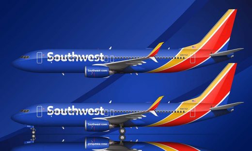
As I already mentioned, there are three colors in the Breeze Airways livery. All of them are blue. It’s a very bold color palette in my opinion, but not nearly as bold as the Southwest Airlines livery.
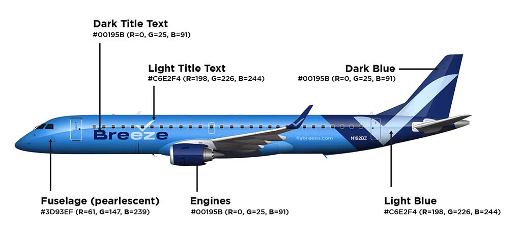
These are the colors used on all Breeze Airways aircraft:
- Fuselage: #3D93EF (R=61, G=147, B=239) – note that this is just my best estimate based on the research that I’ve done
- Dark blue: #00195B (R=0, G=25, B=91)
- Light blue: #C6E2F4 (R=198, G=226, B=244)
Pros and Cons of the Breeze Airways livery
Listing of all the pros and cons of the Breeze Airways livery is entirely subjective. I know. However, as an airline livery designer myself, I can’t help but to tell you all the things that I love and hate about it. Here we go:
Pros
- It’s a livery that will draw a lot of attention. they wanted to be bold, and they definitely succeeded.
- The use of pearlescent paint was brilliant (in my opinion). It changes the look of delivery depending on lighting conditions, and in the right light, the way it sparkles and shines is very unique.
- It’s a very different livery from all the other US airlines, and that’s what is going to make it memorable.
Cons
- As much as I love the dark blue colors, I can see it being a maintenance nightmare. Remember how the old US Airways and United “Battleship Gray” liveries faded after just a few years? I can totally see that happening with Breeze Airways aircraft.
- It has to be ridiculously expensive to paint this livery. That’s not necessarily a bad thing, but it makes me wonder how they can afford it and being an ultra low cost carrier and all.
- It’s a bit too blue in my opinion. Personally, I would’ve liked to have seen a small accent color being used somewhere. Perhaps a neon green or orange for the small little details? Just an idea…
Nice
Thanks man!
Heart Aerospace ES-19? https://upload.wikimedia.org/wikipedia/commons/thumb/e/eb/ES.19_United_1.png/800px-ES.19_United_1.png
Yeah, I’ve been trying to find some decent reference material for that thing. I really want to make a template of that!
Hi Scott
Yes Mr Neelan has certainly earned his reputation so for that alone, i give them alot of leeway.
It is a lot of blue.
It has to be very heavy?
How will it look in a few short years?
It’s kind of a confusing scheme.
But seeing a real a220 ac, from the ground off the front to the side it looks great!
I would love to try the airline, it feels though like a little bit of wackamole, where exactly do they fly?
Will they be flying that route six months from now? I love the concept of the lesser airports, and would love to fly for example RIC LAX or LAX JAX or MCO SNA (orange to orange)
In the last two years Ive flown both B6 and DL a221 and a223s, so my once burning urge to sample Breeze is lessened.
It would help if I could see a route map.A real, simple, non electronic route map lol
This is somewhat the post covid reality for several carriers, routes come and go so fast it’s hard to see where you can fly!