Love it or hate it, the Emirates livery is one of the most recognizable airline livery designs in the world. I’ve heard it being referred to as “overly flashy” on aviation forums all over the internet, but I don’t understand the hate. In my opinion, it has a perfect balance of eye-catching bling and clean negative space.
There have only been three Emirates liveries so far. The first one, launched in 1985, was very similar to the redesigned version launched in 2005. The one launched in 2023 was very similar the the one from 2005.
It’s slightly confusing, but all you need to know is that Emirates prides themselves on subtle iterations from one livery to the next.
A closer look at the evolution of the Emirates livery
Personally, I’m a big fan of airlines who continuously refine their livery from one version to the next (as opposed to coming up with something new each time). The Qatar Airways livery has evolved in the same manner, and in my opinion, it’s a great way to build brand recognition over a long period of time. Emirates has succeeded admirably with the transition of their first livery to the next.
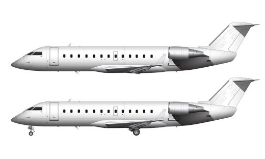
1985-2005: Debut UAE flag livery
The launch livery for Emirates in 1985 was very different from what many other airlines were doing at the time. Cheatlines (or pinstripes) that ran down the entire length of the fuselage were still very common. As a matter of fact, the 1984 Korean Air livery was a modern take on cheatlines. The Qantas livery of 1984 was one of the first to eliminate the cheatline, and the 1985 Emirates livery wasn’t far behind.
The predominant element of this livery was an abstract representation of the United Arab Emirates (UAE) flag which extended from the middle of the vertical stabilizer down into the fuselage. Very few airlines were doing this at that time, and it was a very bold design element which helped to give Emirates instant brand recognition.
The rest of the livery wasn’t all that daring (in my opinion). Yes, the use of the gold was a bold choice for the Emirates titles and the adjacent Arabic script (as well as other little design details), but the typeface that they chose was extremely basic.
From what I can tell, it was a custom font. However, it was very easy for me to replicate it in the illustration you see above using Times New Roman and a handful of little tweaks.
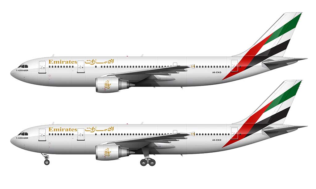
2005-2023: Updated UAE flag livery
In 2005, Emirates unveiled a subtle evolution of their first livery design. All of the same design elements were retained, but everything was massaged and adjusted slightly to give it a more modern look. It was basically the opposite of what we saw with the new Etihad livery (which was an all-out attempt at being as daring as possible).
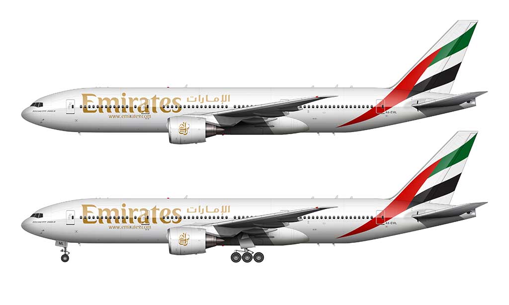
The abstract UAE flag graphic on the vertical stabilizer was reworked to look more fluid. It had much more curvature to it than the first version, and I like the way that the bottom point flows into the body of the fuselage (instead of just straight down). Interestingly enough, the red green and black colors from the first livery are left exactly the same.
The Emirates titles and the adjacent Arabic script were completely reworked in the 2005 version. Although they retained the same gold color, they were scaled up in size nearly 300%. This is a much better use of space IMHO, and it helps to fill the otherwise blank fuselage. Especially on large aircraft such as the A380.
An all new typeface was created for both the Emirates titles and the Arabic script. Both seem to be a custom font created exclusively for Emirates. Also worth noting is that the Arabic logos on the engines of the first version were retained for the updated version (with slight modifications).
[convertkit form=6344129]
Full color palette for the 2005 Emirates livery
The Emirates livery design is a perfect example of less being more. In other words, despite the color palette consisting of only four colors, it’s arguably one of the most beautiful airline livery designs in existence. It’s not always necessary to go wild and crazy to create a powerful brand image.
Here is the full color palette for both versions:
- Fuselage: #FFFFFF (R=255, G=255, B=255)
- Titles: #E4AB2C (R=228, G=171, B=44)
- Red: #D71F27 (R=215, G=31, B=39)
- Green: #018557 (R=1, G=133, B=87)
- Black #000000 (R=0, G=0, B=0)
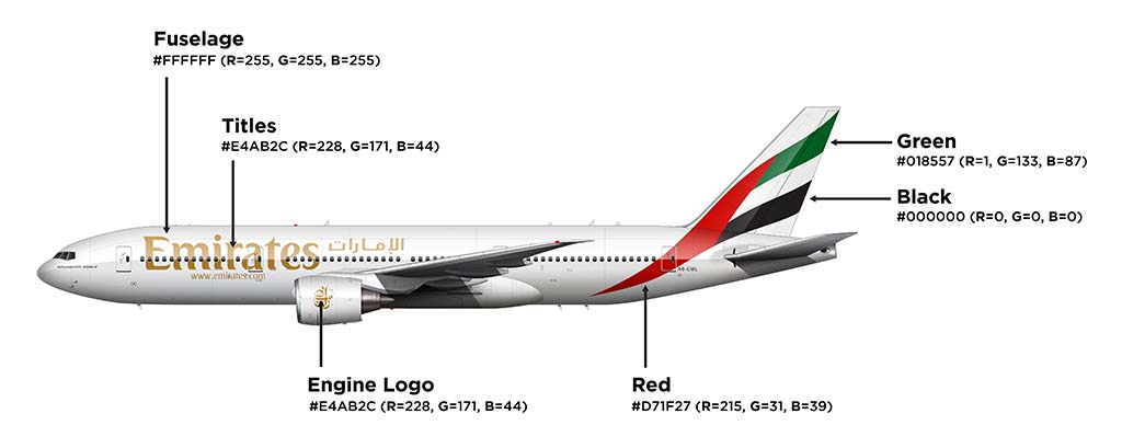
Although there are many other airline liveries with simple color palettes, the use of the color gold in the Emirates livery is a uniquely powerful choice. Especially considering how well it contrasts with the red and green in the vertical stabilizer.
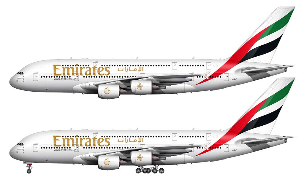
2023-present: Waving UAE flag livery
Emirates unveiled an all new livery in March of 2023 that continued with the tradition of refinement (rather than creating something entirely new from scratch). Upon first glance, this updated livery looks nearly identical to the one that preceded it.
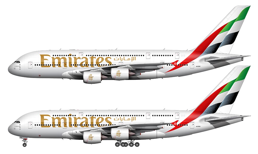
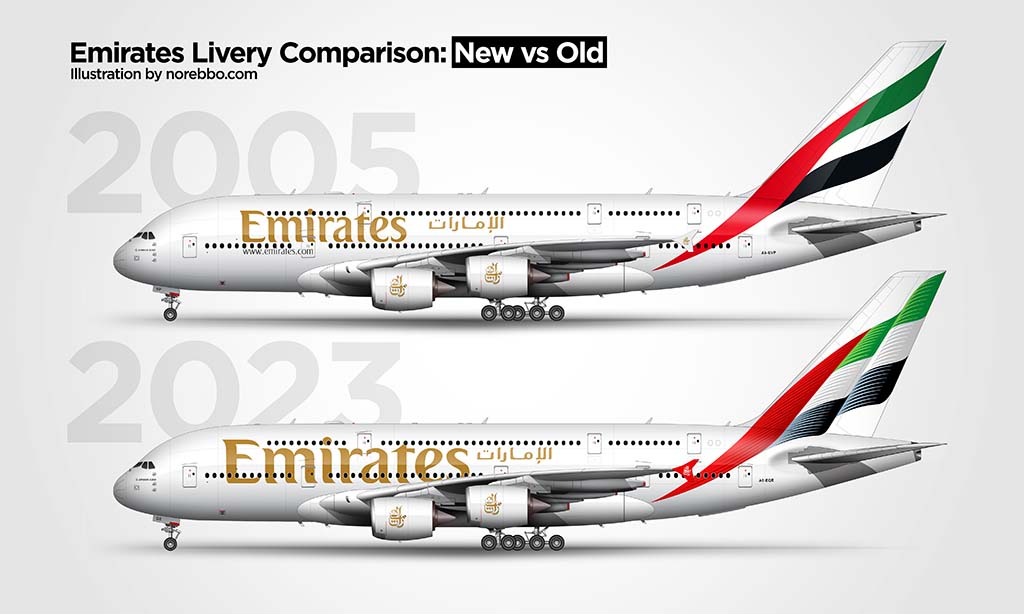
Yes, it looks a lot like what would happen if you told an AI bot to blend the current Emirates livery with the current Aeroflot livery. I think it looks great (if not slightly over-designed). Here are the most notable changes:
- The abstract UAE flag graphic on the vertical stabilizer has been redesigned to make it appear to be waiving in the wind. Shoutout to Aeroflot I guess.
- The red / green / black / white of the previous flag graphic remains, but with the addition of lighter-colored streaks to help give the flag more shape. FYI, replicating these streaks for the illustration you see above was an absolute mother******.
- The size of the “Emirates” titles on the fuselage have been increased by about 65% (I suck at math by the way, so that’s just a wild-ass guess on my part).
- The winglets have been painted red. The script logo on the winglets have increased in size, and are now white.
Hello Scott, where can I buy this EMIRATES SVG model please ?
Thanks a lot ! Bye !
Pierre from France
Hi Pierre – I don’t have an SVG/vector version of this one available unfortunately. I do all of these livery illustrations in Photoshop (with only a few elements created in Adobe illustrator).
Now that you mentioned Qantas, I have always thought how advanced Qantas was at the time and how current that livery is still in force.
Absolutely! I like how they iterate on one design rather than trying to come up with something new each time.
It may be that the paint is expensive and too reduce costs they have less paint paint colors? Before airplanes weren’t for everyone and now they are being more accessible by lowering ticket prices.
Definitely. Fewer colors generally costs less – but I’m not sure how much money they saved with the latest livery. The texture / gradient is extremely complex (which can’t be cheap to paint on hundreds of aircraft).
The 2023 livery is more complex as it has those lines
Absolutely! That wasn’t fun to illustrate. 🙂
I see also the newer livery has a bigger emirates text (yk, where it says emirates on the plane)
Yup, it looks a lot better larger IMHO.
I kind of think subtle evolution like this is a lot more classy, cos when you make a whole new one, it can be a hit or a flop. These kind of subtle change is less risky tbh
I agree. Subtle changes aren’t as exciting, but they help to keep strong brands strong. Emirates already has a great(ish) reputation around the world, so there’s no need to rock the boat.
Could you do an Air India livery evolution too?
Working on it!