If you would’ve asked me 10 years ago what I thought about the Southwest Airlines livery, I wouldn’t have said good things. It’s true: I found the colors and patterns to be overly simplistic and cheap looking in my younger years. However, things have changed.
I’m not exactly sure what it was that altered my perception of Southwest Airlines and it’s bold livery history. But now, perhaps because of blurred vision and reduced cognition due to growing older, I’m actually starting to come around.
In my opinion, Southwest Airlines has one of the best brand languages in the airline industry. Just don’t tell my younger self that I finally admitted to it…
The Southwest Arlines livery strategy
The thing that always bugged me about the Southwest livery (no matter which one) was the fact that it seemed like they were going far out of their way to be different and not like everybody else. The Breeze Airways livery was designed to be different as well, but what’s my problem with Southwest?
I viewed their color choices as being borderline offensive. But you know what? They’ve never been afraid to admit that being bold and different is their primary objective.
That’s one of the reasons why they spend so much time and effort with special liveries. Southwest Airlines has more planes painted in special liveries than any other US airline.
Even their standard liveries been different from everyone else. However, since the special liveries could be a topic for an entirely different discussion, I’m going to focus on the core Southwest brand in this one.
There have been three major Southwest Airlines liveries over the years. And they’ve all been obnoxiously colorful:
- Desert Gold livery
- Canyon blue livery
- Heart livery
Let’s take a look at all of them in greater detail (see below). I think you’ll agree with me that, although quite obnoxious, each one is brilliant in its own satisfyingly weird way.
The Southwest Airlines Desert Gold livery
This livery, which I like to refer to as the “Baby Shit Brown livery” was the launch design for the airline way back in 1971. It featured colors and tones to reflect the spirit of the southwest United States. However, as I alluded to earlier, this color scheme looked downright disgusting in some lighting conditions.
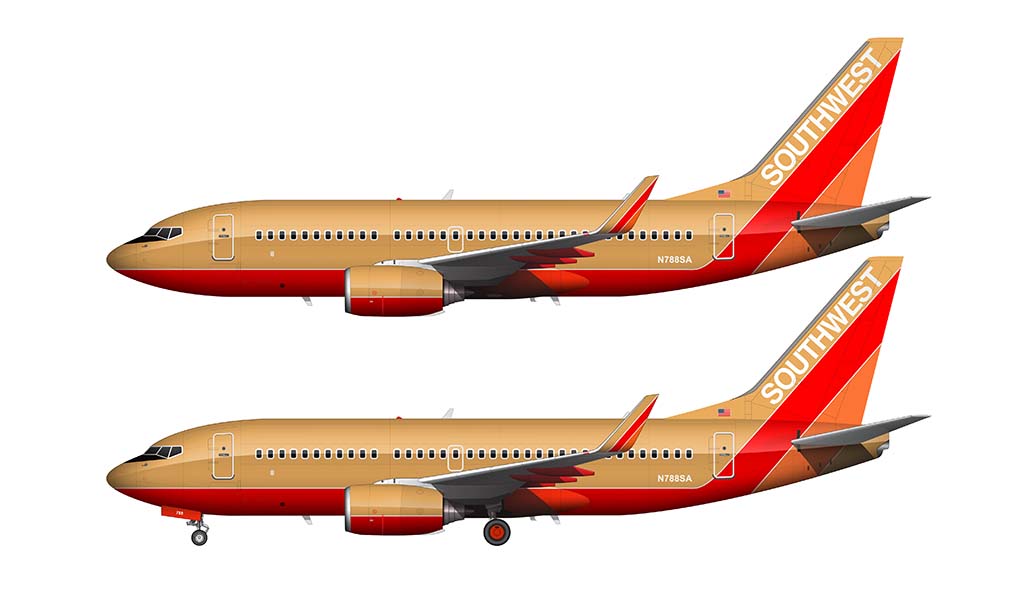
Pinstripes were the core of the design, leading from the nose of the aircraft all the way back up into the vertical stabilizer. It’s interesting to note that when this livery was designed, cheat lines thick lines running down the very center of the fuselage was what was in style, so running the stripes along the bottom of the airplane was actually considered to be new and different.
It was also unique in that the upper forward section of the fuselage was left blank. I can’t think of any other airline at the time that didn’t put their name or their logo in that prime spot. Instead, Southwest chose to be different and to put their brand name on the vertical stabilizer instead.
The Southwest Desert Gold color palette
There have been slight variations in this color palette over the years. For example, the 727‘s that were in the fleet for a short amount of time featured a slightly darker metallic version of the main gold color. There have also been a handful of other color tweaks from time to time, but the following is the color palette that was used on the majority of aircraft:
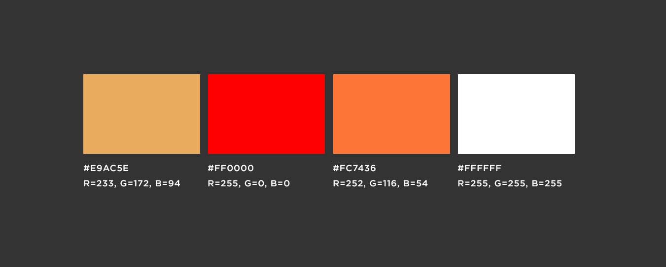
As you can see, it’s a relatively simple color palette. It was also very much a product of its time with the 1970s being so heavily into brown and beige tones.
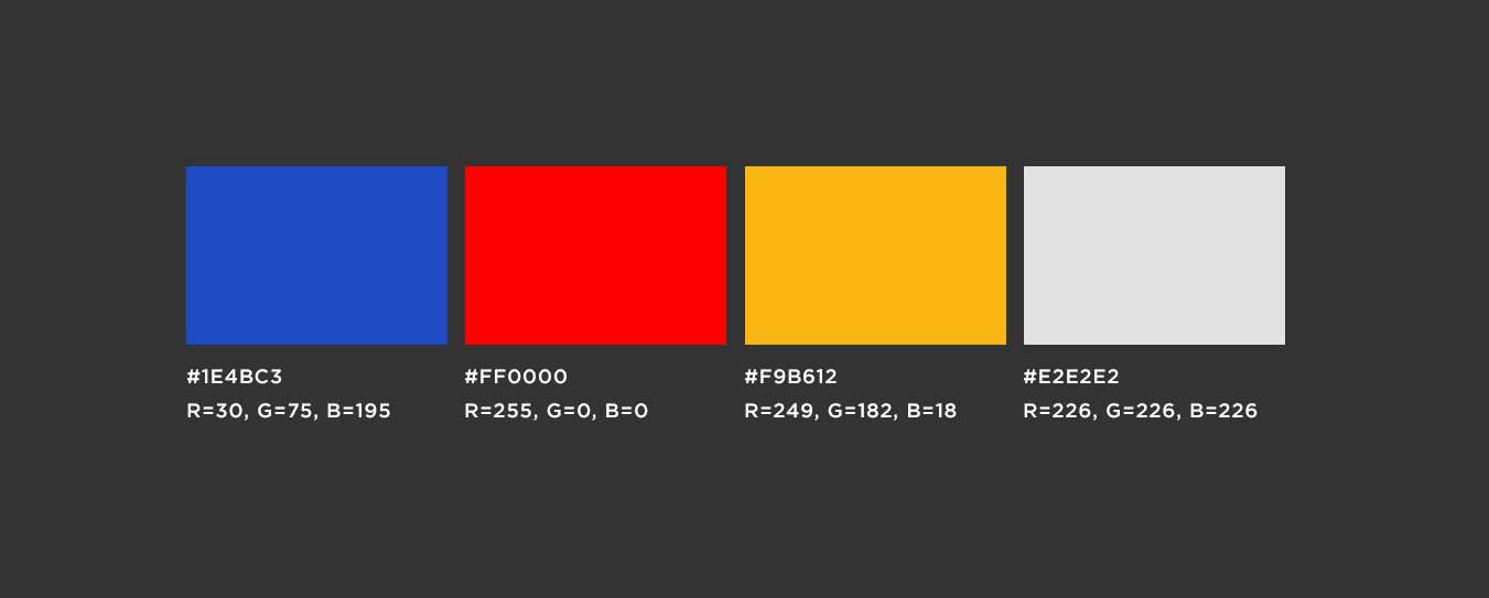
The Southwest Airlines Canyon Blue livery
Launched in 2001 to replace the Desert Gold livery, the new Canyon Blue livery was equally bold and obnoxious.
First and foremost, the “Baby Shit Brown” color was replaced with a vivid blue. No other airline had dared to be this bold, which is probably why the very first words out of my mouth when I saw it were something along the lines of “you can’t be serious.”
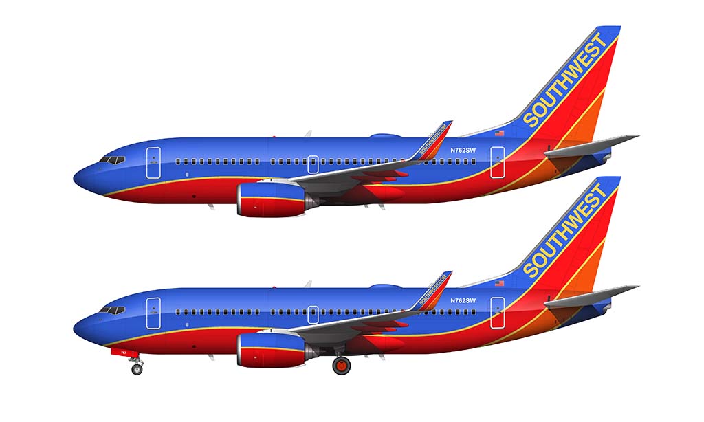
Since this was evolution of the original design, pinstripes remained as a core element. However, these were now curved pinstripes instead of straight.
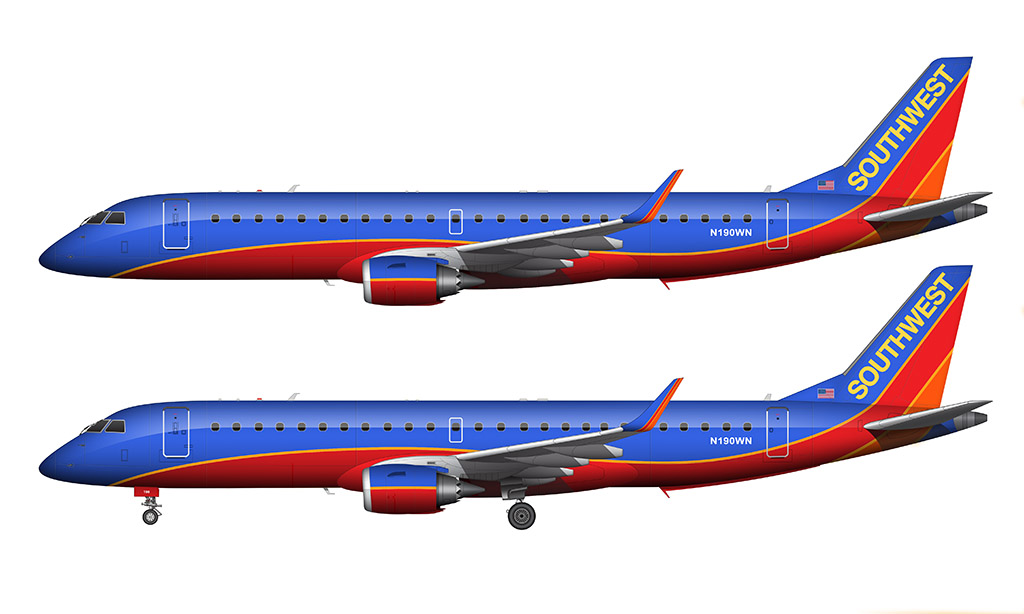
And, because I’m a visual designer who just can’t see to leave well enough alone, here is what an Embraer 190 (an aircraft type Southwest doesn’t use) would like with the Canyon Blue livery:
A video demonstration of how I struggled painting this livery
All versions of the Southwest Airlines livery are relatively simple, but I had a heck of a time getting the Canyon Blue colors to look like the actual aircraft when I was creating the 737-700 rending above. Hope you enjoy this “behind the scenes” look at the livery creation process!
The Southwest Canyon Blue color palette
Even though I wasn’t exactly sure if they were serious or not when they first unveiled it, that didn’t mean that I hated the colors. Sure, it was not like anything else that we had seen at the time. Southwest Airlines was just doing what they do best, which was standing out and daring to be different. This color palette did exactly that.
Think these Canyon Blue colors are bold? Just wait until I start talking about their next next livery…
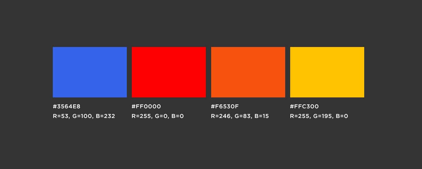
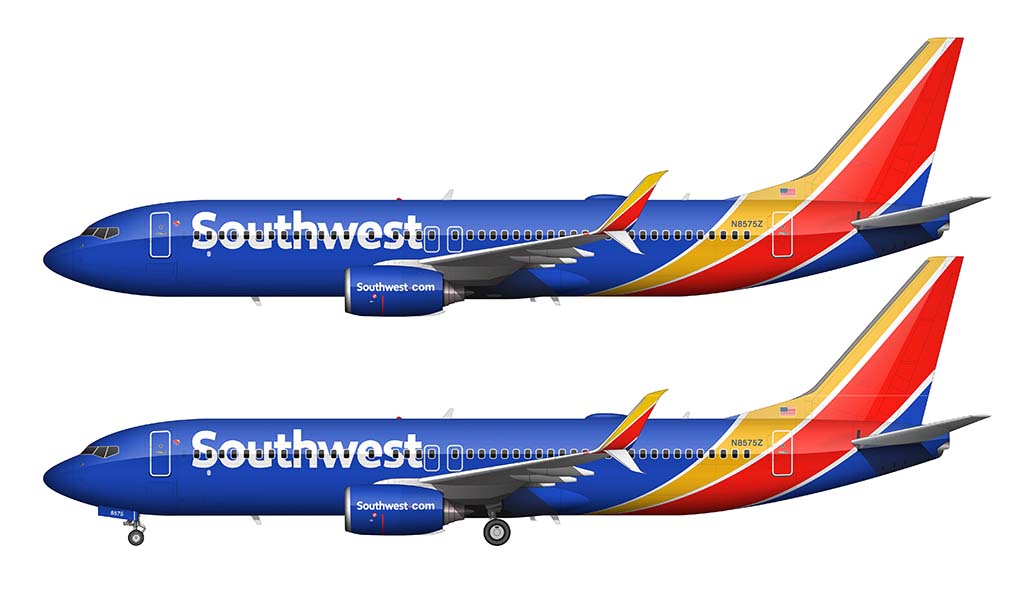
The Southwest Airlines Heart livery
Launched on September 8, 2014, the heart livery seems to be the “slap in the face” that they were trying to achieve with the Canyon Blue livery. It’s essentially that same design on steroids. And if you would’ve asked me how that would’ve been possible way back in 2001, I wouldn’t have been able to give an answer.
As a visual designer, one of the most interesting things about the Heart livery (to me) is that it was developed with five different brand and strategy firms:
That’s very surprising to me considering that most other airlines don’t put that much effort into their own brand languages. For example, Lufthansa’s new livery was created entirely in-house. Etihad‘s new livery was created with just one outside brand strategy firm (Landor Associates).
In addition to this, extensive focus groups (and other research) was conducted with both Southwest Airlines employees and customers to figure out how the brand should evolve. Do you suppose that much effort went into JetBlue‘s new streamers livery? I doubt it.
Anyway, similar to the Canyon Blue color scheme, the Heart livery is an evolution of the past. The pinstripes remain. This time, however, they don’t extend the entire length of the aircraft.
For the first time ever, Southwest titles were placed on the forward section of the fuselage. And if you’re curious, it’s a custom typeface Southwest Sans which was created by Monotype.
Also new to this livery is the fact that they took advantage of the vacant belly space to place a giant heart logo. You know, so you know exactly which airline is flying over your head as you’re doing some plane spotting at the far end of your local airport. As if the vivid blue wouldn’t make it obvious…
A video demonstration of how I created the Heart livery illustration
Believe it or not, the Southwest Airlines Heart livery was easier to replicate than the Canyon Blue livery. The following video is a brief demonstration of how I recreated this color scheme over top of my Boeing 737-800 template:
The Southwest Heart livery color palette
At first glance, it may seem that this new livery is nearly identical to the previous. Upon closer look, you’ll notice that it couldn’t be further from the truth.
First of all, the primary blue color is darker than Canyon Blue. And those stripes? They’re not white. They’re actually silver. Anyway, here’s the full color palette:
Considering how more daring and bold southwest gets with each new evolution of their new livery, I can’t wait to see what they come up with next.
Don’t don’t take my word for it though. Kevin Krone, Southwest’s Vice President and Chief Marketing Officer summed it up nicely during the announcement of this new livery way back in 2014:
“We already know who we are. The job was to keep the elements of Southwest that our Employees and Customers love, and to make them a bold, modern expression of our future.”
Does this mean we’re gonna be seeing a mix of luminescent neon colors next? Only time will tell I guess…
I think I like the 3rd color scheme for Southwest the best. It is colorful no doubt. I wonder what the Embraer 190 would look like in the most recent paint scheme. The colors I miss were on the Braniff 727 Fleet
Where did you get these colors from? Im curious where your source is as I’m recreating the liveries for a game and want to make sure these are the exact colors :). Great article, so glad I’ve found it. I have had a really hard time finding consistency on colors for the Desert Gold and Canyon Blue colors. And I finally found a great source for the Heart colors
Many of these colors came directly from some WN marketing material I had. Some were just guesses on my part because I couldn’t find any specific documentation. Anyway, glad this was helpful!
We always called the Canyon blue livery; “The beachball colors”
Haven’t seen too much reference of that phrase anywhere on the web…
I haven’t heard that before, but I like it. It totally fits!
I feel like the only reason why you were offended in your youth is because due to you seeming to start in 2001 you were also probably offended some way in the events of the September 11th attacks.
The one heart livery is my favorite on a southwest airlines jet. Very beautiful clean and bold
I disagree with your all your statements. the first livery is my favorite. the second iteration is my least favorite and the most recent one is my second favorite.
I like the Baby Shit Brown livery, because of the retro vibe. It is a truly distinctive design.
The name alone makes it one of the world’s best airline liveries lol.
Baby Shit Brown FTMFW
Can you please make a southwest heart livery for the 737 MAX8?
I’ve always wanted to do an entire set of special Southwest liveries, but then I take a good look at them and realize how big of a job it’s going to be lol. I will do it at some point – I just need a decent chunk of time that I can dedicate to it.
When I looked at the ERJ 190 template with the Southwest livery on it, there was a mess up near the tail.
Which part? I’m going to be updating my Embraer E-Jet templates soon and I want to be sure to correct any mistakes…
I am also an Industrial Designer with a Master’s degree out of Syracuse in 1968.
Why do you call it the Heart Livery?
I believe Southwest has, with its latest, created the best airline identity going. It is certainly the most identifiable. It has immediate recognition using the three primary colors and a brilliant, white Southwest. I wouldn’t do another for me it is perfect.
Edit: My bad! I forgot the heart is a special part of the Southwest livery. Still think the heart livery is The One.
It does not need further development. It is one of the most outstanding liveries in airline history. You cannot ignore it. The colors shout out their place in airline history.
Hey Bill, yeah the heart logo has always been an iconic part of the Southwest brand. I always assumed that they referred to this one as the “heart” livery because of the giant heart logo on the underside of the fuselage. Just a guess…
I agree though. Still, to this day, it’s one of my favorite airline liveries of all time.
The first Southwest livery had two kinda-forerunners.
Lamar Muse was the first Southwest Airlines CEO. He was largely written out of the company history because he got badly offside with Herb Kelleher, but he was in charge from 1971 to 1978. He really put his stamp on the company.
There’s a transcript of an oral history of Lamar Muse where he talks about the first livery. Southwest was the third airline at which Muse was CEO. He was CEO of Central Airlines (which then got bought by the first Frontier Airlines – not the one that’s around today) and then he was CEO of Universal Airlines.
Muse changed the livery at Central and at Universal and he used the same designer as did the first “baby shit” version of Southwest. Some people in Dallas, I think. I looked them up on the web and there was zero, so I guess the Southwest livery was their legacy.
The Central and Universal liveries were both pretty striking and both had black and white – but the Central had some brown. Both worth looking up. The Universal one was done in, I think, 1968 and looks quite sixties. The Central one had a kind of “spirograph” design on the tail.
Anyway, the point is that in some way, the history of the Southwest livery goes back further than 1971.