I’ve been following the airline industry for a very long time. It’s always been entertaining, and if there’s anything that causes drama, it occurs whenever an established airline unveils a redesigned livery. The new Lufthansa livery is a classic example of that.
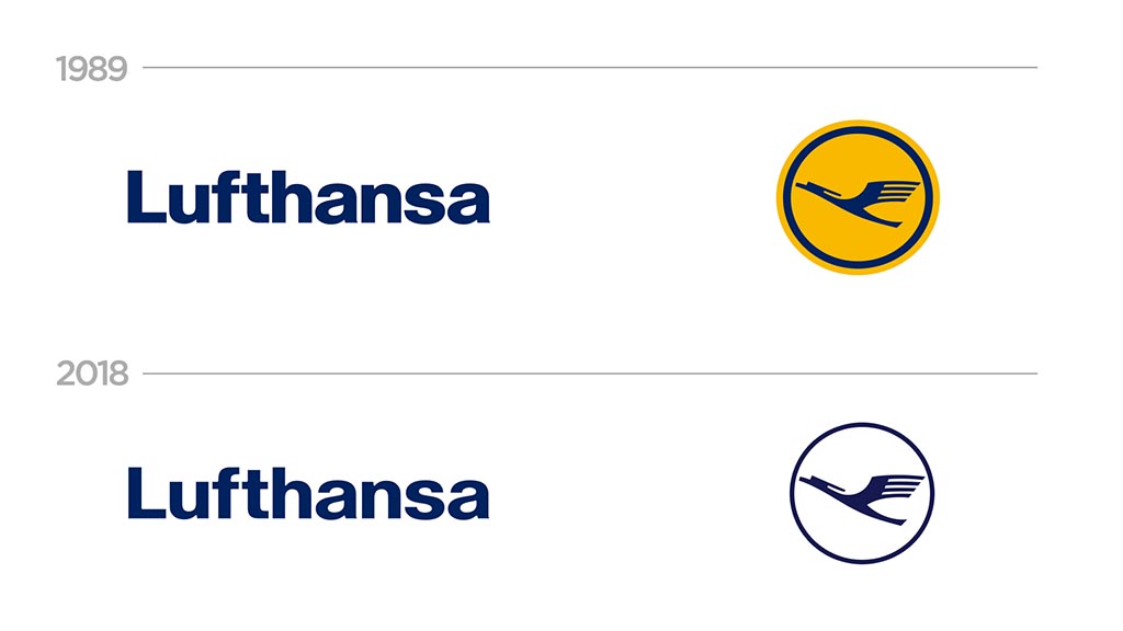
Officially unveiled to the public in February 2018, Lufthansa’s new look was not well received by the public – even though the logo didn’t change all that much and the typeface of the Lufthansa titles was basically the same.
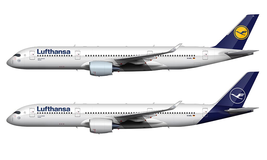
The uproar was caused by the elimination of the iconic “Lufthansa yellow.” It was official. For the first time in decades, yellow was no longer part of the official Lufthansa livery.
A brief overview of the new Lufthansa livery
One of the most interesting things about this rebranding was the fact that it was done entirely in-house. That’s rare these days, as most airlines find it more economical to outsource their livery design. After all, they don’t need to do it very often, and there’s not no sense in having a team of people on staff who can do this sort of thing.
I have a lot of respect for the Lufthansa marketing group. Even though they aren’t “expert” livery designers, they know their brand better than anyone else. Why let someone else tell them what they should do? Anyway, they rolled up their sleeves and got it done. And in my opinion, they got it done very well.
- This was the first major redesign of the Lufthansa brand since 1989.
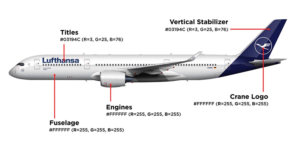
- Blue was chosen as the primary color, relegating that iconic Lufthansa yellow to more secondary roles such as signage and general communications material.
- The Lufthansa titles were thinned out to look lighter and more modern. The typeface (based on Helvetica) is unchanged.
- The iconic crane logo received the same treatment as the titles. The overall design remain unchanged except for becoming slightly thinner and lighter weight.
- They resisted the temptation to go with a bright / heavy color palette (such as the new KLM livery). In other words, they stayed true to their brand.
Did you know that they even painted the wings white? I didn’t even notice it at first. However, every time that I look at a Lufthansa aircraft wearing this new livery, it’s the first thing that I look at. It’s beautiful!
The design process for the new livery
By keeping the design process in-house, Lufthansa was able to experiment in ways that many other branding agencies wouldn’t have been able to. This experimentation helped them of course, but it also caused problems as well.
Everything that went right
Thanks to their vast amount of resources, Lufthansa was able to experiment by applying different design concepts to parts of actual aircraft. The designer in me can’t help to want to give them a virtual fist bump for that, because – that’s thinking outside the box.
More specifically, they used the vertical stabilizer of an old 737 to test out 15 different shades of blue that they were thinking about for their primary brand color. I doubt there are many marketing and branding agencies out there who have the ability to do the same whenever they’re creating concepts for a new airline livery.
Everything that went wrong
Even though they were going the extra mile by actually applying design concepts to components of actual aircraft, they forgot one thing: all of the tests were being conducted indoors under controlled lighting. In other words, they didn’t test these design concepts in a wide variety different lighting conditions.
In Lufthansa’s defense, I’m sure that they rolled that vertical stabilizer outside a time or two just to have a look. All I’m saying is that they didn’t do it as often as they should have. This shortsightedness came back to haunt them a short time later.
Ta-da! Why the first version of Lufthansa’s new livery was an utter failure…
In August 2018, Lufthansa admitted that they made a mistake. The blue that they chose for their primary brand color was so dark that it looked black in certain (mostly overcast) lighting conditions.
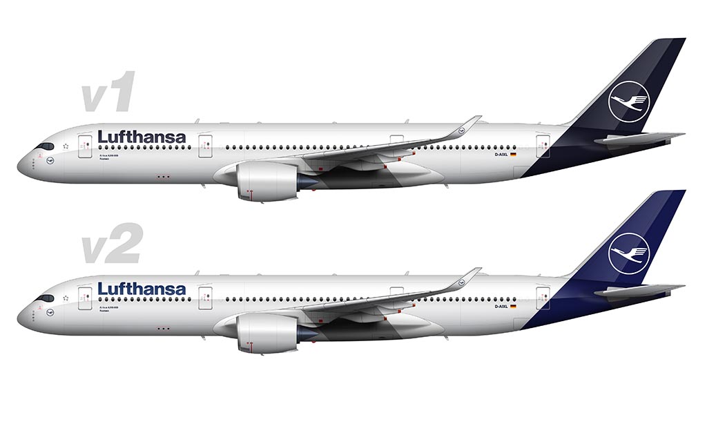
The kicker about all this was that it wasn’t discovered until they had painted several aircraft. Once they (and everyone else) saw these aircraft in real world lighting conditions, it quickly became clear that they didn’t do enough testing in different types of light.
For the record, I actually quite liked the look of a “black” Lufthansa livery. However, since blue is such a critical component of their overall brand, that wasn’t going to work.
The airline ultimately corrected this mistake by creating a new shade of blue that actually looked blue in all lighting conditions.
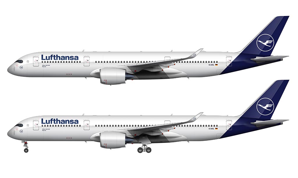
How does this new livery compare to the previous version?
Remember what I said earlier about new airline liveries causing so much drama in the aviation community? Over on airliners.net, things got so crazy when the new Lufthansa livery was revealed that I swear I thought the world was going to end.
Despite what much of the world thought, I actually quite liked it. It was clean, classy, and a nice evolution of the previous design.
It is somewhat unfortunate that they couldn’t find a way to get the yellow within the design, but I still think that it looks pretty sharp.
Then again, I like simple color schemes. Most people see monochromatic things as being “bland” or “unfinished” if they don’t contain any bright colors. I disagree, and once again, I offer a virtual fist bump to the team over at Lufthansa who created this new (somewhat monochromatic) livery.
What makes this version of the Lufthansa livery so great?
It’s the simplicity. Yes, the fuselage is mostly white. However, they accentuated that by painting the wings white as well, which adds a nice touch of class to an otherwise simplistic design.
The crane logo and Lufthansa titles at the forward section of the fuselage balance each other out quite well. Mix all that in with the dark blue cutting a hard line from the tail cone to the vertical stabilizer, and you’ve got a very classy design solution.
Here’s a video that I created which explains all the things that makes this new Lufthansa paint scheme so nice:
I personally don’t feel as if the haters have given this livery the attention it deserves. There’s a lot that goes into the process of creating an entirely new brand for an airline, and most of the people who are saying negative things about this livery can’t fully appreciate what went into it. Lufthansa‘s legacy played a major part in the way that it looks.
The full color palette of the new Lufthansa’s new livery
Even though I haven’t seen official documentation from Lufthansa in regards to the new color palette, that didn’t stop me from doing a bit of investigation of my own.
From what I’ve been able to determine from their official marketing materials, this is the official color palette for Lufthansa after the 2018 brand refresh:
- Blue: #03194C (R=3, G=25, B=76)
- Yellow: #FEAB22 (R=254, G=171, B=34)
- White: #FFFFFF (R=255, G=255, B=255)
- Gray: #C4C4C4 (R=196, G=196, B=196)
As you can see, yellow is still very much a part of the official Lufthansa brand language. I don’t think it’ll ever go away. Also, even though gray doesn’t seem to be an official part of their new color palette, I’m seeing them use it occasionally as an accent color in marketing materials.
What do you think? Did Lufthansa totally botch the redesign? Should they have engaged a reputable airline branding agency to do this for them? I want to know your thoughts, so do be sure to leave them down in the comment section below…
Very interesting article, thanks. Seems that painting a sample tail section was a good idea not seen through fully. That effort was probably intended to avoid the colour change they ended up with anyway.
A lot of airlines seem to continue the line of the vertical stabilizer around the rear fuselage. To me it looks sharp in profile and in 2d, but in real-life, from some angles I think the rear fuselage can look a bit odd – bulbous and wonky if you know what I mean?
Very true – I’ve noticed the same thing. As a designer, I can tell you that it feels totally natural to want to extend the color of the vertical stabilizer down into the fuselage at the same angle. It looks good in 2d, but can be odd in 3d if the aircraft has a fat butt. Haha!
Overall I like the new look, but I am disappointed that they took away the yellow crane. I think having a touch of yellow would be a nice touch. The basic color scheme is white and blue, so certainly adding a little yellow here and there would not be gaudy. It would add a little warmth.
It’s a shame they killed the yellow, the airline is barely recognizable from far, its tail blends in with other carriers such as SAS, Tarom, Lot and no longer stand out.
My hope is that they will eventually cave into the criticism and revise the livery yet again. It’s kind of a pipe dream, but…they did admit to making a mistake once already with the dark blue.
It’s a good design for a mail and package carrier. White paper, dark-blue ink, a round stamp.
Haha, that is a pretty good idea.
In my honest opinion the new Lufthansa livery looks better I hated staring at the yellow something about it just made my eyes hurt
You’re definitely in the minority about the yellow David! It was wild to see the reaction from the aviation community about the loss of yellow accents in the livery. Probably one of the biggest airline livery sins in the past 10 years lol.
I’m just happy to see any contemporary airliner without a waving flag on its tail.
Which… let’s be honest, it’s always disconcerting to see a waving German flag. Good call, Lufthansa!
It has been the trend as of late, hasn’t it? I just can’t wait until cheatlines come back in style.
“Which… let’s be honest, it’s always disconcerting to see a waving German flag. ”
Jesus, Vince…this isn’t the 1930s and it was an entirely different flag back then.
Really wish they’d gone with this version or something like it, which made the rounds: https://www.aviation24.be/wp-content/uploads/2018/01/lufthansa-1.png. Still meets the goal of being more ‘sophisticated’ by making the the yellow more subtle than before but isn’t as harsh as the one they chose.
Yeah, I like the small / subtle touches of yellow in those concepts.
Tbh I LOVE the originally unveiled darker livery, it looks so premium. I know that they need to stick with blue but I don’t like the revised colour nearly as much.
Yeah, that darker one was pretty sweet. Those types of liveries don’t stand up well to the elements though, so it’s understandable why they passed on it.
How do you feel about extending the blue down into the fuselage? That is a trend much copied by airlines everywhere. Thinking Aer Lingus, Alaska Airlines, Air Canada Rouge, Virgin. I find the treatment on Luftansa rather harsh.
That would look pretty sharp IMHO. They could probably go even more extreme and do a reverse of what they currently have (white tail with blue fuselage). Or… add yellow back into the mix somehow? There’s so much they can do to make this better.