I may upset a few people by saying this, but I’m not a very big fan of the new KLM livery. I’m glad they didn’t go “Euro white” like every airline seems to be doing these days, but I’m having a hard time not wrinkling my nose at the way the cheatline droops down at the forward section of the fuselage. Something about it seems a little off to me.
A brief overview of the new KLM livery
Unveiled to the public on April 30, 2014, the highly anticipated all new livery for KLM sent shockwaves through the aviation community.
Ok, I’m probably being slightly over dramatic, but I remember that day very clearly. All over social media, it seemed as though there were as many people who hated it as there were who absolutely loved it.
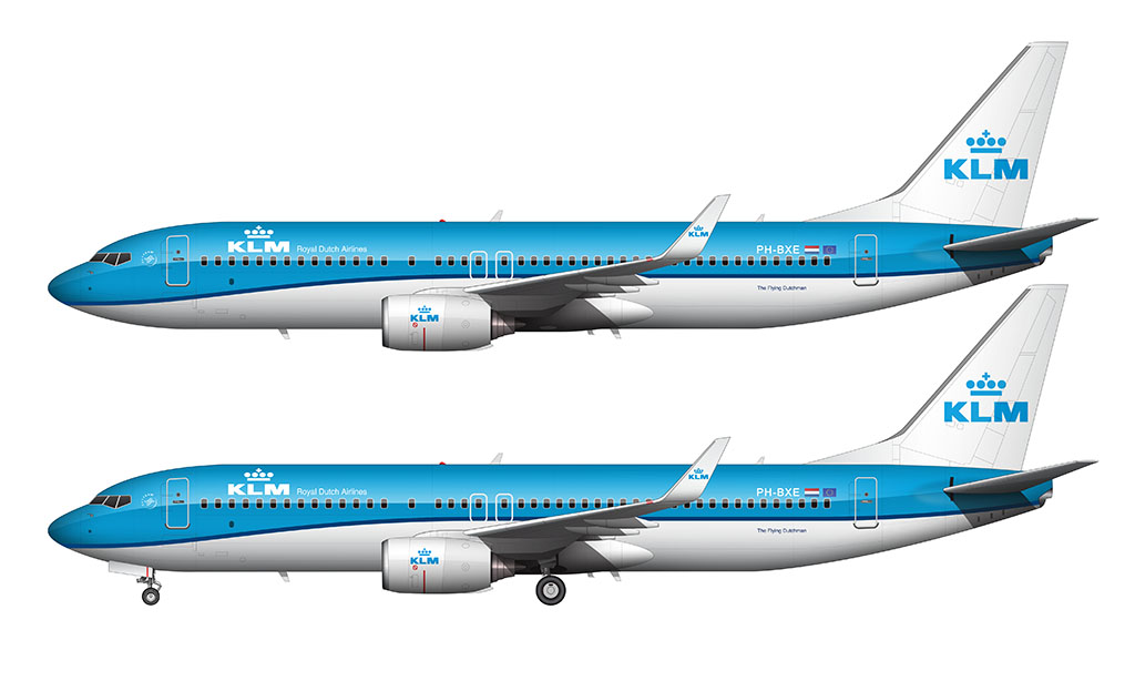
Officially known as the “drop nose livery”, the first aircraft to wear it (and the one they used in all their press materials) was an Embraer 190. IMHO, thanks to it’s long and lean fuselage, it was the perfect aircraft to accentuate the way that the traditional blue pinstripe (cheatline) dropped down towards the nose.
Hans Murris is credited for being the designer of the new look. I can’t imagine how much pressure he felt to be tasked to modernize the KLM livery, as it’s one of the most iconic brands in commercial aviation. However, he was the man personally responsible for the last few KLM liveries, so he was arguably the most qualified to do it.
How is this livery different from previous versions?
The main difference between the old and new KLM livery is the pinstripe / cheatline that runs down the middle section of the fuselage. It still separates the blue top section from the white lower section the way the previous liveries did, but a bit of downward curvature was added to it (just forward of the engines).
Just as the name of this livery implies, the line drops down (“droops” is more like it) to intersect the lower section of the nose. Something about it seems off to me, but it’s not terrible. At least it’s not as bad as what the Sun County Airlines livery evolved into. That was an extreme case of sloppy-looking droop.
Although I haven’t been able to find information confirming this, it appears that the pinstripe has been thinned down slightly. It’s hard to tell just by looking at photos, but it appears as if they did modify it slightly.
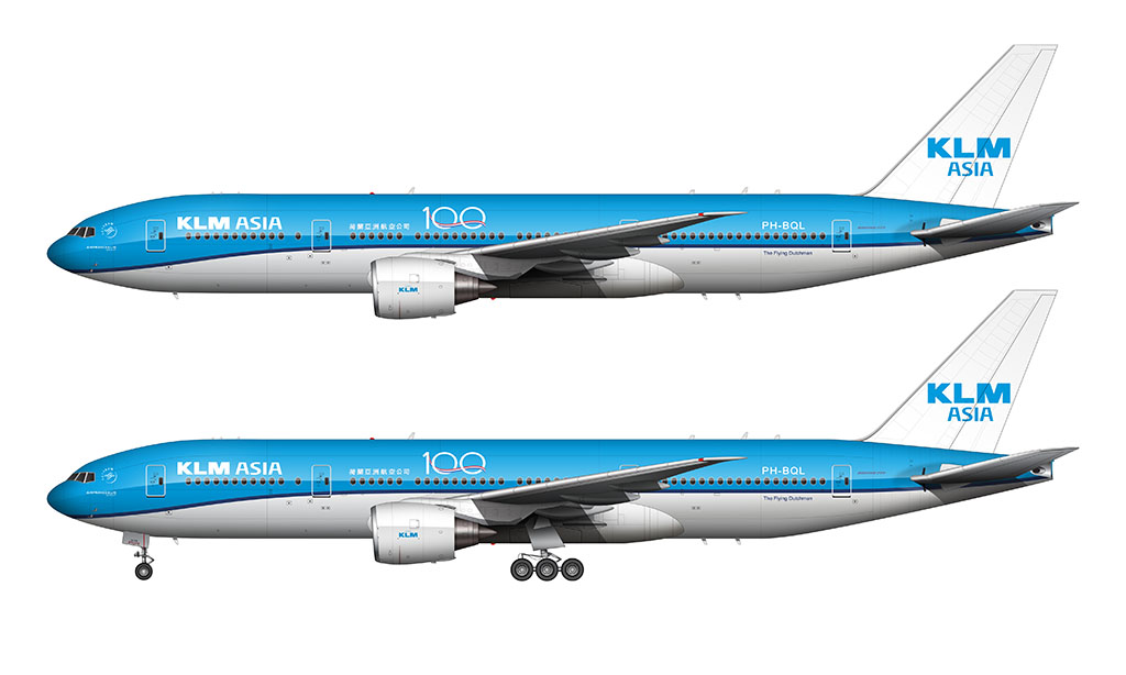
The KLM livery color palette
One of the best things about the all new KLM livery is that the color palette largely carries over from the previous one. The rich shades of blue used in previous liveries are a core part of the new look (thank goodness), which makes this livery feel familiar and traditionally KLM.
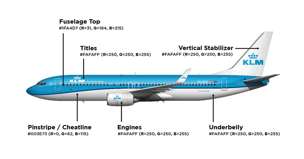
The most interesting thing about the KLM livery (something that most people doesn’t know), is that the white lower section of the fuselage isn’t white.
It’s actually a shade of cool gray that looks pure white in most lighting conditions. A neat little detail that even I would have missed if I didn’t do the research needed to do the illustrations you see above.
These are the colors used on all KLM aircraft:
- Fuselage Top: #1FA4D7 (R=31, G=164, B=215)
- Fuselage Bottom: #FAFAFF (R=250, G=250, B=255)
- Pinstripe / Cheatline: #003E73 (R=0, G=62, B=115)
- Vertical Stabilizer: #FAFAFF (R=250, G=250, B=255)
- Engines: #FAFAFF (R=250, G=250, B=255)
- Titles: #FAFAFF (R=250, G=250, B=255)
Pros and cons of the new KLM livery
I’ve refrained from injecting too many of my opinions of KLM’s new livery up until this point, but now it’s time to lay it all out and let you know what I really think about it. Basically, I think it’s a sharp looking livery. I just can’t stand how “lazy” the pinstripe looks from some angles.
Pros
- All the colors we know and love from previous versions of the KLM livery remain in the new one.
- It’s not predominantly white (like how the new Lufthansa livery is). No, it’s not as bold as the Southwest Airlines livery, but at least it’s not all white.
- It’s still one of the most iconic airline liveries in the world. You know it’s KLM when you see that light blue fuselage.
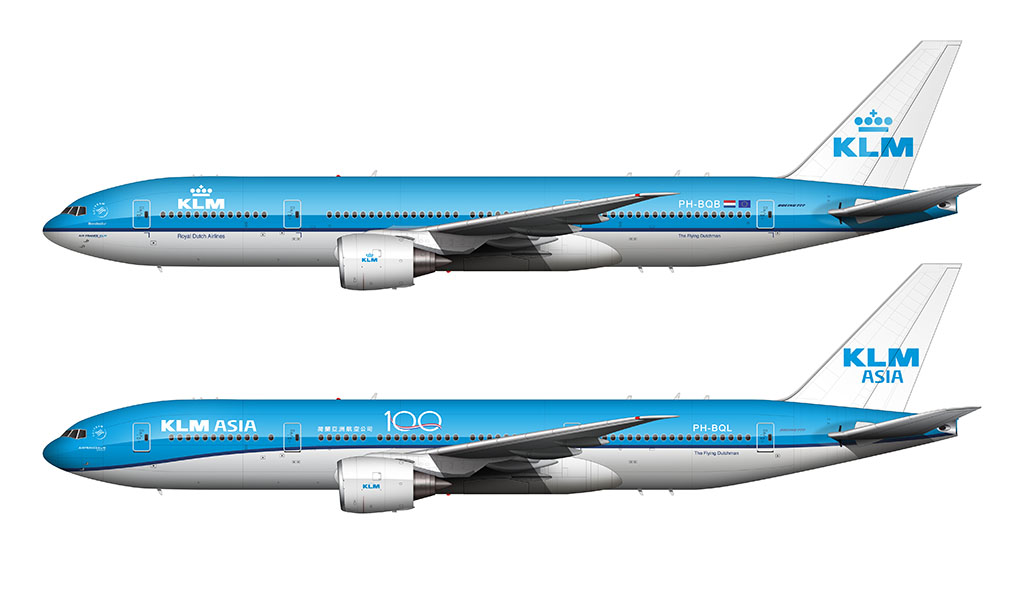
- It carries over from one aircraft to another decently well. There isn’t an aircraft in the KLM fleet that looks more awkward than the others wearing this livery.
Cons
- The way that the pinstripe / cheatline drops down in the front looks “lazy” to me. I can’t help but to think that it looks melted (and a bit sloppy) – especially considering all of the perfectly straight horizontal lines in the rest of this livery. Imagine if they did the same thing to the Northwest Airlines livery (which is very similar to the KLM livery). It would have been bad. Like, really bad.
- Although I’m a really big fan of the light blue color, it might have been beneficial to darken it up slightly in the new livery to help the KLM titles stand out more. They tend to get washed out in bright lighting conditions.
The reason for the ‘droop’ in the KLM livery is more than just aesthetics. Drooping the line puts the entire replaceable nosecone in the same color. If the line were straight and the nosecone color line didn’t match up it would not look right.
That’s a good point – it certainly simplifies things.
Me thinks the new KLM livery looks more modern, and therefore better, than the previous one. The Lufthansa livery looks good as well, though I would have opted for a slightly lighter blue, to prevent it from looking black under some light conditions.
also in my opinion i think the line going strait is kind of ugly because the nose looks odd, but with the line drooping it makes it look more curvy and more modern. plus the line is thiner, also making it look more modern.
Good points Dax. I especially like the thinner line as well.
Thank you for this article it is really nice! As is the rest of the website. The livery of KLM is one of my favorite. Seemingly by design the blue is the inverse of orange which is the color of the royal house of the Netherlands. KLM got the ‘royal’ predicate since its inception and the current king of the Netherlands is also a pilot for KLM. However! The blue reminds me of the blue in the old state flag (https://nl.wikipedia.org/wiki/Statenvlag) so I like to think it is a nod to the “Dutch” in Royal Dutch Airlines. Although the literal translation of KLM is Royal Aviation Company.
You’re very welcome GH! And thank you for the additional info (and thoughts about the color). While I much prefer orange over blue, I’m glad they went with blue. Bright orange feels cheap to me – probably because it’s a color that many ultra low-cost airlines use.
The introduction of the new livery almost coincided with the commission of KLM’s first Boeing 787 and I always figured that the droop had something to do with that, in order to ‘future-proof’ the livery. Notice that the tip of a Dreamliner’s nose is much lower than that of other airliners and the pinstripe now perfectly runs across it, like it used to do with other aircraft models. Had the pinstripe been kept straight it would have either run right underneath the 787’s windshield if it had been kept at the same height, or it would have run underneath the wings if it were lowered to the tip of the nose. I guess that Murris didn’t like either option and created the droop instead.
That’s a really good point – and a perfect example of why airline livery design is so difficult. What works on one aircraft may not work on them all!
Most airlines have modernised their liveries of late. I am a New Zealander and when Air New Zealand changed from their Teal coloured stabiliser to black around 10 odd year ago there was outcry from our small nations residents but we got used to it. One of the few airlines to change much in many years is Qantas, but I like the flying roo livery despite the fuselage being mostly white. Anyway what I do think would enhance the KLM and its recent livery overhaul would be the installation of the split scimitar winglets. Surprising how much a bit of modern bling can define the look and even enhance an airliners livery
Hi again Norebbo, I have been using your photos as reference and an excellent point you have made about the cool grey under fuselage on the new KLM livery on your posting. I am scratching my head as I am currently building the Big Planes Kit 1/72 scale of this exact aircraft. All the KLM resin kits available have white for the lower fuselage in the instructions including the BPK that I am currently assembling even though it is without a doubt a mild grey. This means the grey is so subtle that the model kit manufacturers could not source an off the shelf grey mild enough to commision to the instructions so went with white. I even experimented with light primer grey ( the lightest of all ) but still too grey. I guess white it’ll have to be!
Yeah, I wouldn’t worry too much about not getting it exact. I’m willing to bet that most people (99.67%) assume that it’s white.
The nerd in me wouldn’t be able to resist attempting to re-create it, but past experience has taught me that those types of experiments are always a giant waste of time haha.
Hi Scott
The Dutch, possibly some of the best designers in any number of fields, architecture et cetera really failed here.
That limp weird front is just so wrong.
And, please correct me if i’m wrong, they’ve modified it what now three times?
Finally getting to the solid blue nose on all ac.
BUT!! With their new a321neos w the mask, finally the stars have aligned and it looks smashing.
And don’t get me started on their special livery, the one where they ran out a paint halfway and switched colors lol with zero masking.
But their home base is AMS, the best airport in the world, one that goes above and beyond in recognizing aviation fans!!