In my opinion, the UPS livery is a masterclass in airline livery design. There have been three versions of it since 1988, each featuring the same basic color scheme while iterating on the best elements of the previous one.
It’s always been bold. Classy. And most importantly: unique. How many airline liveries can you name that proudly feature dark (1970’s) brown as confidently as this one does?
UPS Airlines liveries through the years
UPS Arlines was formed in 1988 as a subsidiary of the United Parcel Service. It’s the successor to UPS Air Cargo – which launched operations way back in 1929. For this overview, I’m only focusing on the liveries of UPS Airlines (1988 onward).
The launch livery: 1988-2003
Just imagine the challenge facing the designers of this original livery. The United Parcel Service was known for its dark brown delivery trucks and uniforms – a color scheme which doesn’t exactly translate well to airline livery design.
- Brown was very much out of style in 1988.
- Darker colors (such as 1970s disco brown) absorb heat, which can be problematic for finicky aircraft control systems.
- Using any color other than brown would have been very much off brand.
The solution that the designers came up with is what I consider to be a “safe compromise.”
- It was safe because contained very simple design elements which could be easily replicated from aircraft type to aircraft type.
- It was a compromise because they made “UPS brown” (R=35, G=2, B=0 – #230200) the secondary color rather than the primary.
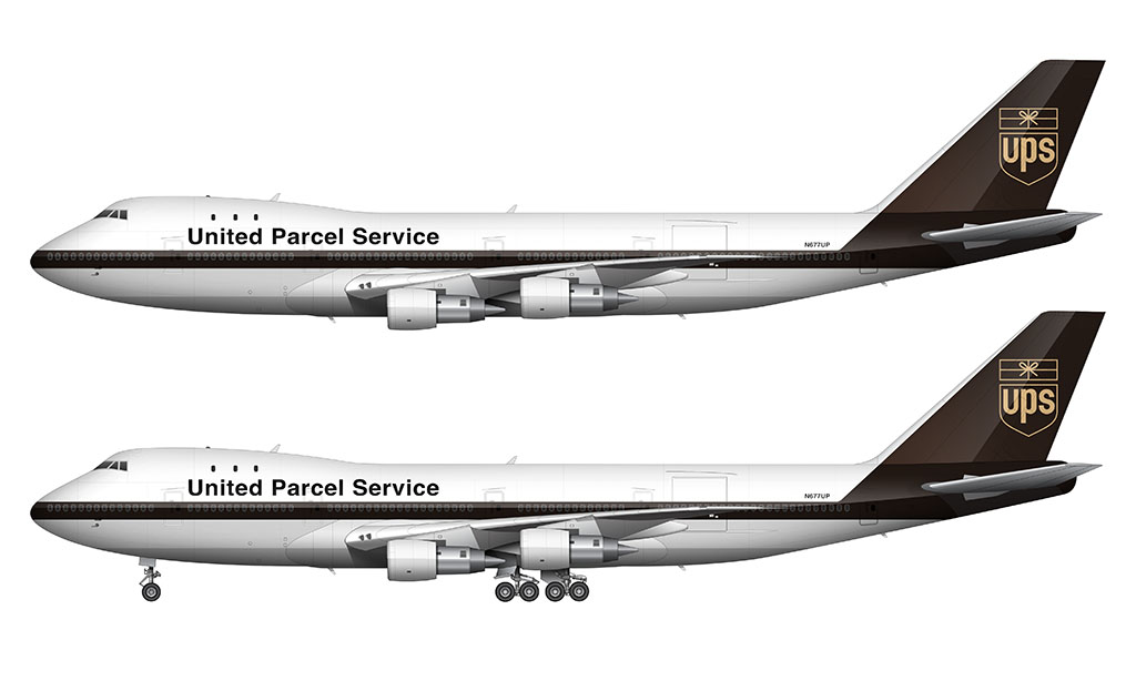
The vertical stabilizer was solid brown, and extended down into the fuselage to connect with that cheatline. The existing (beige) UPS package logo was placed in the center of the vertical stabilizer.
They played it safe with the main titles as well. “United Parcel Service” was spelled out in Helvetica bold (all black – not brown).
Finally, the very bottom of the fuselage was left exposed aluminum. It was a very clean (and classy) design IMHO.
The second livery: 2003-2014
To me, the most fascinating thing about the 2003 livery redesign was not only how modern it looked, but how subtly retro it was at the same time.
Retro you say? Absolutely! I mean, the brown and yellow color scheme is something we haven’t seen since the disco-era 1970s. It’s really hard for me not to give the designers credit for having the balls to plow ahead with a color palette like that in 2003. Totally hip, man!
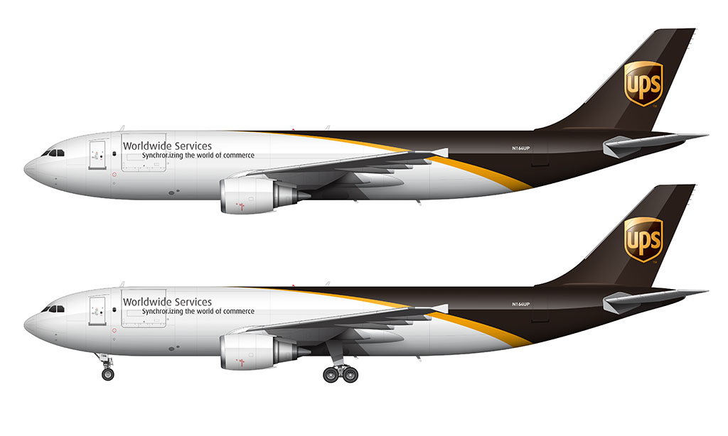
The basic premise of the original 1988 livery remained intact. The vertical stabilizer was just as brown as the previous version, and it blended down into the fuselage. The all new UPS logo of the time was placed directly at the center of it – just like the previous version.
Instead of a linear brown cheatline running down the entire length of the fuselage, it was visually sliced in half (from front to back) with a brown arch. The brown and white sections were separated buy a gold stripe (R=220, G=146, B=35 – #DC9223).
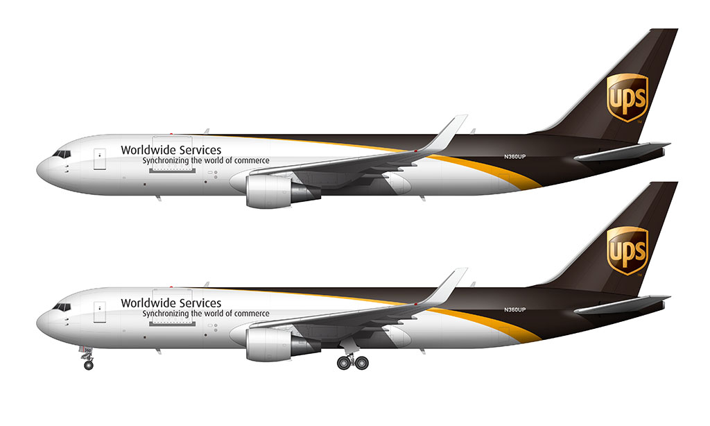
The “United Parcel Service” titles were replaced by “Worldwide Services” in a thinner (but still black) font similar to Helvetica. Just beneath those main titles (and offset slightly to the right) were subtitles that spelled out “Synchronizing the world of commerce.”
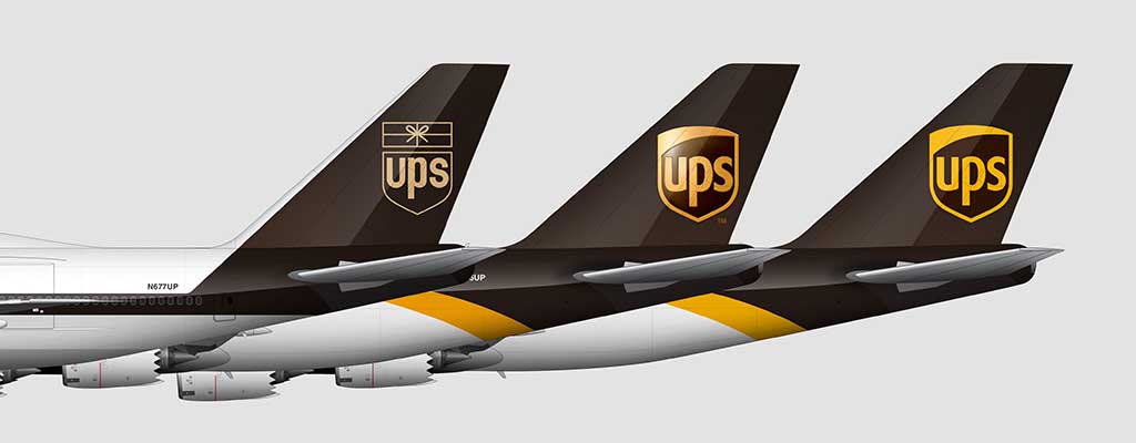
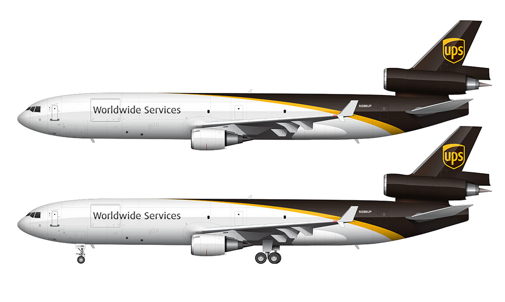
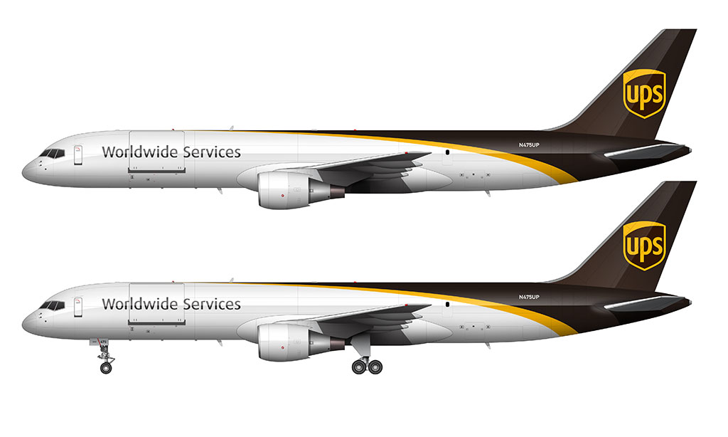
The current livery: 2014-present
You know the saying: “If it ain’t broke, don’t fix it. Unless you can make it better. In that case, go for it. But don’t F it up!” That’s exactly what the United Parcel Service brand and marketing team did in 2014.
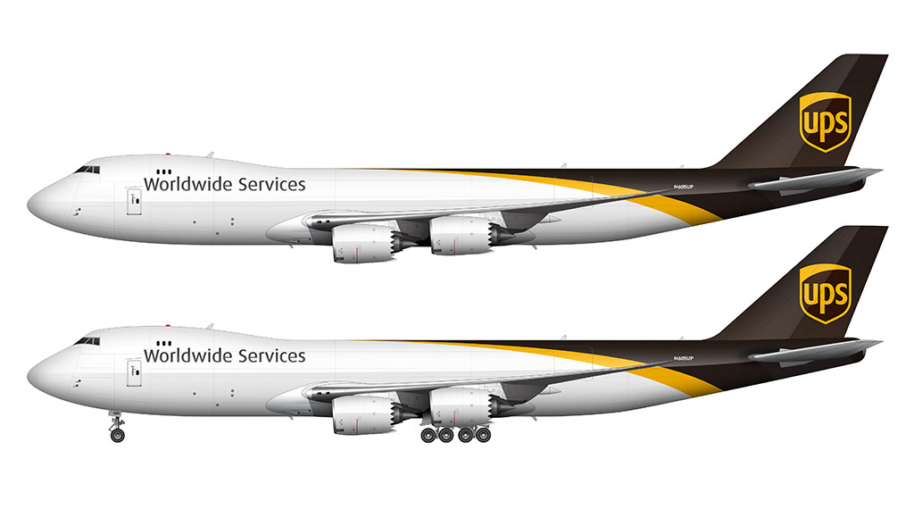
This was a very subtle update, with 3 changes that can be difficult to notice at first glance:
- The “Synchronizing the world of commerce” subtitles were removed from the forward fuselage.
- The gold color (of the stripe and the logo) was made brighter. The new color is R=249, G=184, B=9 (#F9B809).
- The UPS logo was replaced with the updated version. It essentially the same graphic but without the gradient highlight.
Kudos to UPS on doubling down on the “1970s brown” thing! Other than Etihad’s new livery, I can’t think of any other airline using any shade of brown as its primary color. The Saudi Airlines livery is close – but it’s more baby poop tan than brown IMHO.
What others am I missing?

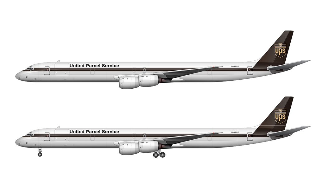
Create blueprints for A300 and MD-11 freighters
I already did – they will be posted soon!
Wow, thank you very much
And there will be cargo versions of the Boeing 707 and Boeing 747-200 ?
You’re welcome! Yes, those two will come eventually. The 747-200F will probably be first since I’ve already completed the 747-100F.
Wow I can’t wait to see them mate when are they going to be out
The MD-11F, 747-100F, and A300-600F are actually ready to go – I just need to write the posts (and get it all formatted). I’m hoping to get them published sometime within the next few weeks. No guarantees though, as I have the attention span of a gnat lol.
The -200F will come after.
Great
Nice job Scott 10/10 I needed that and btw are you going to make the Evolution of FedEx livery from 1971 to 2024.
Thanks Elijua – that sounds like a lot of fun actually. I’ve got a lot to say about the first Fedex livery!
U can say that again and maybe just maybe u can make your first plane company evolution like Airbus from 1970-2024 or Boeing from 1916 to today as well mate and I hope u know how to make planes from 1910’s lol
Plus when I first saw the side view of the planes I started to make them by tracing them and cutting them out
So Scott how long have you been making these sideview planes it looked really cool and why do you make them little 13 year old me wanna know
Oh and sorry for asking a lot I just kinda got a lot of ideas going, Honestly after hearing about your story I kinda wanted to know u better lol
Plus I kinda got a little challenge for ya
U think u can make the NASA B747-100 and the AN225 with them carrying the space shuttles in the NASA livery.
Again sorry if this is a lot
Hey scott do you mind creating the Boeing
Livery
I’m actually surprised that I haven’t done that one yet. I am in the midst of trying to finish up a few new templates though, so I don’t think I’d be able to do it anytime soon.
Could you do the Airbus livery? Including the ship that used to transport A380 components to the Airbus factory in Toulouse.
I probably should. There’s been some pretty neat ones over the years.
Mr.Scott, can you make the livery of Air China
There are so many airlines that I want to do an in depth livery analysis on (Air China being one of them). Some of their older liveries weren’t all that great IMHO. But they were all unique (from a western perspective at least) – and it’s worth talking about.
McDonnell Douglas, Bombarder and Embraer liveries? Anytime soon?
Probably not soon if I’m being honest. I’ve got a lot of other ones that I want to do first!
I’m down with the brown, but I prefer the old tail logo to the new one. A modernized version of that would have been better, IMO.
Hi Scott its Mary again can you make the federal express livery evoulotion
Kindest reguards Mary
Hi Scott;
Very nice webpage of UPS paint schemes. A couple of minor corrections….
The brown color used on all of UPS aircraft, trucks, and uniforms is officially called “Pullman Car Brown” from the color that Pullman rail cars were painted. The Titles on the aircraft are also Pullman Brown.
The paint schemes were the name United Parcel Service is actually spelled out on the fuselages…..UPS never dotted the letter’s “i” in the name, United Parcel Service.
Where worldwide services, or synchronizing the world of commerce, is spelled out, then yes those “i”s are dotted.
A couple of 747-100/200’s in the original paint scheme did slip through repaint’s in the 1990’s with the “i”‘s dotted. After a couple of years of noticing that, I mentioned it to a UPS manager, and within a month, all of the dots over the letter “i”s were painted over with white paint. You can find the occasional photo of the 747-100/200’s that had the i’s dotted on the airliner photo sites.
The DC-8’s and 747’s originally had bare metal engine nacelle’s. They began painting the nacelle’s white around 1988 at the same time the aircraft were being returned from the subcontracting Airlines that had been operating them as that year UPS decided to begin operating as it’s own airline.
I know all of this as I worked either directly for UPS or as a contractor to UPS a total of 38 years.