Of all the Middle Eastern airlines, the Qatar Airways livery has always been the least opulent. There have never been any flashy colors or complex shapes. It’s been clean, simple, and classy since the beginning.
The newest version is one of the few airline livery designs in the world featuring gray as the predominant color. On one hand, it would seem that they didn’t learn much from United‘s “Battleship Gray” disaster from the mid 1990s. On the other hand, maybe they did. It seems to be holding up well (so far).
A detailed overview of every Qatar Airways livery
Qatar Airways was founded in 1993, and began operations in 1994. There have only been three liveries since the initial launch, with the second and third one being nearly identical. Interestingly enough, minor design refinements (instead of a complete overhaul) is how the Emirates livery has evolved as well.
The launch livery: 1993-1997
The very first Qatar Airways livery was all about cheat lines and the color burgundy (the color of the Qatar flag). It consisted of two thin stripes running down the side of the aircraft, blending into a solid fill for the vertical stabilizer. On the vertical stabilizer itself, there was an abstract representation of an Oryx (with a circle around it) in all white.
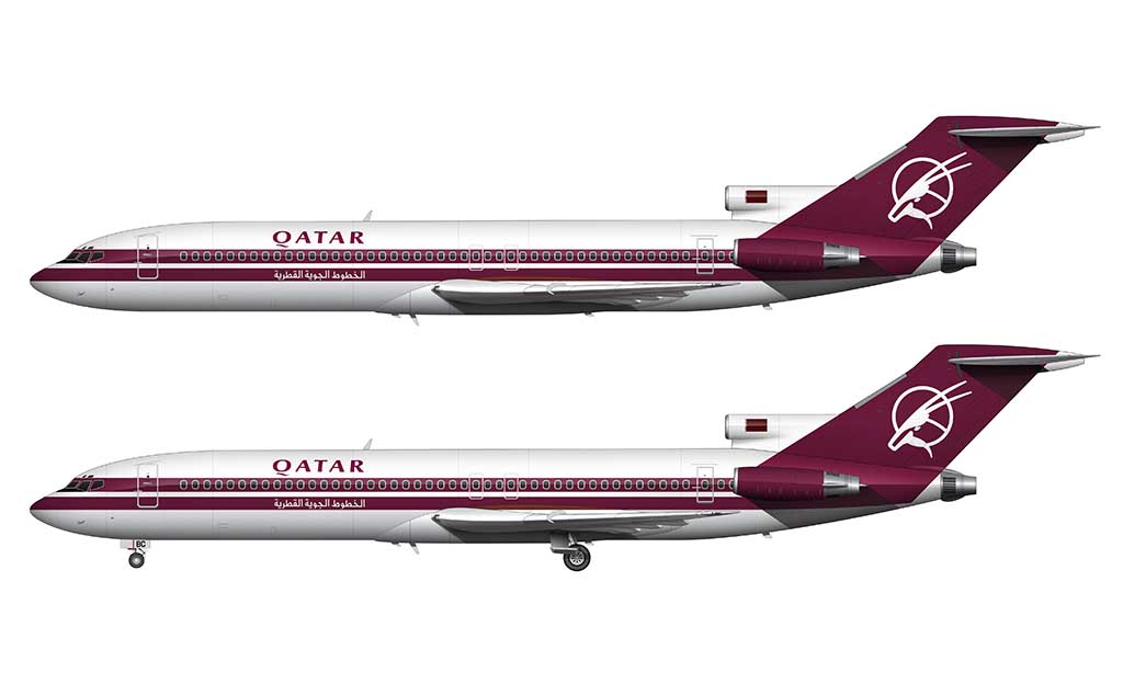
One of the most interesting things about the first Qatar Airways livery was the fact that it was slightly different on either side of the aircraft. On the left side, the Qatar titles were displayed in English (above the pinstripes). Directly underneath (in the lower pinstripe), it was displayed in Arabic.
It was reversed on the right side of the aircraft. The main Qatar titles were written in Arabic (above the pinstripes), and spelled out in English in the bottom pinstripe.
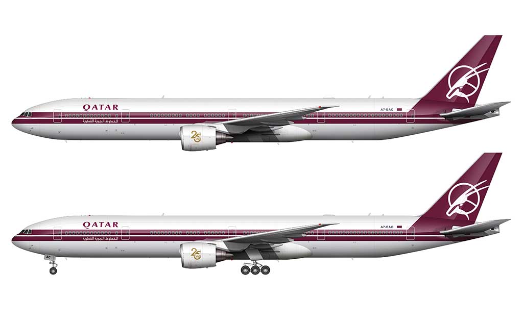
In 2018, to celebrate the 25 year anniversary of Qatar Airways, they painted one of their 777-300/ER aircraft (A7-BAC) in this original livery. The only difference from the original version was the addition of a gold 25 year anniversary sticker on the engine cowlings.
The second livery: 1997-2006
Qatar Airways unveiled their second livery in 1997. It was a drastic and more modern version of the first one, with very few elements being reused.
The primary difference was the elimination of the cheatlines. “Linear horizontal lines” was still the predominant theme of this new livery, but it was done in a way which was cleaner and far more modern. It reminds me a lot of the Korean Air livery.
The top portion of the aircraft was painted light gray, with the bottom portion remaining pure white. Qatar Airways was spelled out in full (instead of just “Qatar”), and a cleaner sans serif typeface was used. It was displayed in two colors (gray and burgundy), and positioned in the upper gray section towards the front of the fuselage.
A redesigned Oryx logo was included as part of this new livery. The circular outline was replaced by abstract horizontal lines, and it consisted of two colors (dark gray and burgundy). Little did we know that this was going to be the livery they would iterate on for the next version.
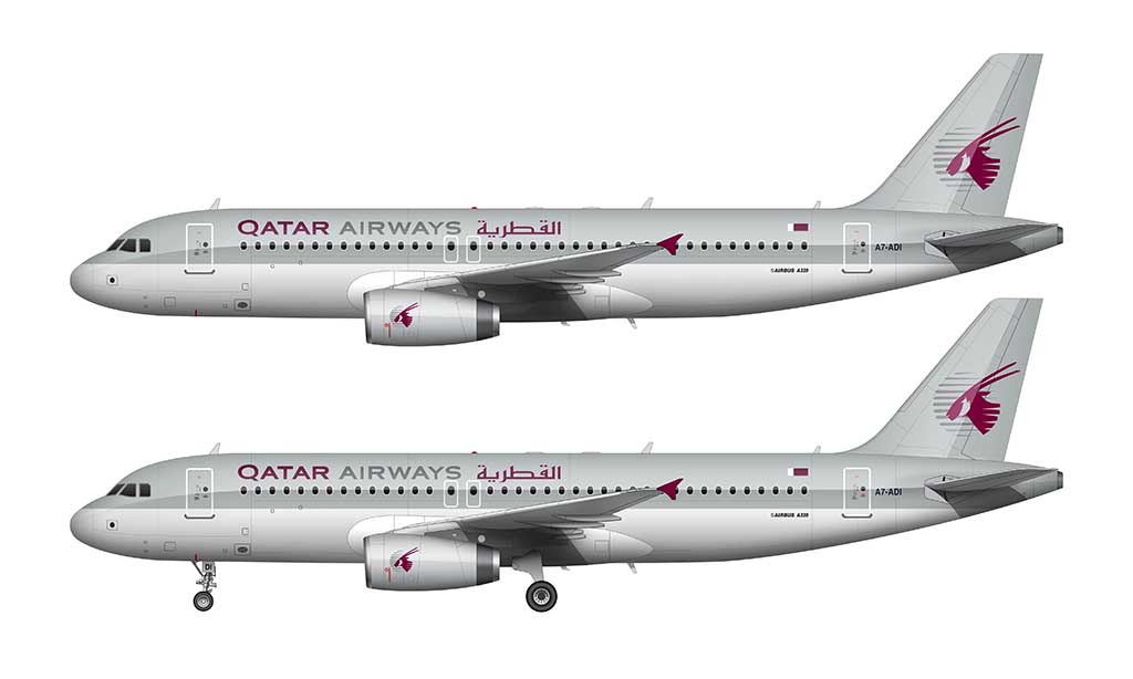
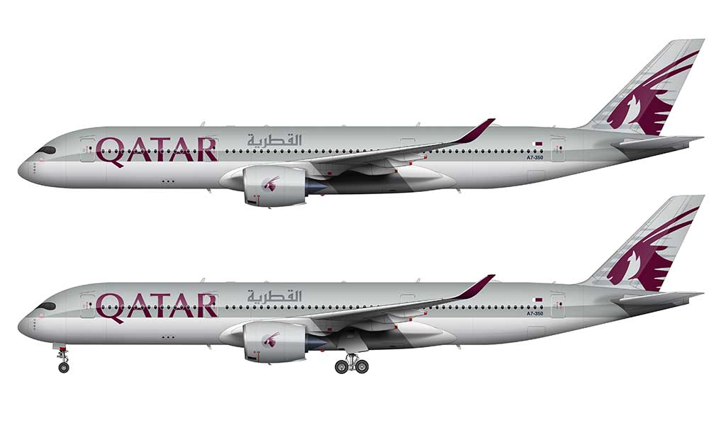
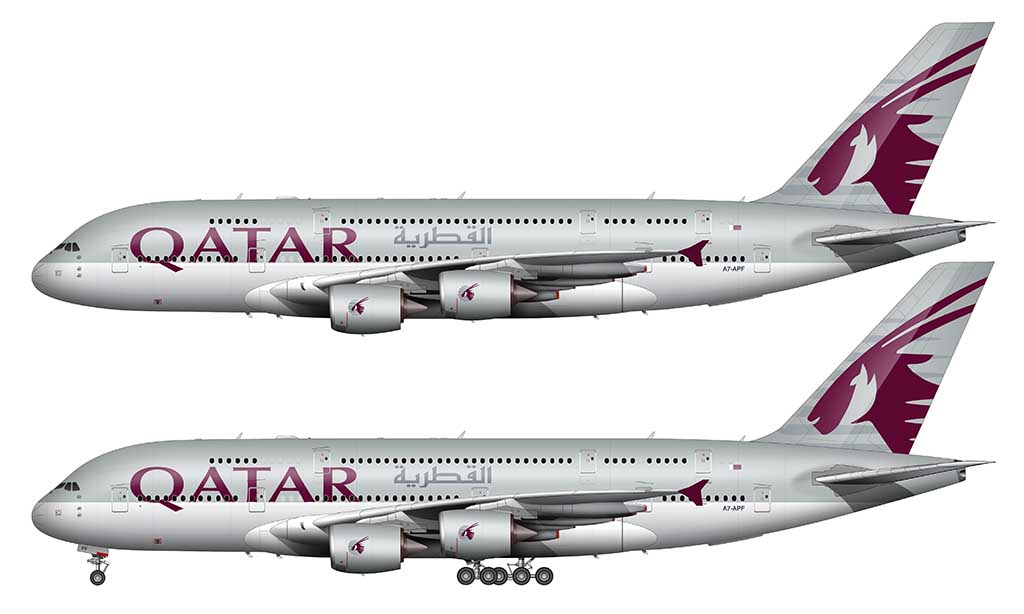
The current livery: 2006-present
As boring as it may seem, iterating on an existing livery design (instead of starting over from scratch every time) is a smart way to evolve a brand image. For its newest livery (unveiled in 2006), Qatar Airways modernized all the best parts of their previous livery.
Essentially, instead of trying to shock the world with opulence and high style (the way the Etihad livery did), they chose a more subtle and classier solution.
All of the base elements from the previous livery remained. The colors were exactly the same, as were the base shapes and how they were applied to the aircraft. The differences were in the little details.
The primary difference was an all new typeface for the Qatar titles. They retained the same burgundy color from before, but they were increased in size by roughly 350%. I also like the fact that they anchored the baseline of these titles to the horizontal line that separates the gray and the white in the livery itself. It’s a neat design detail.
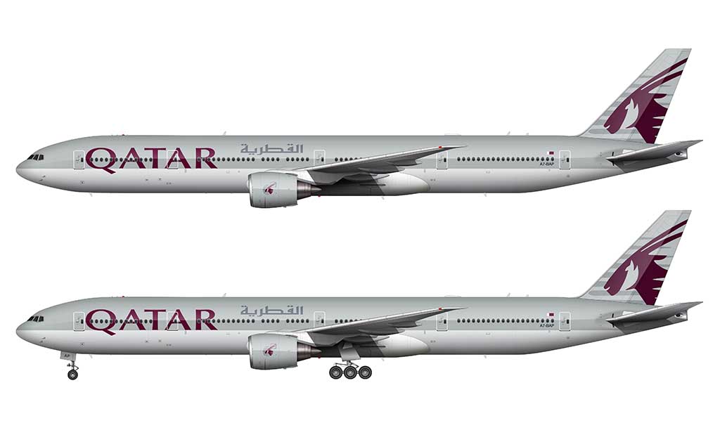
The word “AIRWAYS” was eliminated from the titles as well. This helped to create a much cleaner and sophisticated look for the entire livery. That’s my opinion anyway.
The large Oryx graphic on vertical stabilizer was refined slightly. The main difference was its size and how it was placed. Instead of floating the entire graphic in the center of the vertical stabilizer, they placed it so that the head of the Oryx filled most of the space. The horizontal gray lines bleed off the edges.
I also decided to illustrate a Qatar airways cargo 777F (below) to show you how clean and simple the addition of the “cargo” text was to this livery. It’s an extremely clean sans serif typeface, very similar to what was used for the main titles in the previous livery.
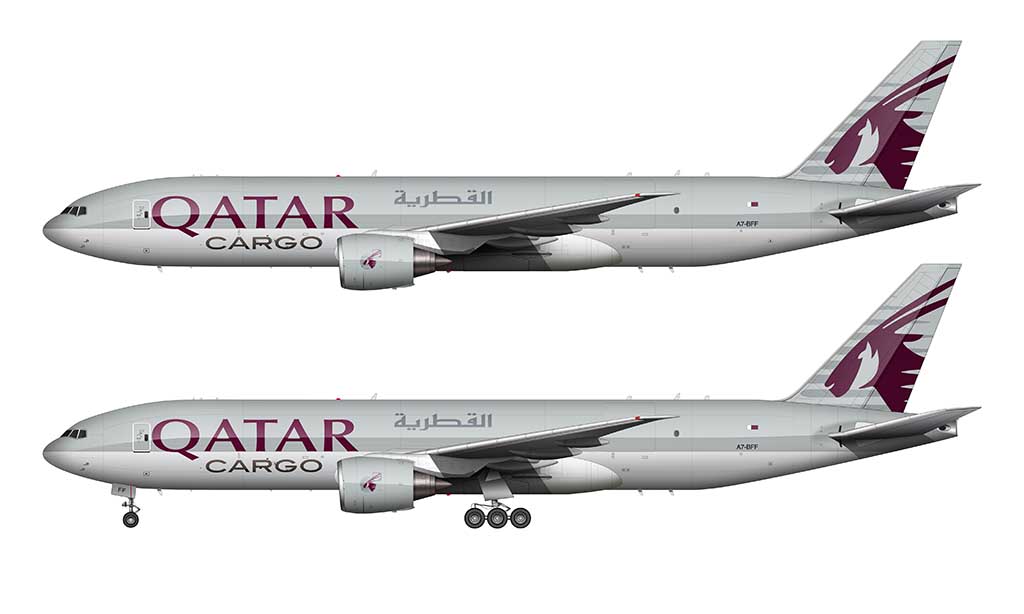
I appreciate their restraint for not going crazy with the addition of this extra element for the freighter aircraft. Simply spelling out the word “cargo” and placing it beneath the main titles was good enough in my opinion.
The color palette
At the top of this overview, I alluded to the fact that gray isn’t always the best choice in airline livery design. The primary reason is because it’s prone to fading over time (just ask United Airlines). The secondary reason is that most people see gray as a dull and uninspiring color.
I’m not one of those people by the way. I like using gray as a base element for my design work, even though I’ve been told from clients in the past that gray is strictly off limits. I applaud Qatar Airways for going against the grain.
There are five colors in the current livery for Qatar Airways:
- Gray (fuselage / engines): #BDC2C2 (R=188, G=194, B=194)
- Gray (Arabic script): #7F8790 (R=127, G=135, B=144)
- Gray (logo): #C9CCD0 (R=201, G=204, B=208)
- Titles / logo (Oryx): #5C0631 (R=92, G=6, B=49)
- Underbelly: #FFFFFF (R=255, G=255, B=255)
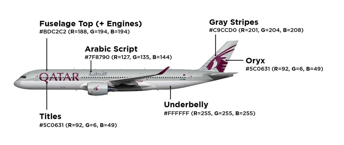
This color palette is darn near perfect in my opinion. The only difference I would like to see is perhaps a lighter shade of gray. This would prevent aircraft from looking worn and faded over time, which is especially important for a Middle Eastern airline. In a region known for opulence and luxury, it’s probably a bad look to have your airplanes looking ratty and run down after a few years. Just a hunch.
Hi Scott! (or should I call you Norebbo?!) hehe
Your work is really amazing. I’m an airplane dork as well hehe, and I’d like to suggest something for you…I honestly think you should create some livery concept art, for some existent companies, like Emirates, AAL or Ryanair “prototype/concept” liveries. Using the same colors and history behind the company. What do you think about it?
I know you are probably busy the most part of your week, but…it’ll be great for the avgeek community.
Thank you.
Hey Victor! Yeah, conceptual liveries are a lot of fun. They take a lot of time unfortunately and it’s always fairly low on my to do list. My long-term plan is to start doing more of those as I scale back on other projects. Hopefully soon…
This is a great livery, in all 3 revisions.
As a lover of classic aviation, I really dig the launch look. And as someone with more than a few complaints about 2000s trends in airline design, the contemporary revision is still pretty damn good looking.
But I think the 2nd revision is my favorite. Almost like what the “battleship gray” version of United’s livery *should* have been.
I totally agree with you about the second livery. United’s battleship gray livery would’ve been so much nicer in that lighter shade of gray!
Nice work, Scott!
I believe that the current livery also had a previous version to it, with a much larger Oryx at the tail (in fact, it went all the way to the fuselage). This is a good reference: https://cdn.plnspttrs.net/43852/a7-acg-qatar-airways-airbus-a330-202_PlanespottersNet_710565_7b68b44e78_o.jpg. It was later changed to the current design. Not sure if there are any other differences though.
Best,
Thomas
Interesting! I had no idea that version of it even existed. Thanks for letting me know – I’ll look into it…
I know burgundy is their national color, but combined with the gray, it gives very ’80s Post-Modern corporate logo vibes.
(See also: the livery used by MarkAir, a US regional airline, in the 1980s.)
Hi Scott
I’ve never had the opportunity to fly Qatar.
Nor any of the ME3, or ME4 if you include Turkish.
But I would absolutely fly them in a heartbeat simply because their livery is so gorgeous and classy.
Emirates is simply ugly and garish.