The evolution of the Alaska airlines livery has been very interesting. It started out in the 1960s as something very regional and niche specific. Today, it’s one of the most recognized brands across the entire United States.
The original Eskimo livery: 1976-1990
Alaska Airlines unveiled in all new livery in 1976 that would define it’s brand image for decades to come. The key element of this livery was the depiction of the Eskimo character on the vertical stabilizer of all its aircraft.
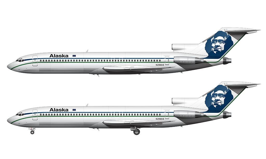
This Eskimo, commonly referred to today as “Chester”, was a significant departure from the rugged outdoorsman it replaced in the previous livery.
Two separate thin lines of color ran down the entire side of the fuselage one (a green one above the windows and a blue one below). They met at a point near the cockpit windows.
Just as it was in the previous livery, the Alaska typeface remained bold and simple. This was a custom font, but it was largely based on Helvetica bold.
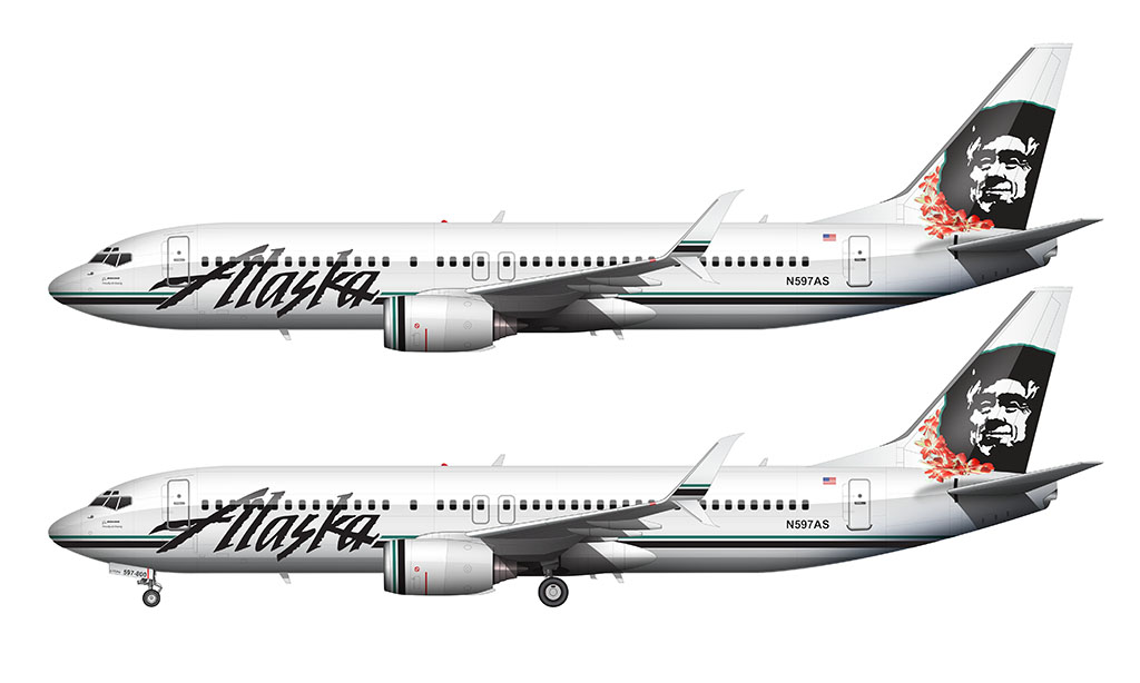
The Icicles livery: 1990-2016
Alaska airlines unveiled an all-new livery in 1990 which was a stark departure from the previous one. Interestingly enough, all of the elements from the previous livery (the stripes, the Eskimo, and the single Alaska titles) remained. They were just rearranged slightly.
The biggest change was the style of the “Alaska” font on the forward section of the fuselage. This new version was much larger, and featured a custom (more rugged) typeface more representative of Alaskan culture. Many referred to these typeface looking like icicles (and thus resulting in the nickname for this livery).
The stripes were pushed down the bottom section of the fuselage. They were also made with varying thicknesses (the green line was thinner), and were connected down the entire length of the aircraft. The dark blue color was replaced with black.
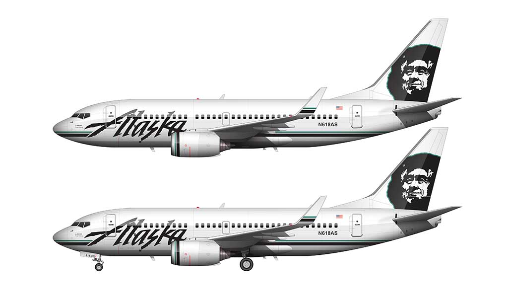
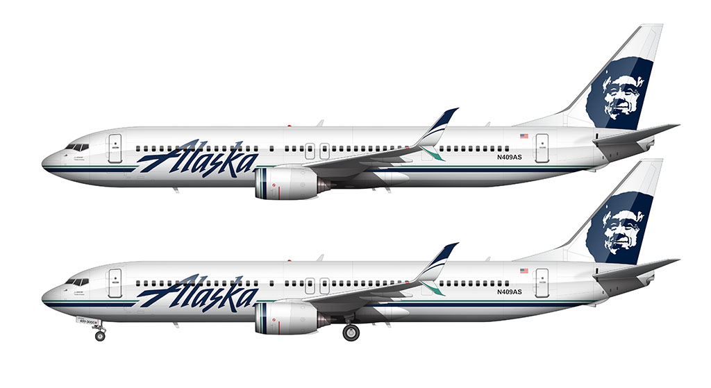
Updated Icicles livery: 2015
The biggest feature of this update was the modernization of the Alaska Airlines typeface – to put it in the simplest terms possible, they smoothed out the font to look more modern (and a lot less like icicles).
They also replaced the black accent colors with dark blue, which to be quite honest, is difficult to even notice unless you’re looking at the airplane under direct sunlight. It’s so dark as a matter of fact, that it still looks black under overcast conditions . I never would’ve even known this if I hadn’t found a slightly over exposed picture on the Internet of an airplane wearing this update. Who says over-exposed pics are worthless?
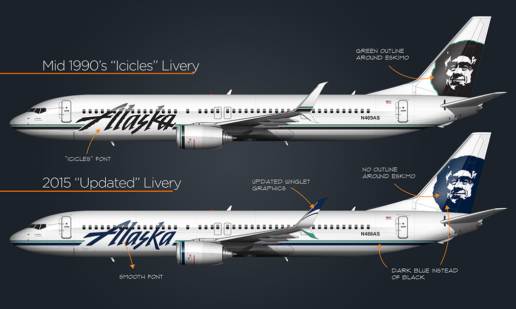
Additional modifications included the removal of the green outline around the portrait of the Eskimo (Chester) on the vertical stabilizer, as well as an intricate (and swoopy) version of the dark blue and green stripe on the winglets.
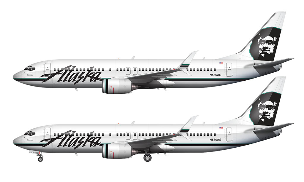
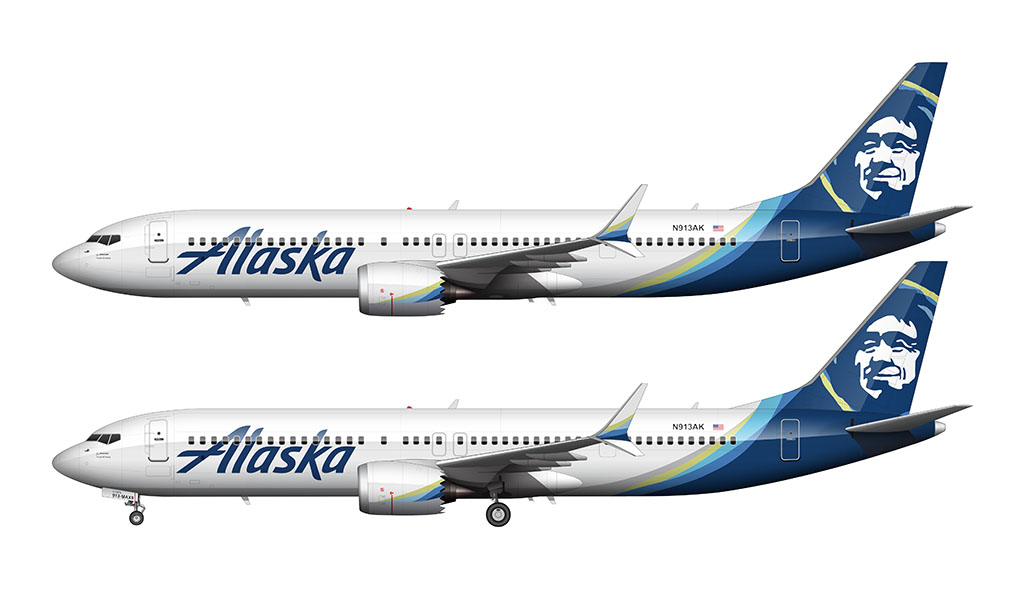
Overlapping colors livery: 2015-present
In early 2015, the Alaska Airlines livery changed yet again. This was easily the most significant livery update in the history of the company, featuring a bold departure from traditional Alaskan design elements. It was also pretty good timing considering that they would be soon need to begin repainting aircraft in the Virgin America livery to Alaska Airlines. Might as well start with an all new design, right?
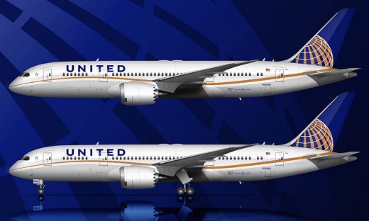
787 Northern Lights livery: 2025-present
Because having two active liveries at the same time sounded fun (I presume), Alaska Airlines unveiled a livery specifically for their 787 fleet in mid 2025. I consider it to be and evolution of the 2016 livery rather than a whole new design. Except for the part about the Eskimo. They kicked him to the curb.
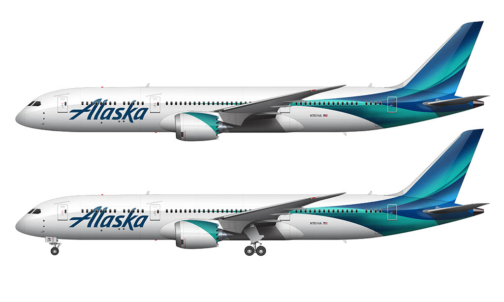
Note that I wrote an entire post about the new Alaska livery (for both the International 787 and domestic fleets) and I’d recommend reading that to learn more about them.
Nice job. I fly those for a living so I’m glad Alaska is a favorite. Cheers!
Thanks! I’d really like to try and recreate some of the Alaska Airlines special liveries, so stay tuned for those.
Love this! I started doing cross stitch when I was being treated for leukemia, but as I got older I found out there aren’t many “manly” patterns out there. I took your drawing and made it into a pattern for myself. Hope you don’t mind! I’m over 100 hours into it but the end is in sight! I wish I could attach a picture for you.
That’s awesome! I don’t mind at all. Please feel free to email me at norebbo at g mail dot com with a pic – I’d love to see it!!
i understand you probably have a lot on your plate-could an Alaska new livery come out sometime in the future please?
It’s something I’ve wondered about as well, and I wish I had time to come up with some potential concepts! The more I think about it though, I doubt they will push forward with a new livery since they just finished a major rebranding effort.
Hi Scott!
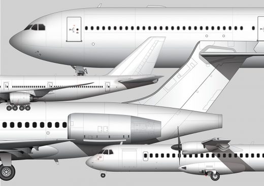
I know you are busy, but here are some suggestions for future aircraft you could illustrate –
ATR 42
A318
A300
B717
B727
B707
Bombardier Dash 8 300/200/100
Yeah, that’s a long list! Haha! The 717 is actually coming up next, and I’ve already got a 727 in the works that I just need to finish. I’ll get to them all eventually!
No one I know who works for or worked for Alaska Airlines refers to the Eskimo as Chester.
Yeah, I’ve heard the same. It’s definitely a nickname created (and spread) by AvGeeks.
Hello,
I’d like to suggest working on an Alaska Airlines 737-900ER in the new livery, maybe N247AK?
Also, an Alaska Airlines 737-800, N583AS?
I had always heard our friend on the tail referred to as “Ernie the Eskimo”. Initially he didn’t smile, perhaps as he was only one of four logos used on the fleet – each had their own color. The others were a gold prospector, a totem pole, and the last – onion domes (representing Russian Alaska). Ernie became the lone logo in 1976, and gained a smile. A quick Google search does tell us that the model for Ernie (if that is indeed the nickname, and my apologies if not) is said to be Chester Seveck, a native of Kotzbue.
Nice post Scott!!
Big Alaska fan here.
Would love to see some Alaska 787 renderings!! The 76 livery has always been my favorite. Looked so great on the MD80s too
Big news for Alaska today! Off to Rome!
Thanks Robert! I’m still coming to terms with Alaska Airlines going long haul haha. It’s exciting for sure but it doesn’t really seem normal yet. The 787 is going to look great with Chester on the tail!