The history of the Sun Country Airlines livery is fascinating. It went from being the absolute worst, all the way to being the very best, and now it’s bad again.
Despite their flaws, every Sun Country livery has been bright and colorful. They’ve always zigged when everyone else zagged, and I have to give them credit for at least trying to be unique.
All the Sun Country Airlines liveries (most of them were bad)
There have been 5 different liveries for Sun Country Airlines since they initiated service way back in 1983. Actually, there have only been 3 if you don’t count the slight revisions and adjustments they made along the way. Let’s have a closer look at all of them:
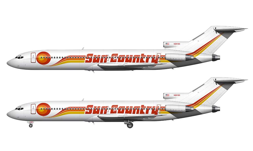
Launch livery: 1983-1996
The launch livery for Sun Country Airlines in 1983 is probably the worst airline livery that I have ever illustrated. It’s a three color design featuring an abstract (clip art) sun graphic near the forward section of the fuselage.
Colored stripes flow outward from the sun graphic and extend the entire length of the fuselage and up into the vertical stabilizer. Smack dab in the middle, “Sun County” is spelled out in large red block letters. It’s horrible really.
Other variations
There was a slight revision to this livery in the final few years of its existence. The most significant change was the tightening up of the Sun Country titles which eliminated the excessive spacing between the characters. Additionally, the T and the R letters were modified to look more substantial.
A slightly more subtle modification was the tightening up of the stripes that extended outwards from the sun graphic. They appeared less “lazy” in this version, with a straighter and more horizontal top edge.
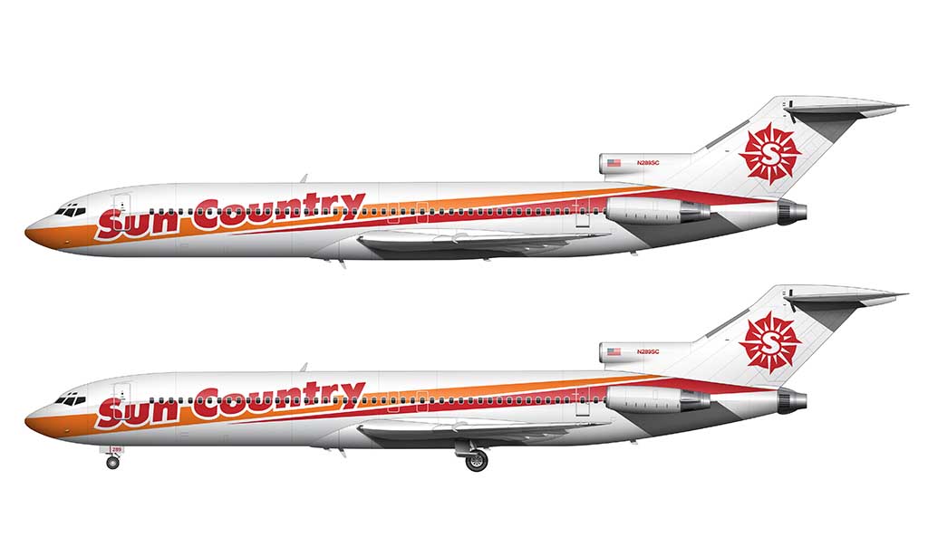
In doing my research for these illustrations, I noticed a handful of other variations of this livery:
- One of them featured a revised color palette consisting of more saturated colors (still red, orange, and yellow).
- Another version that I saw was more angled. Instead of the stripes flowing out of the sun graphic in a gentle swoop, the angle was more severe. I assume this was either a temporary livery, or just a test. Maybe it was a complete **** up by a third party contractor. I don’t know
The bottom line is that Sun Country experimented a lot with this livery over the years. They most likely knew how bad it was, and I don’t blame them for trying to fix it (any way possible).
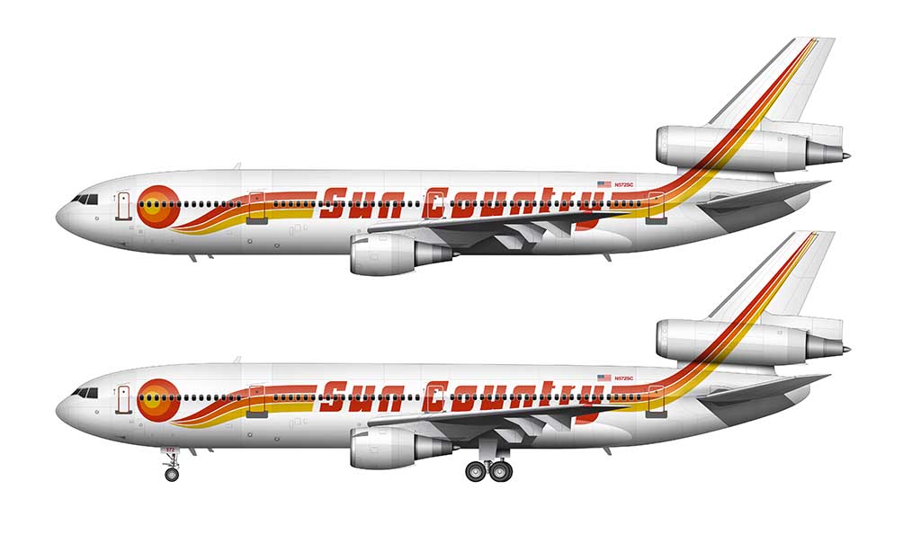
Orange livery: 1996-2001
Sun Country unveiled a much needed a redesign of their first livery in 1996. The same basic elements from the first livery were retained, and I consider it to be a very nice evolution of the brand.
The most significant change was how the Sun Country titles intersected the stripes. Instead of being placed between them, they became part of the stripes themselves. Other changes included:
- The elimination of the clip art sun graphic
- Rotated titles and stripes (roughly 25°)
- Tapered stripes from thick to thin (from front to back)
- An all new Sun Country Airlines logo (mimicking a sundial) was placed on the vertical stabilizer
- An all new color palette – which matched one of the concepts they were experimenting with in the final years of the previous livery. Instead of three colors, now there were only two (orange and red).
Overall, this was a decent looking livery. My only real issue with it is how the stripes were cut off at the base of the vertical stabilizer. It would’ve been nice if they extended up into the tail like the previous livery.
737 livery: 2001-2016
Just when we all thought that Sun Country Airlines had no sense of style, they shocked the world with the unveiling of an all new livery in 2001. It was (and still is) stunning.
This livery, which was created to celebrate the launch of 737 service, was way ahead of its time IMHO.
- The majority of it consisted of the color blue, which was to represent the sky.
- The Sun Country sundial logo was redesigned slightly, and placed larger on the vertical stabilizer (and even rotated slightly).
- A watermark-style light blue version of that sundial logo was placed behind the cockpit windows and forward boarding door.
- The Sun Country titles were reduced in size, and changed to all white.
- The signature orange stripes from the previous livery remained, but in a slightly different form. It was now a single stripe which separated the blue from the white and extended down the entire length of the fuselage (curving up at both ends).
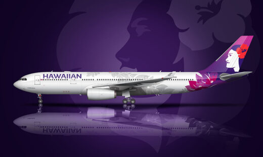
This was a brilliant livery. I’d even go as far as to say it was probably one of the best airline liveries of all time. I like it even more than the new Etihad livery (which is one of my all time favorites). It’s even better than the Hawaiian Airlines livery, which I consider to be nothing short of brilliant.
Simplified 737 livery: 2016-2018
Unfortunately, Sun Country Airlines couldn’t leave well enough alone. In 2016, they unveiled a modified version of this livery which was much simpler and far less beautiful. And probably a lot cheaper to maintain.

The most significant change was the elimination of the light blue watermark sundial graphic at the forward section of the fuselage. That was the best part of this livery IMHO, and it completely changed the look of the design by eliminating it.
The other significant change was to the titles. Instead of saying “Sun Country,” it was changed to “Sun Country Airlines.” A thinner typeface was used instead (in all caps).
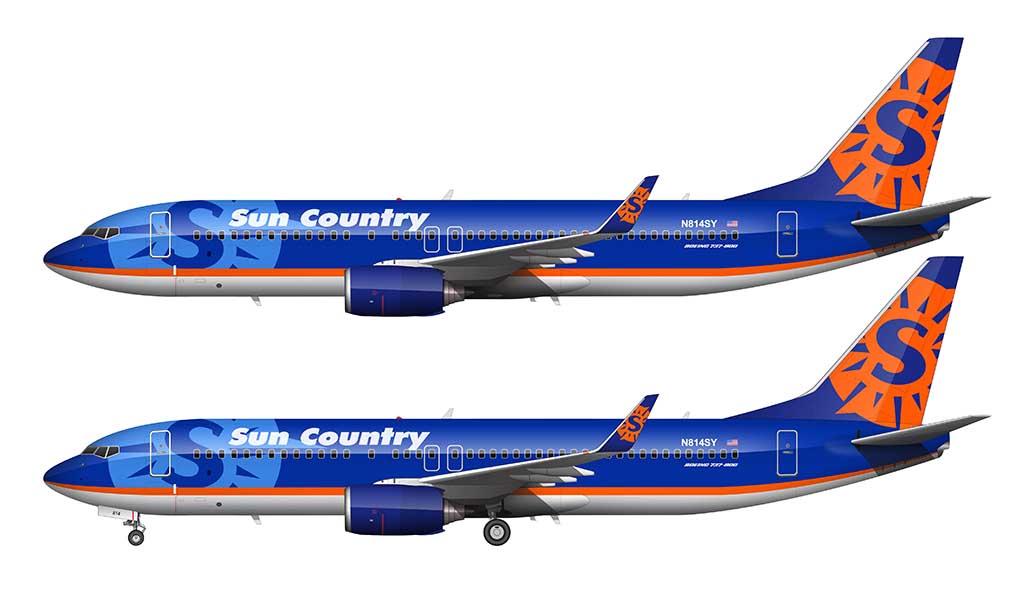
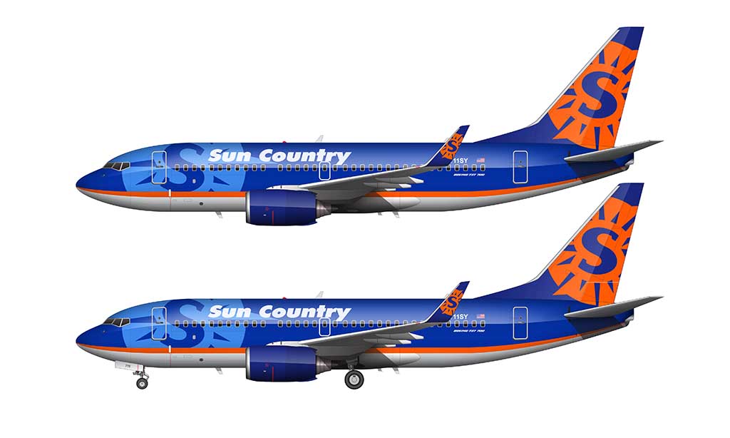
Tide Pod / Employee livery: 2018-present
It’s true. All good things must come to an end. in 2018, Sun Country announced that they would be switching to an ultra low cost business model. This was a significant change for the airline, which resulted in all new livery.
Instead of just coming up with one design and running with it, the Sun Country management team presented four different designs to their employees and let them choose. This was the result of that vote:
Upon first glance, it’s actually not that bad of a livery. I like how they retained the brand colors from previous liveries, and I certainly can’t fault it for being bland and boring.
The problem is that it’s a very busy design with many inconsistent design elements:
- The typeface of the Sun Country titles doesn’t match typeface of the S in the sundial logo.
- The color of the sundial logo is slightly different than the bright orange used in the rest of the livery.
- The droop of the white coming down from the top of the fuselage seems a bit extreme to me. I would’ve liked to see this a bit less severe. Maybe it’s just me, and I don’t like droops, because I said the exact same thing in my detailed overview of the new KLM livery.
- There’s actually a textured terrain map graphic in the dark blue sections. I didn’t even notice it until I was creating the illustration above, and honestly, I don’t think this livery needs it. It just adds unnecessary complexity – especially if nobody is going to notice it!
This was such a stunning livery. The new owners ruined their brand by giving it a cheap and unnecessary makeover. Why a waste!
Sun County had the best livery of any airline in the US by far! I didn’t like the new one when I first saw it, and I still don’t. 🙁
Do you have an image of the Sun Country with the white “swoosh” over the rear of the aircraft? I am the Media Director with the Eastern Iowa Honor Flights who charters Sun Country for our trips to DC. I’d like to find an image of one to use in a newspaper ad if possible that I could photo shop our 40th flight on the side.
Hi Frank – I don’t yet have any illustrations featuring other versions of this livery, but I am planning on doing some soon. I’ve got a lot on my plate at the moment though, so it’s not likely I could have them done in time for your needs. My apologies!
I could be reading too much into this but I think there are a couple of subtle nods to Minnesota over the years. The chunky T in the second version is shaped a bit like the state. And the terrain map in the newest one looks an awful lot like the lake depth maps that everyone has in their cabin.
Good observations Peter! The ‘T’ thing makes total sense now that I look at it. I never liked the way that it looks – but if it truly is a reference to the shape of the state of Minnesota, then… I hate it no more (lol). That’s genius!
And yes, I figured that the terrain map had something to do with local geography. It’s pretty neat that it might actually be a depth map.
You should write an article about how suncountry pays its flight attendants and mechanics as little as possible but absolutely takes care of the pilot’s. As they should. But everyone else gets paid much less then the industry standard. They arent looking to make the most as they are a low cost carrier but they should be paid fair wage and they ate not. My wife works there and compared to other airlines suncountry is way off since new management took over. Not to mention the flight attendants have been flying without a contract for 10 years. Yet the company is making record profits. Ceo gets his big bonuses. My wife gets ZERO of any kind of bonus which seems off to me being they make so much money. I loved the story about the aircraft and colors. Dont get me wrong my wife lives her job her and her fellow flight attendants just want to be treated fairly as far as the industry standard. Im thinking about paintinf some old kids airplanes into suncountry cilors as we collect airplane stuff of course. Lol would be nice for the general public to really see what happens behind the scenes. They dont get very much put to the public as they are not lime Delta or the others. Just wish someone would put them on blast a little bit so people know the real truth.
Thanks for the insight Tim! I hardly ever hear anything bad about Sun Country, so it’s interesting to hear what things are really like from the inside.
Hope things get better.
Hi Scott. You mentioned the S in the logo and typeface don’t match. Have they ever (since the sundial/compass rose was introduced)? Love your blog, btw! I just discovered it.
Hey Colin – they’ve never matched. Can’t fault them for being inconsistently consistent from one livery to the next I guess.
Glad you’re enjoying the content!
Scott
I’m sorry, but I’m being a total airline snob here.
I never felt like Sun Country was a legitimate airline, thus never liked anything they did paint wise! Lol
Don’t @ me! Lol