Every Cathay Pacific livery from 1971 to present has been subtle and classy in a way that has made me compare everyone else in the industry to them.
I’m basically at the point where my default thought whenever I see an airline livery that I don’t like is something along the lines of: “Idiots! They should’ve consulted with Cathay Pacific first!”
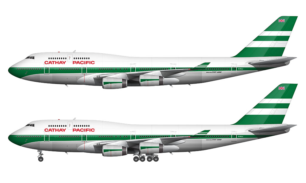
1971-1994: Green and white stripes livery
The 1971 Cathay Pacific livery is most commonly (and brilliantly) referred to as the “lettuce leaf sandwich” livery. It’s essentially a design consisting of alternating green and white stripes.
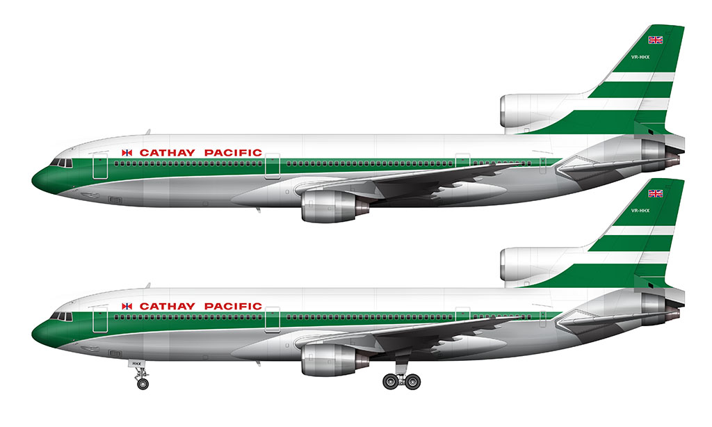
The vertical stabilizer is solid green with two white stripes cutting through it horizontally. These stripes are varied in thickness (the top is thinner than the bottom). The Union Jack flag was applied to the top of the vertical stabilizer during the time when Hong Kong was a British Dependent Territory.
A single green stripe ran down the entire length of the fuselage. Unlike other airline livery designs at the time, this stripe varied in thickness. It was thicker (and curved downwards) at the nose, and it tapered to a point at the tail cone.
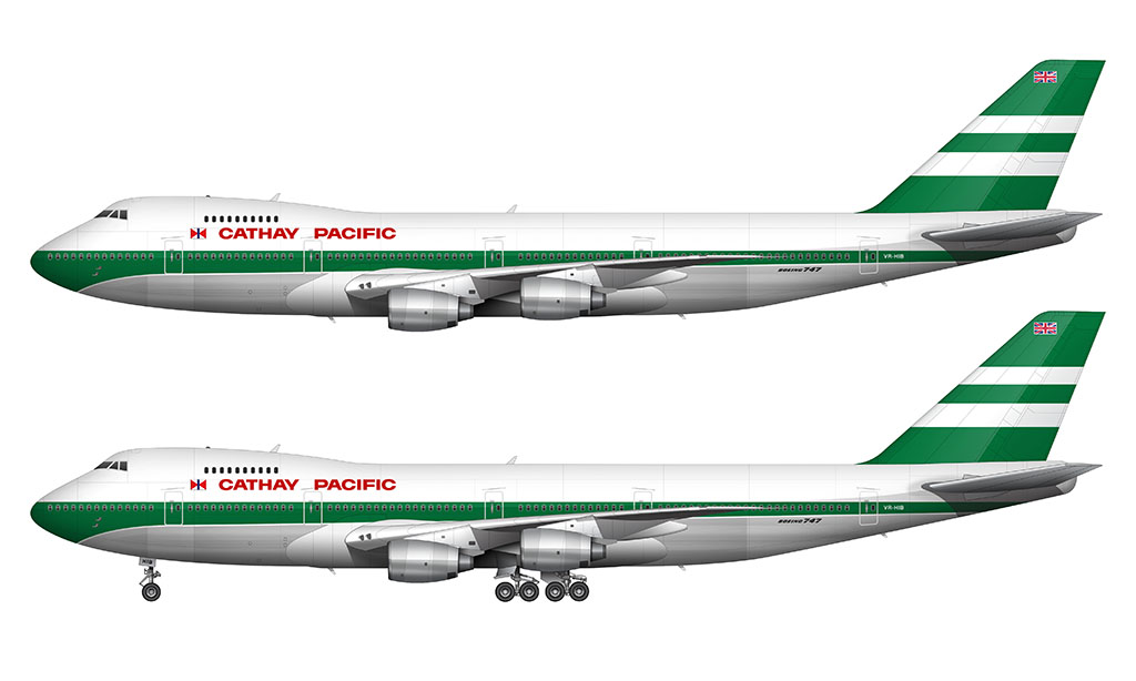
The fuselage was painted solid white above the stipe. It was left bare metal beneath it. Separating the green stripe and the bare metal was a thin white pinstripe.
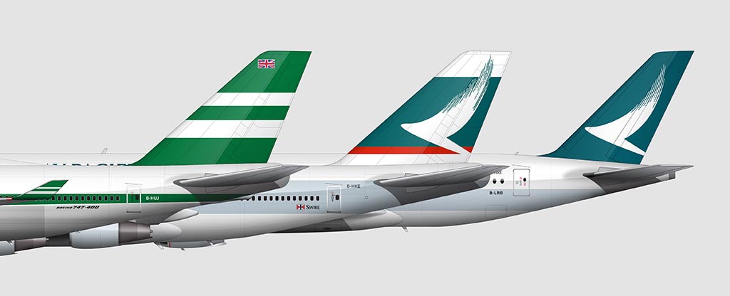
1994-2015: The Brushwing livery
Designed by Landor Associates and introduced in November 1994, the “Brushwing” name is a perfect depiction of what it is. The tail logo features an abstract depiction of a wing represented in a brush-like texture. The upward motion symbolizes flight. It’s probably one of the best airline logos ever created IMHO.
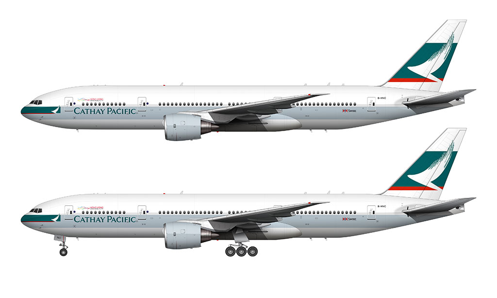
This livery is fairly simple. A solid stripe of color (light blue) runs down the center of the fuselage. The thickness of that stripe remains consistent from nose to tail, but it’s vertical positioning on the fuselage varied depending on which aircraft type it was applied to:
- On the 747, the stripe covered the entirety of the boarding doors and windows
- On all other aircraft, the stripe was positioned below the windows
I don’t think the Brushwing livery looks as good on the 777 and A330 / A340 as it does on the 747. The large band of white on the upper section of the fuselage makes this look like an unbalanced livery design on those smaller aircraft types.
The colors are soft and complimentary, and the typography is clean and precise. However, it’s the addition of several little details which makes this such a brilliant livery:
- The small block of solid green (featuring the Brushwing logo) at the nose provides the perfect amount of visual balance with the dark green on the vertical stabilizer.
- Two red stripes (one of the base of the graphic on the vertical stabilizer and the other on the solid green block on the nose) adds just the right amount of contrast to all of the other design elements. This livery would’ve been completely different without it.
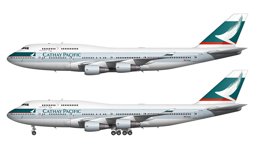
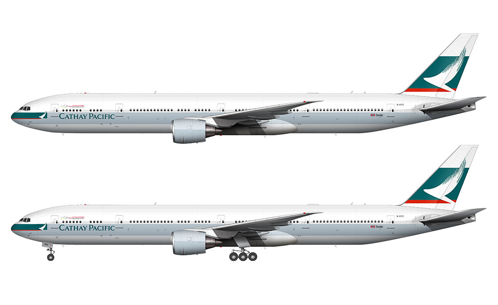
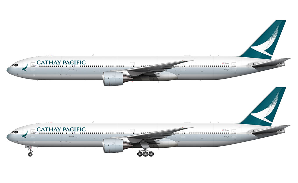
2015-Present: Brushwing livery 2.0
Cathay Pacific unveiled an update to the Brushwing livery on November 1, 2015. It was more of an evolution than a complete redesign. Honestly? I missed the original announcement, and I didn’t even notice the change until sometime in 2016. It was that subtle. Or maybe I’m just that stupid.
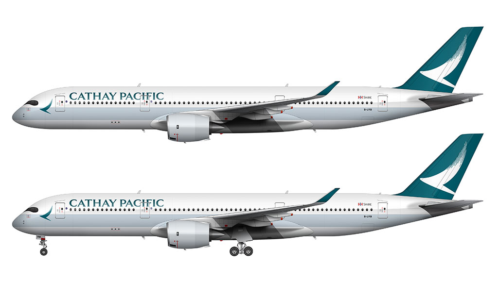
Cathay Pacific worked with Eight Partnership on this brand refresh. The overall structure of the Brushwing livery remained, but there were a few significant changes:
- The Cathay Pacific titles were changed to be fixed case (instead of mixed-size uppercase in the previous livery).
- The titles were moved out of (and above) the horizontal blue stripe. They also increased in size.
- The vertical stabilizer is solid green with a solid white (and enlarged) Brushwing logo covering a significantly larger portion of it.
- The dark green block (with the white logo) at the nose was eliminated. A larger (and dark green) Brushwing logo was put in its place.
- Just as how it happened on the most recent Korean Air livery, all red accents were eliminated.
Can you make Air Canada’s evolution next?
YES
I probably should considering that I already have an assortment of Air Canada illustrations ready to go. Maybe!
TBH this would be goated if you made a brushing 2.0 A321NEO
I’m probably going to do that one soon (I just didn’t get it done in time for this overview).
Lettuce be thankful? What?
You kinda need to read the entire article for that make any sense lol
Ur working on air india right?
Hey, I know that you get a lot of suggestions. But could you do Avianca’s livery history?
That would definitely be a fun one. But I’m working on Air Canada right now…
After Air Canada, please make templates of Boeing 777-200LR MF and 777-300ER SF. This is converted to cargo Boeing 777-200LR and -300ER
I am working on a complete redo of my 777 templates. It’s a slow going process, but it’ll be nice to have all of the variants accounted for.
could you make the new 80th livery? hopefully it won’t be hard because its very similqr to he luttuce leqf livery
I will at some point. I just find it interesting that of all the liveries to choose as the basis for the 80th anniversary, they chose that one. Not my favorite lol.
yeah, it’s overhyped , don’t get me wrong it’s not the worst, but they could’ve made it more unique compared to the the old livery