When it comes to vintage airlines and aircraft, the Pan Am livery has pretty much been at the top of my “cool” list for as long as I can remember. Growing up in the 80’s, Pan Am was the pinnacle of what I considered to be a true international airline. With their huge fleet of (then) modern wide body aircraft, five star onboard service, and a very impressive global route network, I considered them to be the best (which was a pretty big deal in my little 10 year old brain).
This ultimately (foolishly?) led me to compare them to everyone else – never mind the fact that I was just a boy and I (nor anyone I knew) had ever once stepped foot on any Pan American aircraft. All I knew was that this was the airline that I saw all over TV and the movies, taking my heroes to destinations all over the world to fight crime and do amazing things.
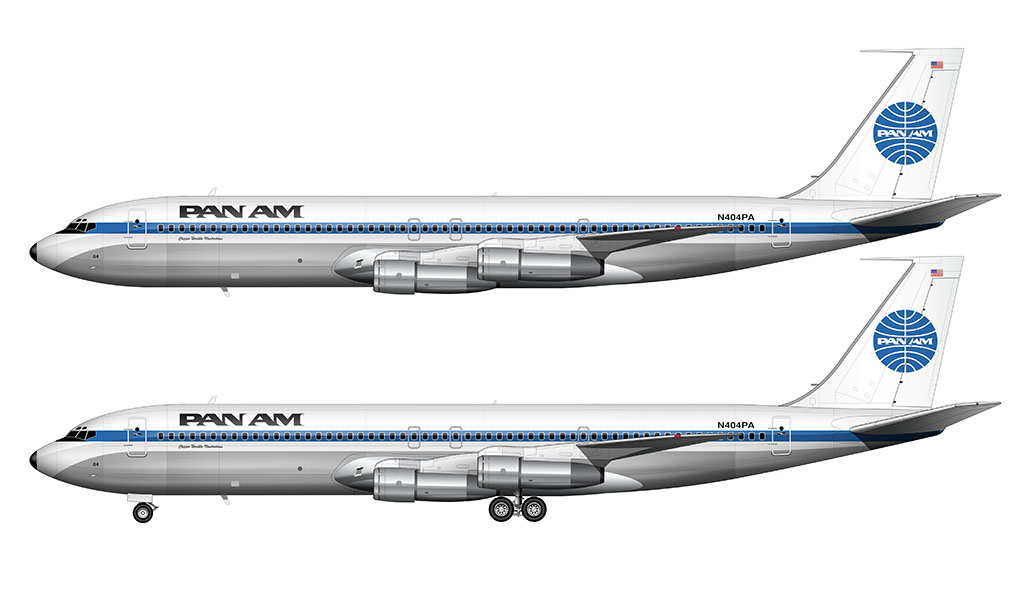
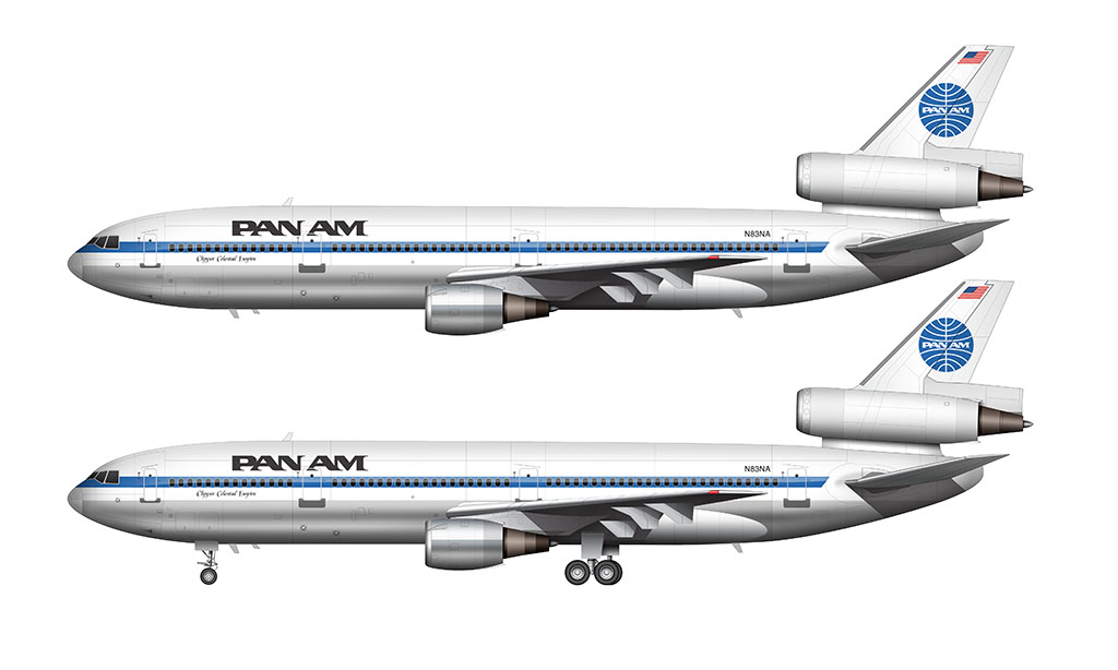
Pan Am “Globe” livery: 1958-1984
Designed by Edward Larrabee Barnes and Charles Forberg (an architect), the ironic “Globe” livery is the one that I think of whenever I think of Pan Am. There were many versions of it, but to me, the original one introduced in 1958 is the best.
While the Boeing 747 probably seems the most “Pan Am” to me, I tend to like this livery on the DC-10 just as much. This combination just screams “1970s” to me, which speaking in airline terms, is actually a good thing.
Yeah, that was a time when air travel was still considered luxurious and somewhat extravagant – and I’m totally bummed that I never got to experience any of it. Does anyone have a time machine I can borrow?
Shortly after putting the final touches on my Airbus A320 templates, I couldn’t resist the temptation to paint this classic version of the Pan Am livery on it. Why not, right?
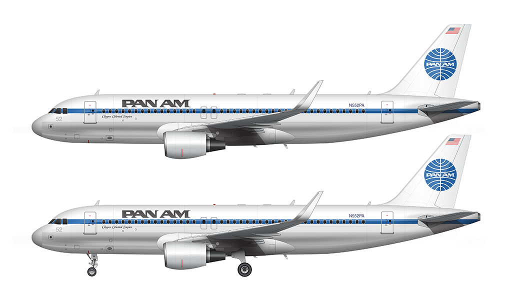
I did have to take a few artistic liberties with it, namely painting the engines white instead of keeping them bare metal (which was common back in the day). I’m not sure why, but an A320 with bare metal engines just looks…odd. I also made the conscious choice to use cfm56 engines. And of course, it just had to have sharklets.
As far as fantasy liveries go, I almost like this one better than the Saul Bass United 787 I created.
Pan Am Billboard livery: 1984-1991
Pan Am later switched to an all-new livery in the 1984 which featured larger PAN AM titles on the forward section of the fuselage, while retaining the original globe logo. That was one of the first “billboard” liveries ever done in the airline industry, and while nice, I don’t think it had the class and subtlety of the previous livery design. Gotta love the classics.
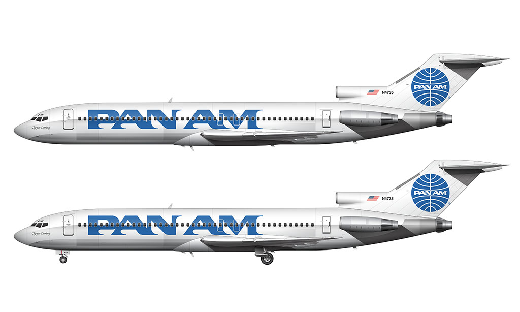


You hit it on the mail here. Looking down history lane, there s nothing close to what Pan Am has accomplished… for their time. This was such a classy livery. The white belly accentuated the blue cheatline. The billboard lacked elegance.
I actually didn’t mind the billboard livery all that much – it’s what they were using just as I was really getting into airliner stuff, and it’s the livery I think of first whenever someone says “Pan Am”.
Pan Am definitely had a great livery with the initial “globe” design. The only other airline I believe can match the Pan Am color scheme is the Air New Zealand livery of the 1970s to early 80s. It looked great on both their DC-10s and later 747s.
I agree. I consider the original Pan Am livery to be my favorite of all time. Not only because of the way it looks, but because of the memories it invokes. As an 80s child, that livery was all over TV (and in the movies)!
Hi mate could you do a Qantas constellation
Cheers
Hey John – I’ve got to find the time to illustrate the Constellation first. It’s a beautiful aircraft that would look great in the Qantas livery!
Do you know what white was used in the Pan Am livery?
I am building a larger scale model of the Orion III Space Clipper from 2001 A Space Odyssey. The filming model was a light grey with slightly different color panels (to simulate deterioration from usage). I can’t imagine that if Pan Am is its prime were actually flying something like that that it would a different livery from their planes or that they would let the panels become discolored, so I won’t be painting it to match the filming model.
That’s a very good question Alan – I always assumed it was pure white. Even now, when looking at a high resolution well-lit photos of Pan Am aircraft, it looks as white as snow. There was likely a technical reason for using gray during filming (perhaps to enhance the discoloration thing you mentioned).
hey Scott is me Elijuah again if ya dont remeber but i was lookat the history of Pan Am, it was good but you forgot the Boeing 747-100 and 747SP (btw and u forgot the Clipper maid of the seas which again is the 747-100) think u can all that and for the clipper maid of the seas was a memorial for flight 103 from Pan Am which was caused by terrorist bombing on the 21st of December in 1988 over Lockerbie in Scotland killing all 259 people on the plane and additional 11 on the ground and found who did the bombing. The US announced charges against Abu Agila Masud two years ago, alleging he had played a key role in the bombing on 21 December, 1988.
Yeah, there are so many aircraft that I need to add. The history of Pan Am is amazing – I definitely need to go back and redo this entire writeup.
Dedicating an entire section to flight 103 is something that I would like to do as well.
Good morning, I’ve collected some of the large aluminum travel agency airliners and have recently retired. So finalyy some time to work on restoration the ones that need some help. I’ve recently invested in a Cricut Vinyl Cutter and so, I’m able to both make masks for painting various liveries as well as also having printed vinyl decals cut and applied also on some variations. All just a learning process currently, however most all of my collection consist of Lockheed Constellations at this point. So, this would mean early Pan American World Airline liveries. I can reinvent the wheel myself or understand if you’ve created or would design templates for earlier liveries? If so, are your designs scaleable to various sizes, ie: 1:43, 1:53, 1:72, etc?
Thanks much, Tim
Hey Tim – congrats on your retirement!
To be honest the airline livery stuff is just something I thinker with on the side. I don’t have any decal kits available for sale – nor do I have any interest in providing that as a service. I’m primarily focused on creating highly detailed aircraft templates.