Here are 15 Ferrari logo illustrations that I recently created. I’m actually sort of curious to see how popular these will be (or not), as the car guy in me would much prefer creating logo illustrations like this instead of the same ‘ol stock images I’ve been making for the past five years.
Past experience has taught me one very important thing about stock photos and graphics: whatever *I* think will be popular doesn’t end up being so. And everything that I’m almost embarrassed to upload usually becomes my most downloaded images. Go figure.
Anyway, being the huge automotive enthusiast that I am, I suppose it was inevitably that I would eventually create an entire set of logo graphics for my favorite automotive brand. I mean, I already created Porsche logos so why not?
Ferrari logo set 1
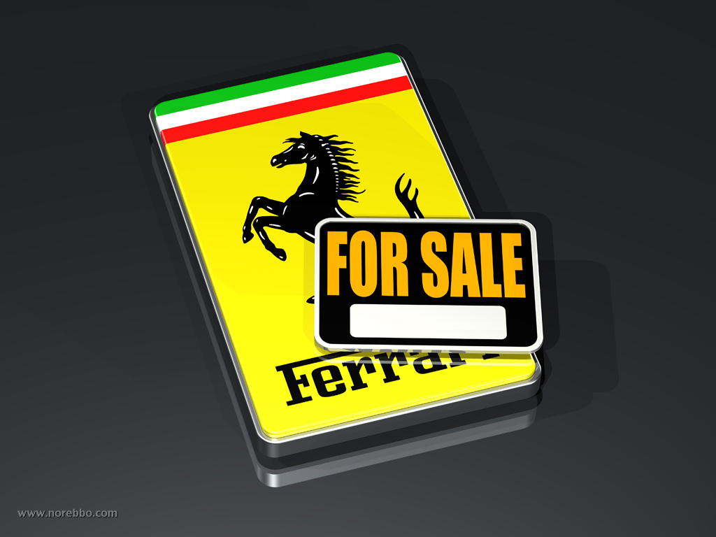
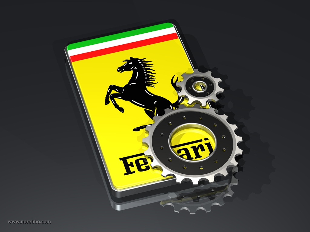
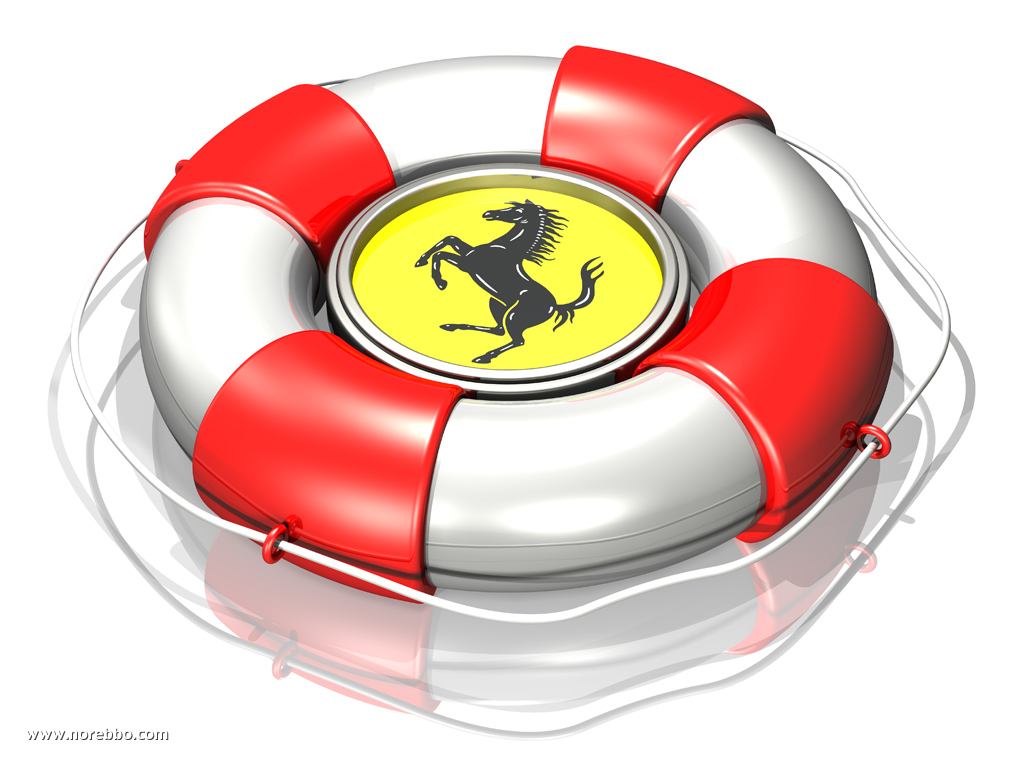
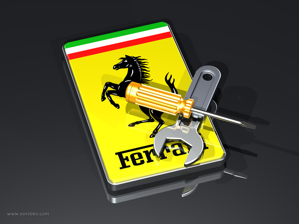
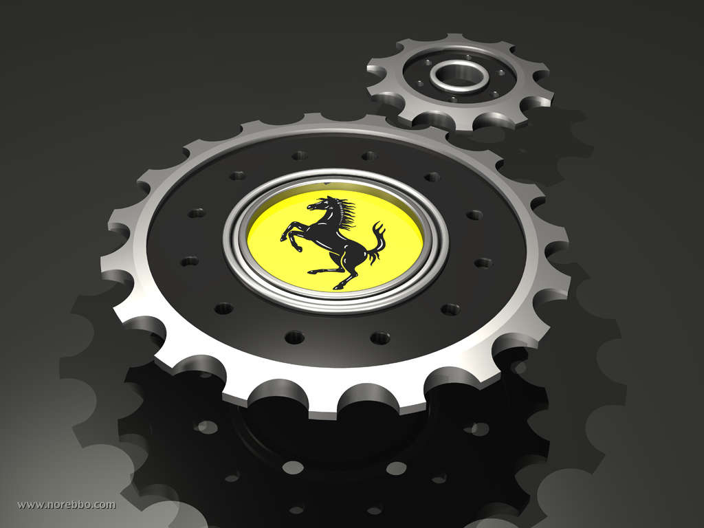
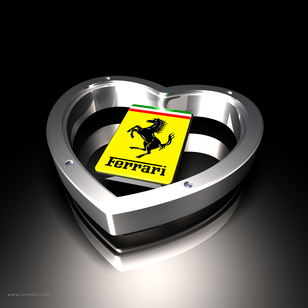
Much like how creative I got with my Apple logo illustrations, this entire collection is based on placing the Ferrari logo against a variety of different objects (to create metaphors which are ideal for use as stock images). There are six images in this first set, and the supporting objects include:
- A black and orange For Sale signs
- Two large transmission gears
- A large red and white lifesaver on a white reflective surface
- A wrench and a screwdriver
- Two large gears
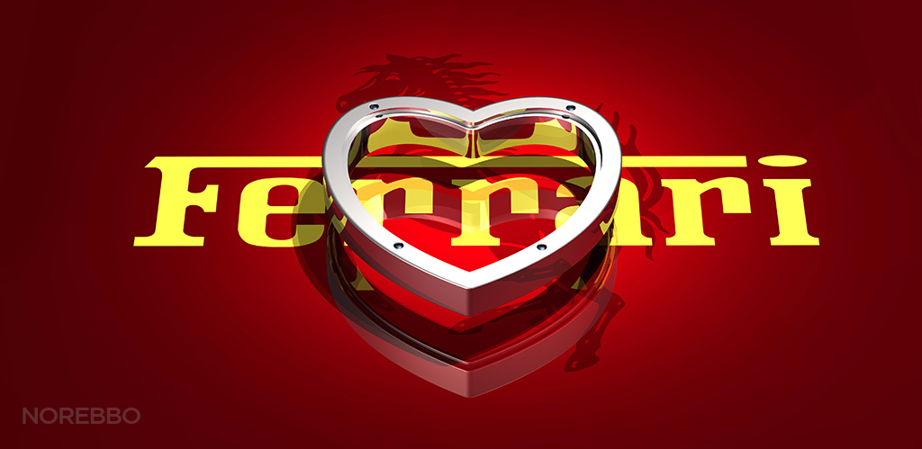
- A chrome heart shape
The second set
An entire year went by before I added more illustrations to my original Ferrari logo set (above). Ever since I created those original renderings, I’ve had a pretty strong urge to add more to that collection – mostly since I didn’t really feel like I successfully captured the essence of the Ferrari brand.
Additionally, one reader even asked me (point-blank) why I chose not to include the color red in any of them. It was an intriguing question, and it kind of lit a fire under my rear end to redo the set properly with that famous Ferrari red.
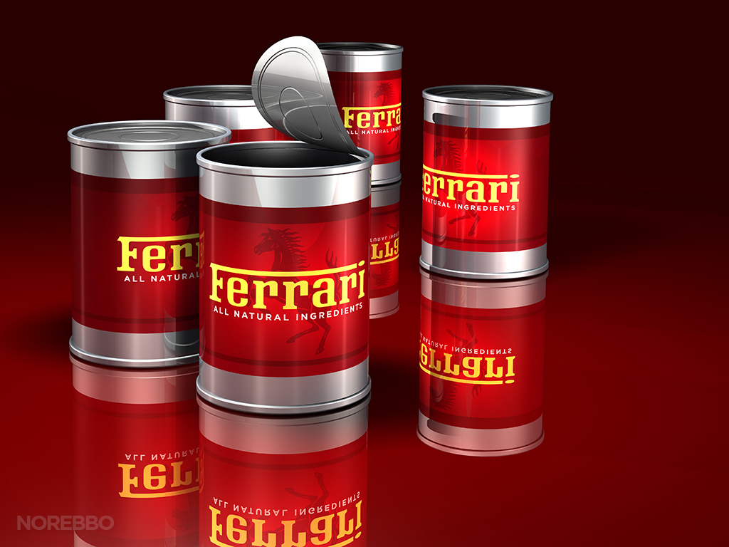
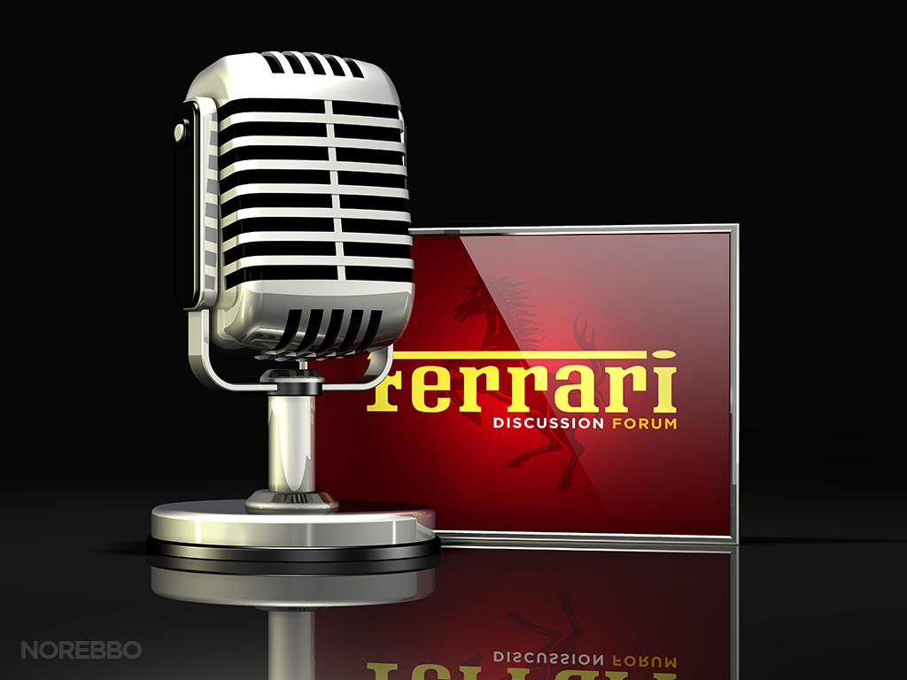
So here they are! Never mind that it took so long to complete, but I’m much more satisfied with this set. Each one of these images feature that iconic yellow Ferrari logo illustrated in various conceptual situations. Ok, some of them may be a bit corny, but hey – they are what they are. As you can see, that lipstick-red color is prominent in all of them (except for one).
There are 9 objects in this set, and the supporting objects include:
- An assortment of food cans
- A large silver microphone
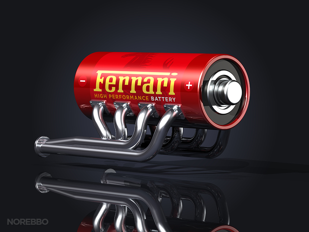
- Chrome automotive exhaust headers attached to a red battery
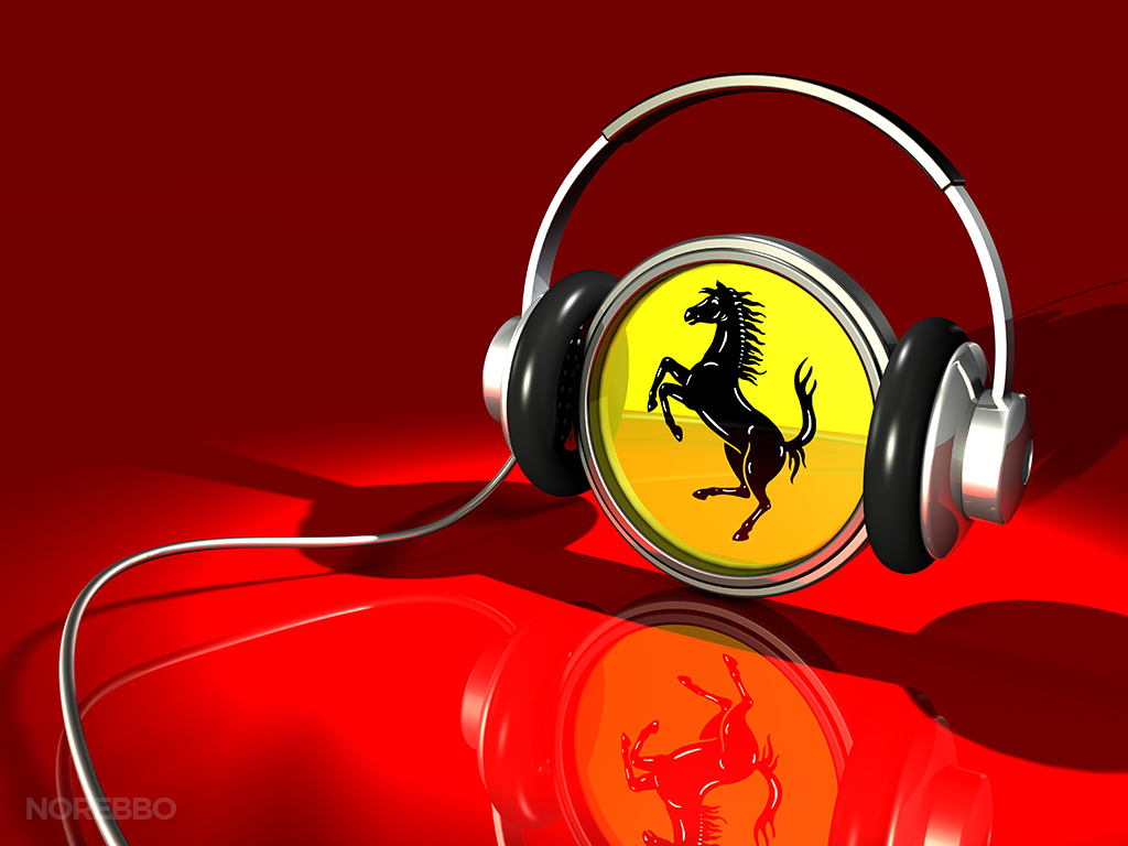
- A yellow Ferrari logo with a chrome frame wearing a pair of audio headphones over an red reflective surface
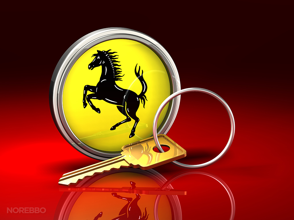
- A large brass key
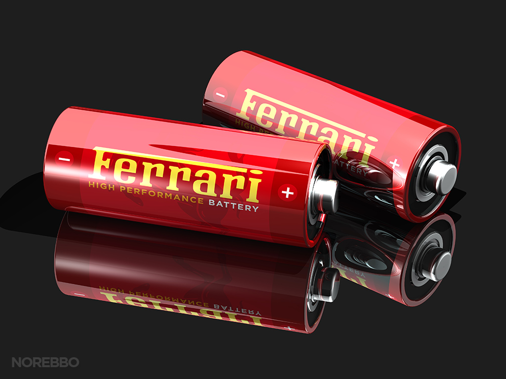
- Two red glossy batteries with yellow Ferrari logos on them
- A large transparent SOLD sticker
- A large white transparent map of the world hovering over top of a framed yellow Ferrari logo
- A large chrome heart


And before anyone calls me out on it, yes, I know that I used an older version of the of the Ferrari logo for these illustrations. I’m not really sure why, but I don’t like the typeface of the newer one as much as this classic style. I guess that’s just another point proving that Ferrari design is timeless.

I really like those with heart and tools. Beautiful 🙂