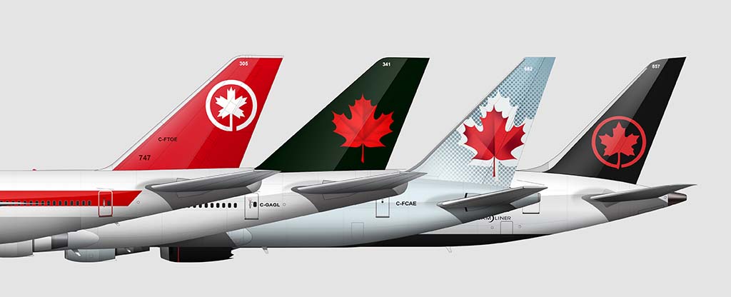
There have been six Air Canada liveries since 1965. All of them have used the color red in some form or another. Not just red, but murder scene / bloody severed arm style red. It’s always been intense.
The first three liveries used it as the predominant color, while the latest three have featured it as more of an accent (presumably because they were getting annoyed by the ‘bloody’ comments).
Despite the flip-flopping color palette, they have all featured a large maple leaf graphic in some form or another. Which, if I’m being honest, kinda looks like a deadly throwing star.
What is Air Canada management not telling us?
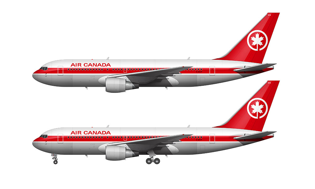
1965-1980: Black Nose / Red Stripe livery
Trans-Canada Air Lines officially became Air Canada in 1965. They announced this name change along with an all new livery, which was nothing revolutionary for the time.
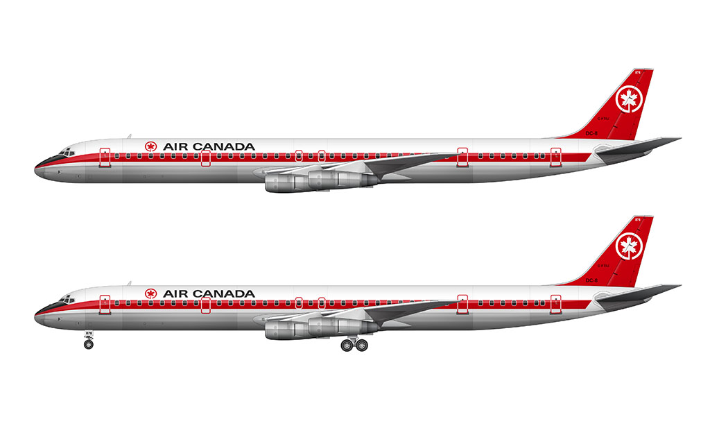
This all new livery consisted of a single red stripe running down the length of the fuselage along the window line. It curved down to a point at the nosecone, and was severed at an angle (guillotine style) at the horizontal stabilizer.
The top half of the fuselage was painted white, while the bottom half was either painted gray (or left as exposed aluminum). I’ve seen pictures of it both ways.
The very top of the nosecone (just below the cockpit windows and above the red stripe) was painted flat black to reduce glare for the pilots. Just like the bare aluminum lower section, I’ve seen pictures of aircraft in this livery with and without it.
The vertical stabilizer was painted solid red, with a simple white maple leaf logo graphic applied to the upper section. Simple, clean, basic.
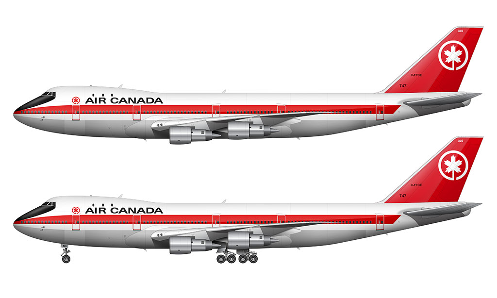
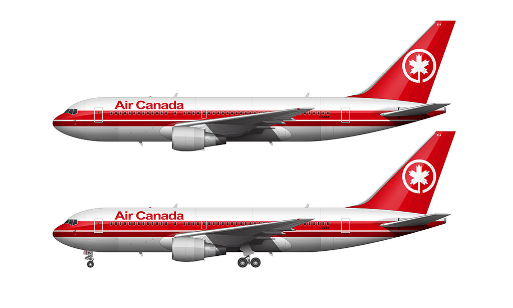
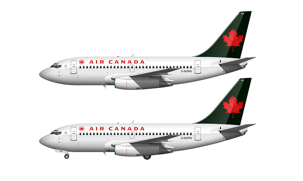
1980-1987: Simplified Red Stripe livery
Air Canada unveiled an all new livery in 1980, which, as you can see in the illustrations below, is borderline “all new”. It was essentially a simplification of the 1965 livery.
The solid red cheatline remained, but they eliminated the tapering at the nose cone and the hard cut at the horizontal stabilizer. The red vertical stabilizer (and white maple leaf logo) remained, as did the white fuselage top.
The only other significant change was the elimination of the red maple leaf logo next to the Air Canada titles (which were now red instead of black).
1987-1994: Dual Stripe livery
Not to be outdone by the dual-striped (and very red) TWA livery of the time, the next evolution of the Air Canada livery came in 1987. Don’t get excited. It’s not like they took a huge leap of faith and set off to create a new design trend or anything.
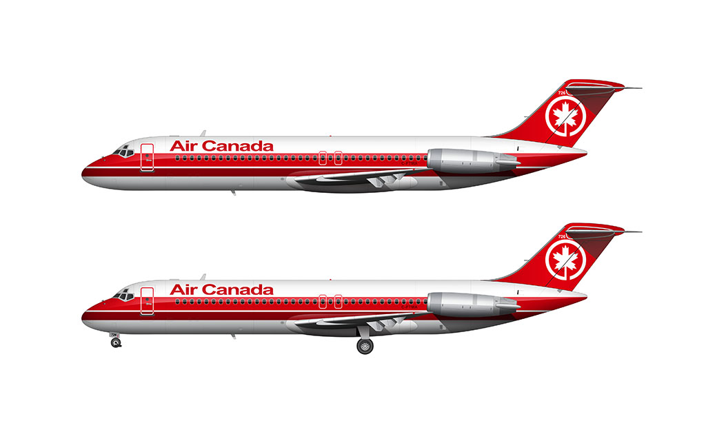
This was a minor update, but there were two notable changes:
- A secondary (and thinner) red a stripe was placed below the existing red stripe. There was a slight gap of white between the two, which created an interesting pinstripe effect. Very 1980s IMHO.
- The Air Canada typeface was updated. It remained red, but was simplified and written in mixed case. I find it interesting that they switched a common-style san serif font (similar to Helvetica) from the custom san serif typeface of the previous livery.
1994-2004: Snow White livery
All good things (bloody red liveries in particular) must come to an end. Air Canada shocked the world with an all new livery in 1994 that was nothing like they had ever done before.
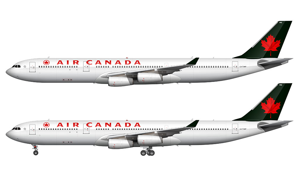
Gone were the iconic red stripes that had been synonymous with the airline even before it was called Air Canada. It was now an all white (‘Euro white’) fuselage, which, thinking back on it, would’ve been genius if they marketed it as symbolism to “virgin Canadian snow” (or some other BS). I don’t recall them doing that.
The maple leaf remained however, and they gave it a fresh new ‘3D’ style look with texture and dimension.
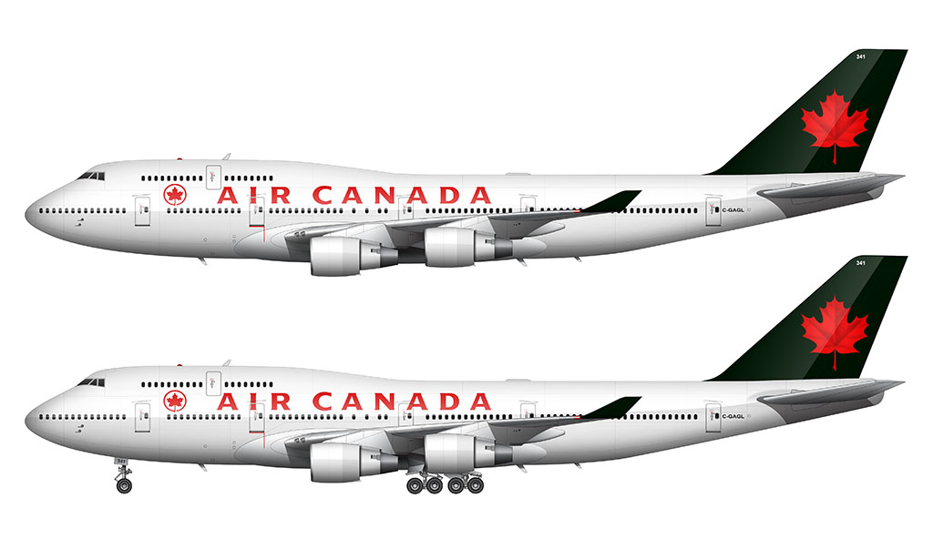
Oh, and that black on the vertical stabilizer? It’s not black. It’s very dark green actually, which looks black in nearly all lighting conditions, so I don’t know why they just didn’t use black. Same difference.
2004-2017: Frosted Leaf livery
Air Canada shocked the world again in 2004 with the unveiling of the “Frosted Leaf” livery – which I will forever refer to as the “Toothpaste” livery.
It was so different (and such a bold change from the 1994 design) that it almost seemed like a revenge livery. One designed to silence all the naysayers of the previous 10 years.
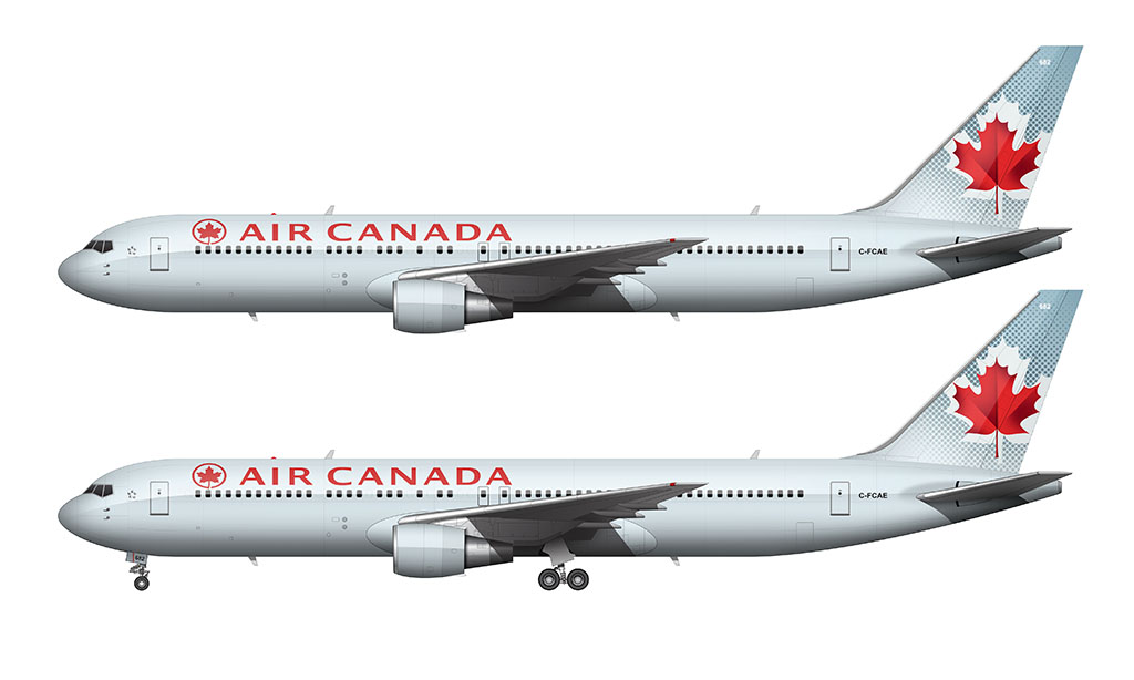
This livery featured a very unique teal (minty toothpaste) color covering every surface. It was a bold but very strategic choice IMHO. I mean, a color that generally mimics ice can’t be considered anything but totally on brand for an airline from the frozen north.
The vertical stabilizer was the best part IMHO. The textured red maple leaf logo from the previous livery remained, but it was layered over a dot pattern gradient and an offset soft white silhouette.
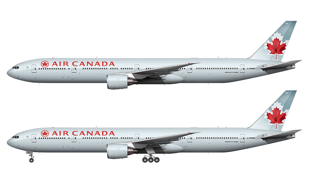
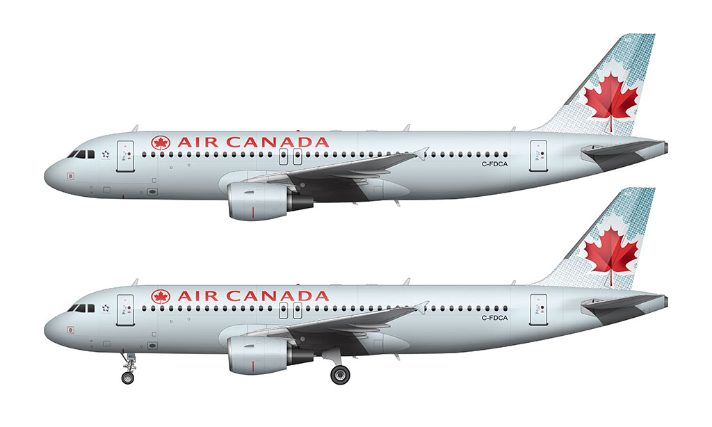
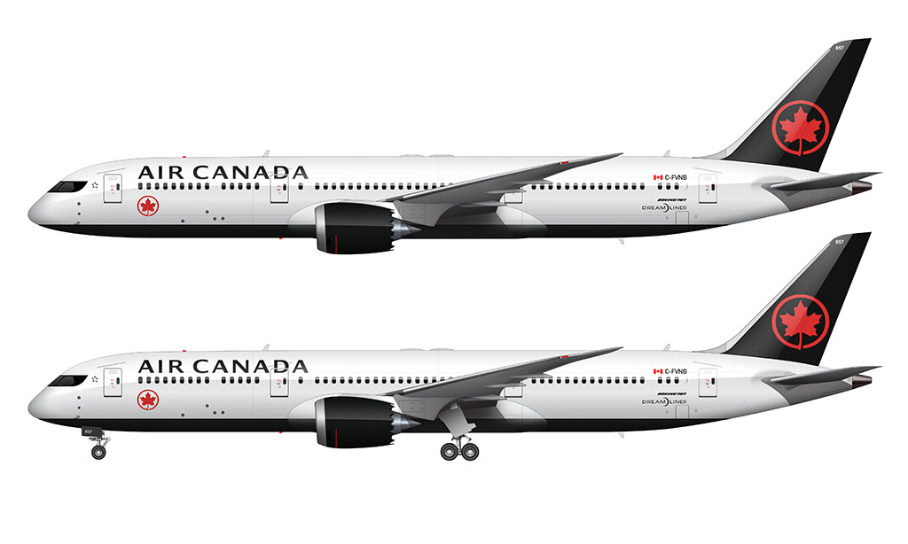
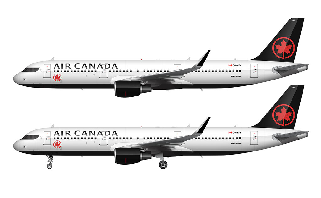
2017-Present: Air Canada is Boring Again livery
I haven’t been able to find an official name for the 2017 Air Canada livery, but let’s just call it what it is: a retreat to ‘safe’ and ‘not all that exciting’.
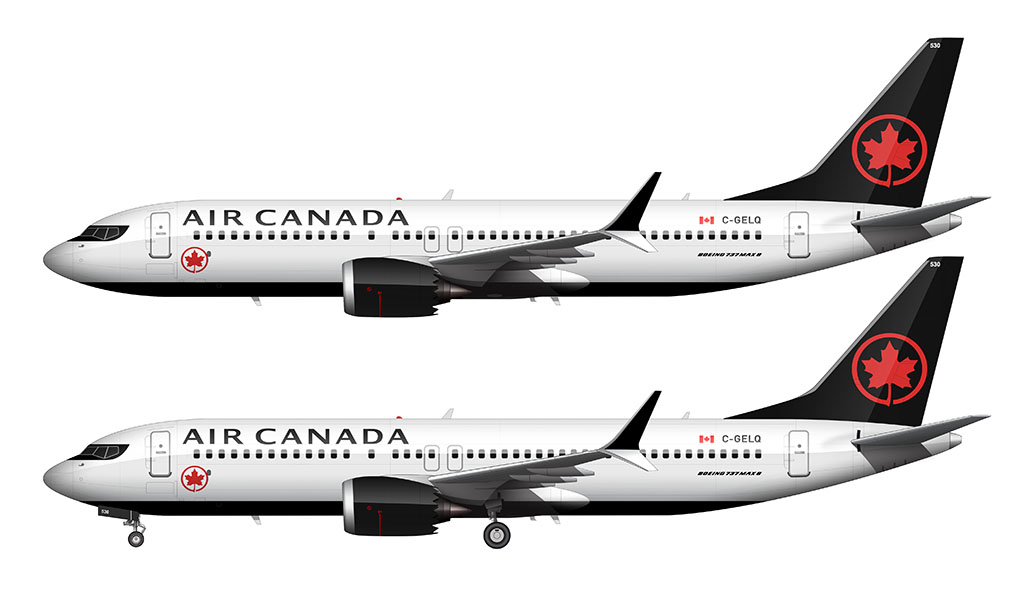
This livery is very similar to the 1994 all white livery, but with a few modern updates:
- I’m pretty sure that they’ve come to their senses and changed the dark green to black. Someone please correct me if I’m wrong…
- The underside of the fuselage is painted black. It also features a large Air Canada logo (in blood red of course).
- For the first time ever, they separated the Air Canada titles and the maple leaf at the forward section of the fuselage. The maple leaf is now under the main titles.
- The iconic red maple leaf logo on the vertical stabilizer lost it’s rich texture. It’s now just a flat red graphic.
- Yay for cockpit bandit masks! It’s a neat design element which adds some spice to an otherwise boring livery.

Love the new livery from Air Canada, but miss older liveries, especially on the 747s. Really good illustrations especially for reference side photos. Thank you Scott!
You’re very welcome Grace! Yeah, the 747s were amazing. I can’t think of many liveries that looked bad on the Queen. She wore them all so well!
That’s amazing, I knew it will be beautiful
Thanks Konstantin!
Really great article! I feel like this one had even more humor than your usual content, which is great haha.
As for AC’s liveries, they’re all pretty good IMHO, but here’s how I’d rank them:
1) Toothpaste. Easily the best one. The light teal looks very “Canadian”, and the red maple leaf/titles add a touch of warmth.
2) Black nose. It’s maybe a bit too similar to the Swissair livery, but still a really solid one.
3) Simplified Red Stripe. Almost as good as the previous one (I actually prefer the cheatline in this version), but it doesn’t look as sleek without the black titles and nose.
4) Current one. I love the name you gave it lol. I like it though. Black & red is a sleek and elegant combination, and the underbelly with the leaf as well as the raccoon mask give it character. It’s what the 2004 livery should’ve been.
5) Dual Stripe. The second red stripe was unnecessary IMO, and (more importantly) it doesn’t even look good. I’m not really a fan of dark red, as it just looks kinda “stale”, especially when paired with another shade of red.
6) Snow White. I still like it, it’s just that it’s not much of a livery given how little paint there is. The dark green tail is an interesting idea though, and they could’ve done something with it on the fuselage (especially considering it’s a shade of green you’d find in a cold Canadian forest).
It wouldn’t be hard to imagine the designer of this livery slapping his/her head in a “why didn’t I think of that??” way if they ever read your ‘cold Canadian forrest’ comment. It’s perfect justification for the green IMHO.
Glad you enjoyed this!
What a carefully crafted and lovely article! Thank you for putting together the history of AC’s livery
You’re very welcome Rebecca! I have way too much fun with these livery overviews lol…
Dude why aphid you stop posting? What happened to An-225 we’ve been waiting years!
I haven’t stopped. It’s just been a little slow that’s all haha. The good news is that I’m currently working on an all new template that will be posted soon…
It won’t be the An-225 unfortunately.
Prime Air or cargolux next?
Long ago I got a cease-and-desist from Amazon for posting some logo redesign concepts on social media, so there’s no chance of me doing Prime Air anytime soon lol.
Yes! I’ve been hoping for air Canada liveries and I think they turned out really good. Especially the A321 current livery one. Everything just looks crisp and aerodynamic. Really well done! But if you could stop yawning at them that would be good. Anyway thank you!
Ya mind doing the westjet livery history?
A.C.I.B.A.L.
Air Canada Is Boring Again Livery
your illustrations are excellent
Thanks! Fingers crossed that they have something really nice up their sleeve for the next livery lol.
IMHO the Aloha Airlines would be the best sequel to the Hawaiian Airlines livery overview, Anyways love the Air Canada overview, the Red Stripe Livery is definetley the best one IMHO.
An Aloha Airlines delivery overview might be interesting. I will always regret not getting the chance to try them while they were still around.
My favorite Air Canada colors was the “Ice Blue/Frosted Leaf/Toothpaste” livery. It was iconoclastic and bold and I’m sorry they changed it. Oh well
Hey Scott/Norebbo, can you do the Lufthansa XXL Crane livery for their 100th Anniversary? It looks absolutely stunning and I’d like to see your take on it with current and older planes.
Hello norebbo! I like your illustrations. I know I always say that but you deserve fans! Anyways- are we ever going to get Air France templates?(preferably on the 777-200 or a livery evolution. Maybe on the a318 also…)
Love your article and art!
Just a reminder that ac has several A320s in their 2017 color without the eyepatch. not sure for all of them but many of these 320s are second hand from cz
I actually flew on one of those ex-China Southern aircraft from Vancouver to San Diego last year. The interiors aren’t very Air Canada like either.