I recently wrote about how much I dislike current Verizon Wireless logo. This time I am going to focus on one that I do like…which also happens to be a service that I am particularly fond of and spend a great deal of time with. That logo (and service) is LinkedIn.
For an entrepreneur such as myself, there’s no better place on the internet to stay in touch with past colleagues and clients.


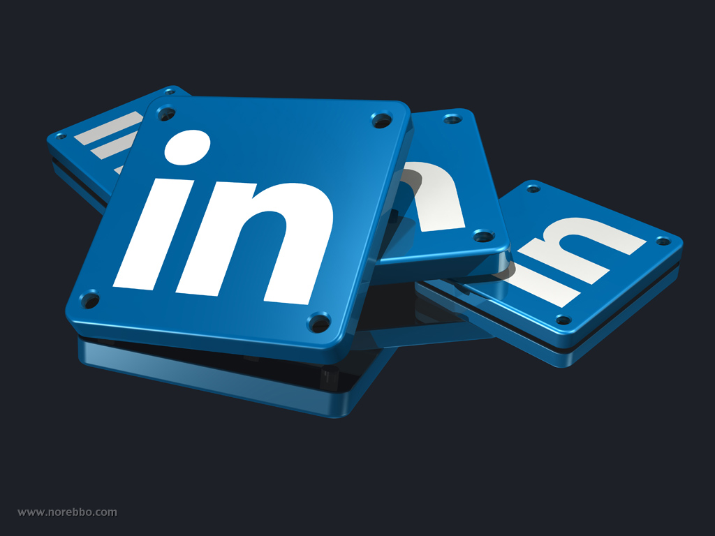

![]()

When it comes to design, I’m a huge fan of excessive simplicity. Corporate logos and marks don’t have to be overly complex to be effective, and I much appreciate the approach that the designers took with the LinkedIn logo. How much more to the point can you get that using a blue square with big white letters displaying the word “In” for their corporate identity? It’s strong, bold, and powerful.
Most importantly, it’s easy to reproduce. Yes, that’s right – while most corporations live in fear of unlawful reproduction of their logo, I think it’s vitally important that a brand identity be simple enough for the masses to distribute easily into their own documents and articles. It’s free advertising at it’s finest! Even better is the fact simple logos like the LinkedIn example are basic enough to create from scratch by most anybody with basic image editing software, and that’s a huge plus.
I had fun with this set, and the images you see here are just a small sample. I will be posting more at a later date. Anyway, here’s what I’ve got for you today:
- A large metallic LinkedIn logo sitting on a stack of unrolled blueprints
- A LinkedIn logo sitting on a large silver hand truck
- A pile of blue LinkedIn logos with rivets
- A large brass key lying in front of an upright LinkedIn logo with rivets
- A large metallic LinkedIn logo over a dark reflective surface
- A big red push pin stuck into a framed LinkedIn logo


Ran across this Linked-In logo. Really Cool ! Great work !
How may I get linkedin_logo.jpg with no background, just as an icon for use on my site?
Looked at a lot of LI logo icons and by far, this one is my favorite !
Good Job again!
Hi Scott – I don’t currently have these available with a transparent (or white) background. I may go back through some of my older sets and generate some without the background, so I’ll let you know if that happens.
Hi, did you have the same https://www.norebbo.com/wp-content/uploads/2012/03/linkedin_logo-172×172.jpg
but for Google +
Thanks
No, I don’t have one in my archives – but it should be fairly easy to make. I won’t have any time to do it in the next week or so, but I’ll add it to my list of things to do.
Scott. Still my favorite Linked-In logo design. Wondering if you ever rendered any versions with transparency ?
Thanks again for creating. Really great job !
Thanks Scott – still not yet. As a matter of fact it’s been quite a while since I’ve created any 3d logo rendering like this (unfortunately). Billable work has me much too busy these days…