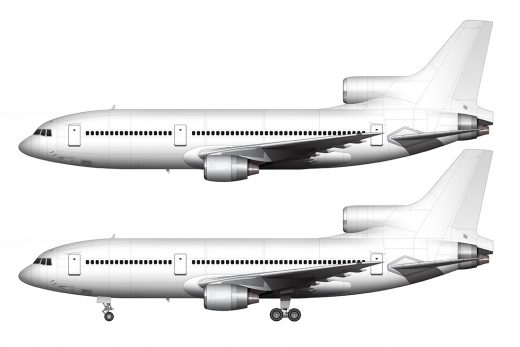
Right off the heels of my TWA livery illustration series, here’s another nostalgic set of this classic Lockheed wearing the three different variants of the Eastern Airlines livery. I actually had no idea that there were three different versions of the Eastern color scheme, but the bit of research I did revealed that there were some slight differences over the years.
The illustration at the top of this post depicts the second version (my favorite of them all) with thick blue cheat lines spanning the entire length of the highly-polshed bare-aluminium fuselage. This is the version I had in my mind when I set off to start this illustration set, and it was only when collecting reference photos that I discovered the different versions of this livery. I guess I’m not as much of a hard-core aviation nerd as I thought I was!
Eastern launched their L-1011 service in 1972 with a very clean white and blue color scheme:

Personally, I think this design was a bit ahead of it’s time. Those cheat lines are oh-so-70’s, but they remind me of something that was commonly seen later in the decade, and not as early as they were introduced. Also, the colors seemed to have more of an 80’s look and feel with soft blues over a clean white fuselage. Most 1970’s airliner liveries were very bold and featured dark (saturated) colors integrated with large sections of exposed metal.
On a side note, I love how they referred to these things as “Whisperliners”. If you’ve ever had the chance to be under the flight path of one of these things on takeoff, you’ll know what I mean when I say that the nickname was a bit of a stretch. These airplanes did anything but whisper.
The final livery was just a slight variation of their second, with the only difference being thinner cheat lines. The polished aluminum fuselage and both shades of blue remained, but making the stripes thinner had a rather significant impact on the overall look of this design IMHO.
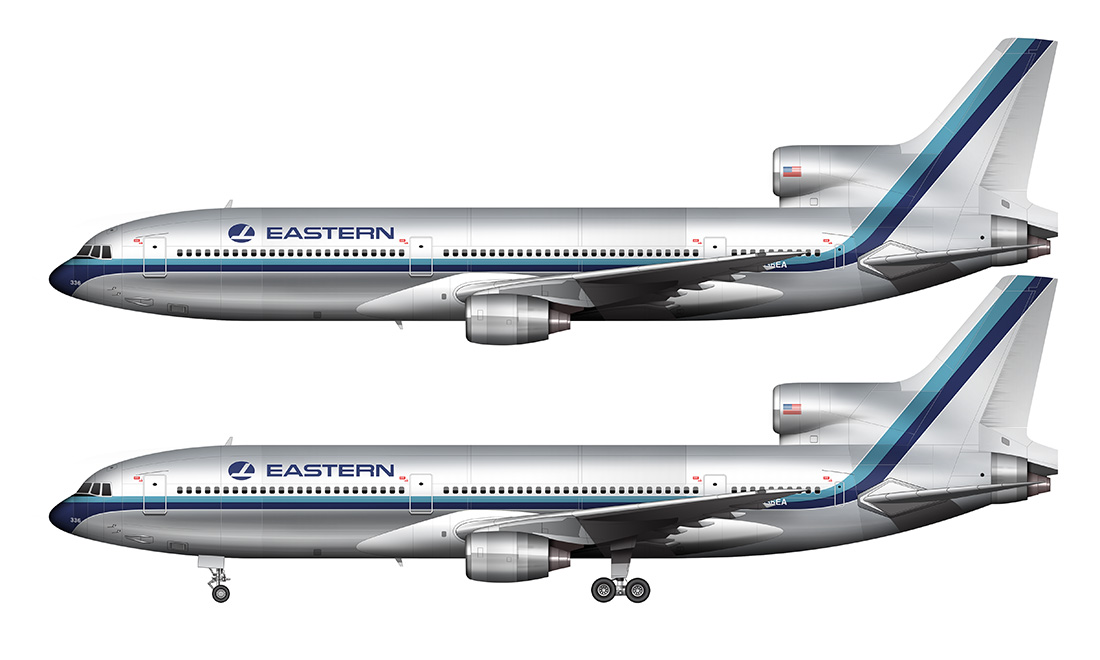
All the research I’ve done seems to indicate that the purpose behind the stripe re-size was to reduce the amount of paint they used for each aircraft, which not only saved on paint costs, but weight as well (translating to better fuel burn).
Eastern Airlines must have been in pretty bad shape financially if they found their original polished-aluminum livery to be too costly. There was hardly any paint on those airplanes to begin with! I would have guessed the reasoning to be just a modernization of the look, that’s all. Remember those ultra-thin neckties in the 1980’s? Thin was in!
sir
first ‘ whisper ‘ is meant to benefit any one inside of a tri star second this livery is so cool even now
purrr
Yeah, it wasn’t until after I wrote this post that I realized that “Whisper” is probably referring to cabin noise levels. Don’t know why I didn’t think of that before!
Actually, you missed another livery style. The “silver scheme” you posted has the cheat lines below the cabin windows. There was yet another where the cheat stripes were actually on top of the windows instead of underneath. On top meaning the light blue stripe was the covering the windows like the early white version. I believe this was in between the white livery version and the latter “silver scheme” you posted.
Wow, phenomenal! Thank you for this great work.
Thank you – I enjoy putting it together!
The reason Eastern went to the narrow scheme was it was much easier to paint. They didn’t have to mask off each of the windows. However, they went back to the wide scheme in the very late 80s.
Yeah, I was just a boy in the 80’s so while familiar with the Eastern brand, I didn’t really know about all the different liveries until I did these illustrations. It’s definitely fun to do the research.
Great illustrations of the Eastern L1011. Ex-employee of Eastern. Thank’s for the free use of your work. I’ll share with the EAL FB family.
Does anyone know the PMS (Pantone Matching System ) paint codes for the two blue stripes that EAL used in the three different liveries?
Additionally, the third livery which is under the windows is easier to paint as you don’t have to mask every window, but more importantly is saved significant amounts of LABOR costs, which were killing EAL back then
BTW Good job on the article.
Thanks
Very cool stuff. Thanks 🙂
You’re very welcome Tim!