There hasn’t been much time for aircraft illustrations in my busy life over the past 6 weeks or so, but I have been tinkering here and there with some AeroMexico renderings for my travel blog whenever I could find spare time. I’m also trying to get Airbus A340 templates created, but those kind of technical drawings take a lot longer to do compared to these livery illustrations.
And I fully admit that the livery illustrations are a million times more fun than the templates are – playing with graphics and color will always be much more interesting than drawing part lines on fuselages!
AeroMexico used to have a pretty cool livery. It was polished aluminum (just like American Airlines livery), and it looked downright awesome in bright sunlight. It probably pissed off other pilots every now and then due to how reflective that color scheme was, but it was a real looker for sure.
But then the aircraft manufactures started building airplanes with non-metallic composite skin materials, which meant that all those beautiful polished-aluminum liveries of old had do go. You can’t polish carbon fiber, so the best the airlines could do was to start painting airplanes white. American Airlines is using silver paint instead of white at the moment, but to be honest, it looks like dull gray unless you see it in bright sunlight.
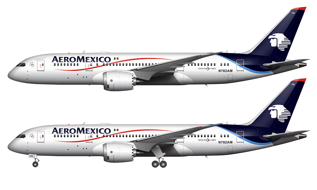
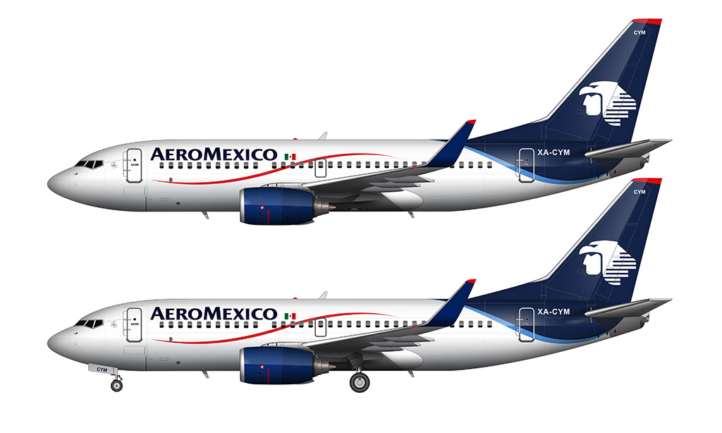
The new livery that AeroMexico came up with is represented here on both the 787-8 and 737-700. I will give them credit for being creative with the curved two-tone blue tail section that blends into the white fuselage, but it seems as if they ran out of ideas (or budget) with that random red “stripe” on the forward section of the aircraft.
That splash of color is nice – I think the red goes very nicely with the white and blue, but it simply doesn’t integrate with any other design element in a meaningful way. My experience as a designer tells me that it was likely added at the last minute by a non-designer executive who thought that “a little splash of red would be nice” even though there wasn’t enough money in the budget to add more paint to the airplanes.
I can’t imagine that any designer, who after designing such a good looking tail section, thought that slapping that random swoopy red stripe to the forward section was a good idea.
On a final note, I didn’t realize it until I made these illustrations that the engine covers are not painted blue on the 787. I assumed the liveries were the same across all AeroMexico aircraft, but I actually think I like the white engines better since it puts more emphasis on the tail section (and that ever important logo).
Incredible. Great talent.
Thanks Dan – I really appreciate it!