Spirit Airlines is one of those obscure air carriers that I’ve never really given much thought to in the past. They’ve always just sort of been there, distant and uninteresting, mostly flying to places I never travel to. But all of that has been changing over the past few years – they are quickly turing into a major low-fare airline, and I’m starting to hear more and more people talk about them wherever I go.
Usually that talk isn’t so good (they are probably the stingiest airline in the US right now), but it’s been interesting to watch them grow from nothing into the near-beheamoth they are today.
All that growth has meant that they’ve had to experiment with a lot of different things over the years, playing with different business models and fine-tuning their product. That continuous fine-tuning has resulted in three different liveries over the past decade – all of them quite different from one another, reflecting a “low fare” look with a twinge of serious professionalism. Sort of. Let me explain…
The silver and black “pixel” livery is my favorite of their last three liveries. It’s cool, high-tech, and very unique. It doesn’t really convey the “low fare” message very well, and I’d go as far as to say it does the exact opposite. It looks very high end! That’s probably why it didn’t last so long.
The next livery (below) was unveiled just a few short years later, and to me, it was a huge step down in terms of style and design. I’m not really sure, but the bright blue and and neon accent colors just scream “cheap vacation packages to Cancun”. Not that there’s anything wrong with that, but I really cringed when I first saw it. I couldn’t believe they killed the pixel livery!
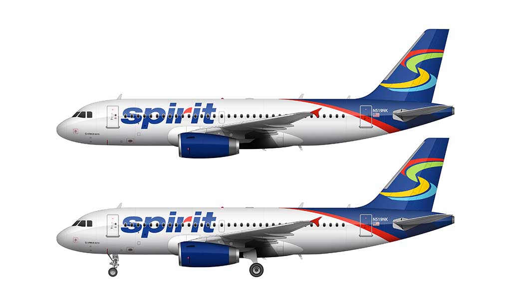
And finally, Spirit just went through another major rebranding effort last fall. The livery they came up with was…well…um…bold. Have a look for yourself:

I have to give them credit though. If they are looking for attention, they are certainly going to get it with these bright yellow banana planes flying around. How could you not notice something this flashy over all the other airlines that are mostly white with a few splashes of color here and there? Knowing how risky they’ve been with their marketing campaigns in the past, I’m pretty confident in saying that I’m sure that’s their goal. They’ve succeeded admirably in gaining my attention.
Anyway, it was a lot of fun to illustrate these three Spirit Airlines liveries. I was dreading the silver and black pixel livery the most, as I wasn’t sure I would be able to replicate it with any sort of realism. But it wasn’t that bad – and as a matter of fact it just reaffirmed itself as my favorite Spirit Airlines color scheme of the past 10 years.
The yellow version was the most difficult of the three – yellow is always a difficult color to render because it’s way too easy to make the shadows look muddy (“poopy” is another way to describe it). On top of that, there isn’t always enough contrast to be able to show gloss and reflections accurately. I gave it my best shot though, and I hope you enjoy.
thank you so much for this template im making a landing simulator on scratch i’ll be sure to give you credit! thx so much keep up the good work also can you plsss make a spirit a321 if you can with sharklets please?
You’re very welcome! As a matter of fact, I do have plans to illustrate a Spirit A321neo soon (for another project), and I’ll be sure to post it here once complete.
I will love to see a United Airlines 747-400 with the new livery Or a British Airways A380s with past liverys like the ones in the 747s (now all were donated to Museum’s) like the BOAC , and Landor liverys ,they will look amazing with theses liverys
Yeah, applying old liveries to current generation aircraft is fun. I just wish I had more time to do it!
the second livery is not really bad, the third one looks like an eyesore. change my mind
What?! It’s the second one (the “birthday cake” colors) that is the worst to me. The pixel livery will always be the best, but I actually don’t mind the banana livery all that much.
In my honest opinion the Birthday cake livery is my favourite, not a big fan of the other two, but of course we all have our opinions 🙂
It’s also amazed me to see that (as of writing this), N631NK is still in the Birthday Cake livery
I was surprised to see a few aircraft in the birthday cake livery recently as well, but I guess it makes sense considering that Spirit has far more pressing issues than repainting aircraft at the moment lol.
Sitting here after sprit just ceased operations feels surreal lol
The fact they’ve been on the brink of shutting down for years made it sting a little less than it would normally. I’m very bummed that they’re gone, but we all knew it was coming.
Spirit noooooo!