Hi! My name is Scott, and I draw airplanes.
I started creating aircraft templates way back in 2012, but I’ve been mixing it in with a lot of airliner art these days. Check it out:
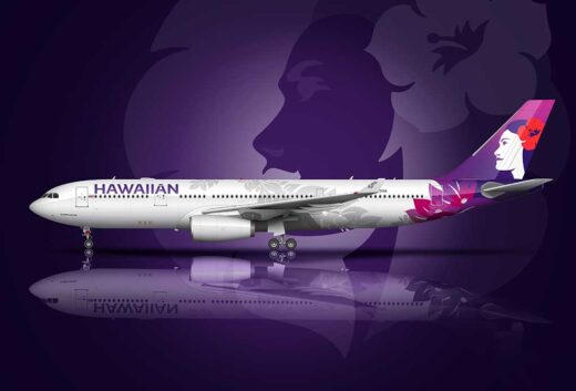
A pictorial history of the Hawaiian Airlines livery
The Hawaiian Airlines livery has gone through an interesting evolution over the years. Each new design has…
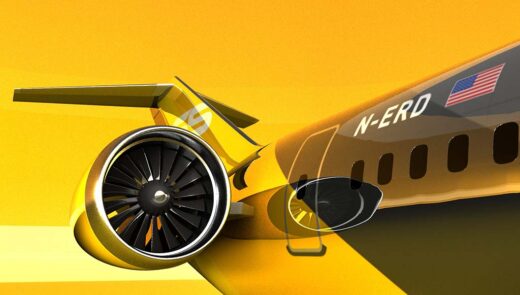
An all-new Boeing 727-300 concept for modern times
As we all know, only two variants of the Boeing 727 were produced. The -200 was (by…
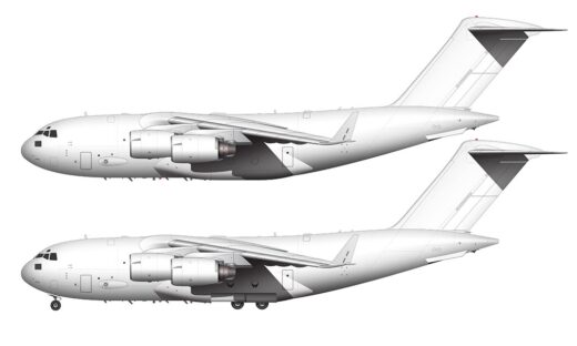
Boeing C-17 Globemaster III side view blank illustration templates
Depending on how well these are received, the following Boeing C-17 Globemaster III side view illustration templates…
What is the Boeing 757 replacement going to look like?
After years and years of reading heated discussions about whether or not they should bring back the…
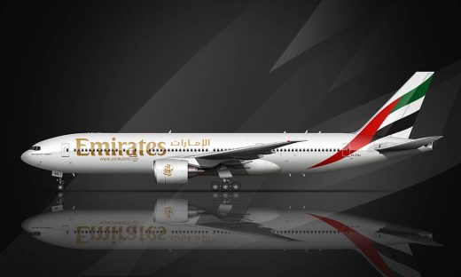
The subtle evolution of the Emirates livery
Love it or hate it, the Emirates livery is one of the most recognizable airline livery designs…
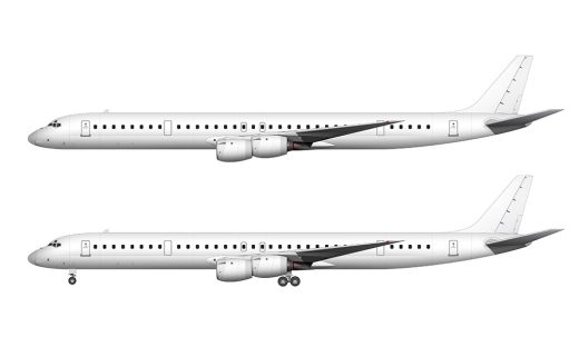
Douglas DC-8-73 (and DC-8-73CF) blank illustration templates
Why is it that just when an aircraft manufacturer finally gets an airplane “right”, they kill it…