As a child of the 80’s, my memories of TWA only goes back as far as the Dual Stripe livery launched in 1975. It’s the TWA livery I grew up with, and the only one I think about whenever I see (or hear) a reference to this once great airline.
All the Trans World Airlines liveries (especially the final three) are a perfect example of less being more. Although relatively simple, they pushed the limits of what airline livery trends were at the time – without complex color palettes and gaudy logos.
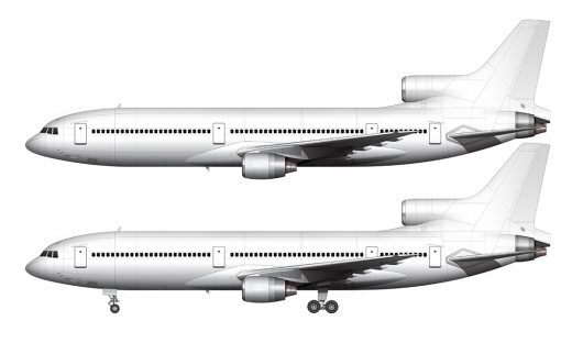
A detailed look at the evolution of the last 3 TWA liveries
An entire book could be written about every Trans World Airlines livery that ever existed (there are many). I might get around to doing that someday, but for now, I’m just going to show you the details of the final 3. They are more intricate than they appear at first glance.
1959-1975: Arrowhead Livery
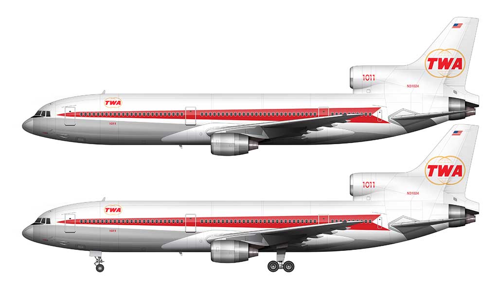
The Arrowhead livery was the color scheme that TWA launched their L-1011’s with back in 1972, and if you ask me, it was a brilliant interpretation of the “cheatline” livery that most airlines were adopting at the time. Stripes were all the rage back then (you can have a look at the history of the Air New Zealand livery to see what I mean).
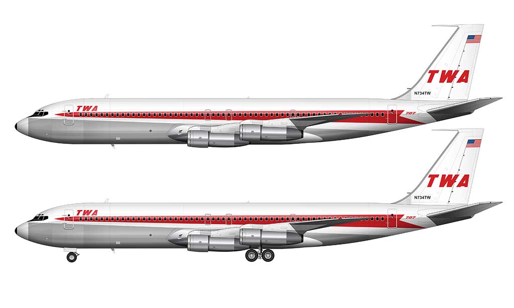
Unlike how most of the other airlines were doing it (the Continental Airlines livery is a good example), the stripes in this livery mimicked an arrowhead – complete with a pointy nose and a split-tail / feathered end. It was a beautiful (and bold) change of pace from static horizontal stripes IMHO.
Other than the stripes, the Arrowhead livery stayed true to the TWA design language. The fuselage remained white, the belly of the aircraft remained exposed aluminum, and all the design elements (titles, stripes, etc) were TWA red.
1962 update: Dual Globes
In 1962, there was an update to the Arrowhead livery that replaced the block letter “TWA” logo on the vertical stabilizer with a stylized dual globe graphic instead. Not only was it a better representation of TWA’s global brand, it was the first time the color gold was used in a Trans World Airlines livery.
1975-1995: Dual Stripes Livery
Nothing screams “1980’s” more than thick red stripes running down the side of a white fuselage. The livery that TWA unveiled in 1975 totally reminds me of the A-Team van (with different colors obviously), and I swear I could hear Wham and Madonna playing in the background as I was creating the following illustration. It was a product of it’s time, and I loved it.
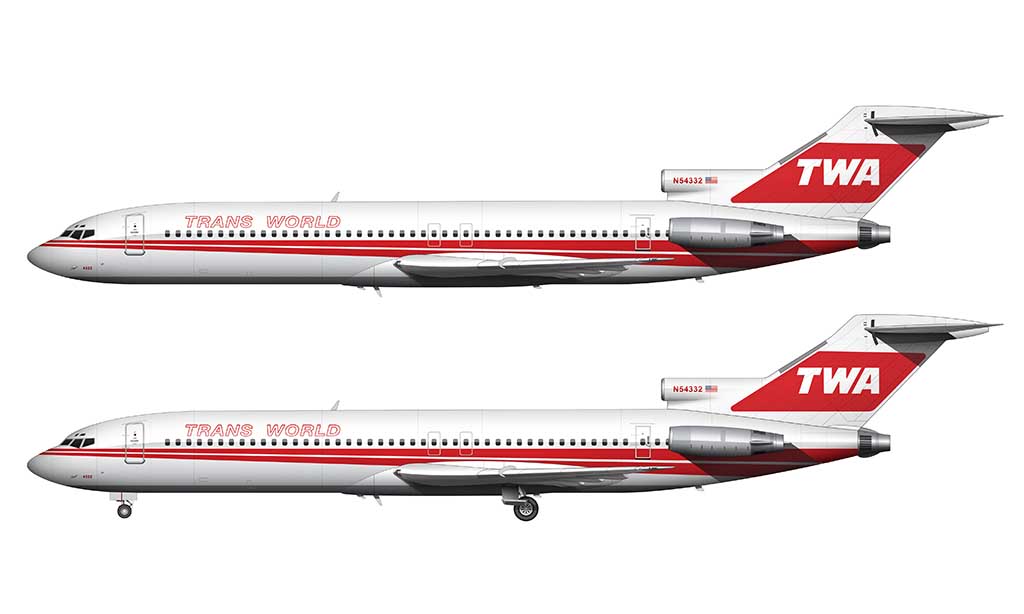

The design of the Dual Stripes livery was essentially a “freshened up” version of the Arrowhead livery. The stripes remained pointed, the colors remained the same, and the typeface used for “TWA” was nearly identical.
The major differences from the previous livery:
- The stripes were split into two (hence the “dual stripe” name)
- “TRANS WORLD” was spelled out of the forward fuselage (replacing the smaller “TWA” logo)
- A large block of color (red) was added to the vertical stabilizer (with white TWA titles instead of red)
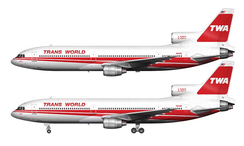
It’s also worth noting that angled pinstripes / cheatlines weren’t unique to TWA at the time. The Northwest Airlines livery that came a few years later had an angled (though curved) stripe as well.
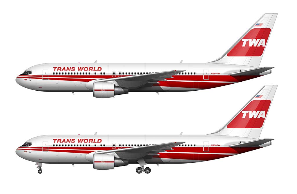
1995-2001 (RIP): Globe Livery
TWA introduced an all new livery in September 1995 that never made it to all their aircraft before the brand was absorbed into American Airlines in April 2001. And that’s a shame, because it was a beautiful brand refresh.
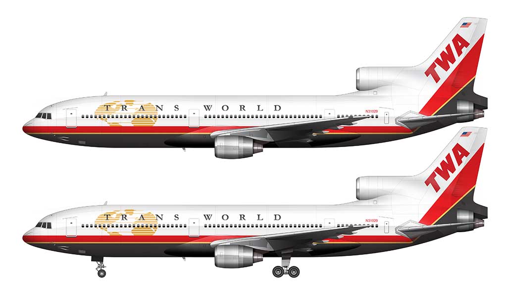
Speaking of the old Lockheed’s, only one L-1011 ever wore these new colors. That honor went to aircraft N31029, and it’s a shame that they didn’t have enough time to convert others in the fleet before the last of this type was retired for good in 1997.
The 1995 Globe livery was a huge departure from previous liveries:
- The stripes remained, but they now consisted of three colors (red, gold, and black) instead of one (red).
- For the first time ever, the stripes curved up into the vertical stabilizer – making them one solid element from nose to tail.
- The use of the color black (in the stripes and the titles) was an all new thing for TWA.
- The gold globe logo returned, but in a more stylized fashion. This time, it was placed at the forward section of the fuselage (and layered underneath the main titles).
- Not only were the “TRANS WORLD” changed to black, the typeface was changed to a serif-style design which (and I hate to say this) mimics Times New Roman. At least it wasn’t Comic Sans I guess.
Wonderful work – and yes the dual stripe is classic
Thank you very much! It is the best TWA livery IMHO – and I was so happy to see that American Airlines chose that one for their retro TWA scheme on the 737-800.
Dual stripes was my childhood and the best. I liked the 1995 refresh, but I swear it was dark navy blue, not black for the bottom of the hull.
I don’t even know why airlines use dark blue, as it always looks black in nearly any light. I’m a big fan of the dual stripes as well!
The final livery, gorgeous as it was just didn’t sit right on the MD80/717 fleet in my opinion. The T-tail planes didn’t really work as well on the tail.
I agree – the way the livery transitioned from the fuselage to the tail was problematic for some aircraft. It was a nice livery, but notably flawed in that way.
I’ll be honest, the final livery looks ugly. I don’t know it feels wrong.
It definitely doesn’t have the same character as the others IMHO. I think they were trying to hard to come up with something interesting, and it ended up being too complicated.
I love the resurrection of the golden globe in the final livery and the boldness of the livery as a whole. It also today views directly as 90’s so I don’t think it would have had longevity before another refresh had they remained a viable carrier. One last detail; I don’t believe the final color scheme was black but actually a dark dark blue.
It could very well be dark blue – I’m currently looking around to see if I can find any confirmation of that, but it wouldn’t surprise me if that’s the case. And you are correct, they would have very likely moved on ton an updated livery by now had they survived. Sounds like I need to get cracking on some concepts!