Thinking back on it, every version of the Continental Airlines livery was trend-setting in one way or another. For example, the 1930’s Skystreamer livery flowed with the shape of the aircraft, making it appear to be part of the aircraft design.
Most livery designs weren’t as well integrated at the time, and it really set Continental apart. That attention to detail continued all throughout the history of Continental Airlines – all the way to their demise in 2012 (which was a full merger with United Airlines).
A closer look at the most significant Continental Airlines liveries
Eventually I’ll find the time to illustrate every version of the Continental livery that ever existed. But for now, let’s have a closer look at what I consider to be the most significant liveries in the history one this once-great airline.
The Skystreamer livery: 1944-1958
As I’ve already mentioned, the Continental Skystreamer livery was ahead of its time (in my opinion anyway). It featured parallel red and blue stripes that ran the entire length of the fuselage. They originated at the nose (coming out of the Continental Airlines logo), curved up above the windows, and then curved down into the tail cone.
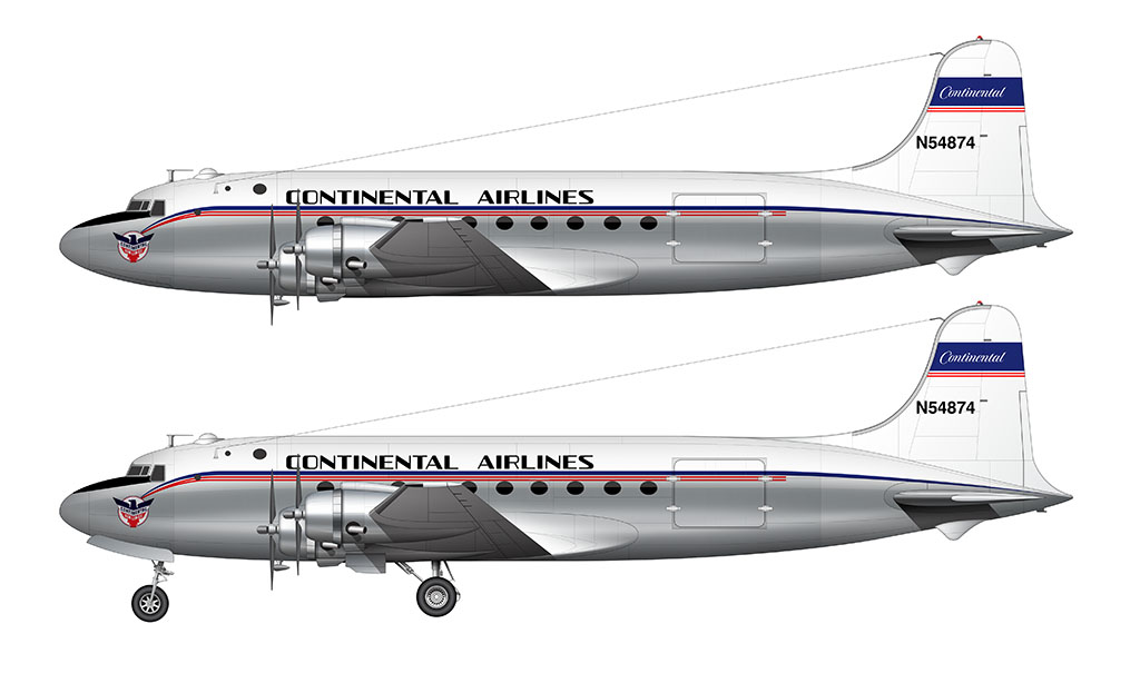
Some aircraft featured a white top (above the stripes). Others were left with exposed aluminum. The vertical stabilizer of all aircraft featured a thick horizontal blue stripe with “Continental” script in white. Two thin red pinstripes were applied just below.
Note that there were several versions of this livery over the years. Later variants included more white paint (covering the entire upper section of the fuselage), along with an additional red pinstripe beneath the windows.
The Golden Jet livery: 1958-1968
The late 1950’s Golden Jet livery looked high-class and sophisticated compared to the brightly-colored Skystreamer livery that preceded it.
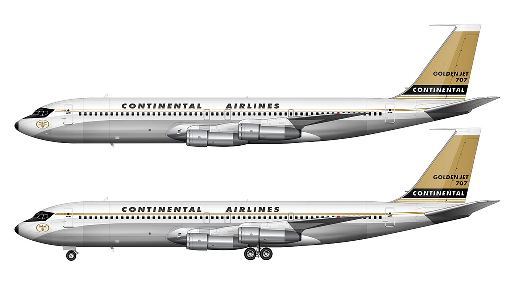
Introduced on the Viscounts in 1958 (and one year later on the 707s), this design was a nice evolution of Continental Airlines brand image. It featured stripes and a painted upper fuselage section like the previous livery, but the colors were very different. Gold was the primary color for the vertical stabilizer – a color never previously used in Continental Airlines liveries.
This livery was revised slightly in 1962. The colored stripes were replaced with thickened gold stripes, the nosecone graphics were revised, as were the text elements on the vertical stabilizer. The illustration you see above is an example of this revised livery.
It looked fantastic, but (in my opinion), it wasn’t as bold as the TWA livery of the time.
The Contrails livery: 1968-1991
Better known as the “Meatball” livery, this is the one that I consider to be the best of all time. Yes, some of the older Delta Air Lines liveries are just as good, but the Continental Contrails livery was utterly brilliant.
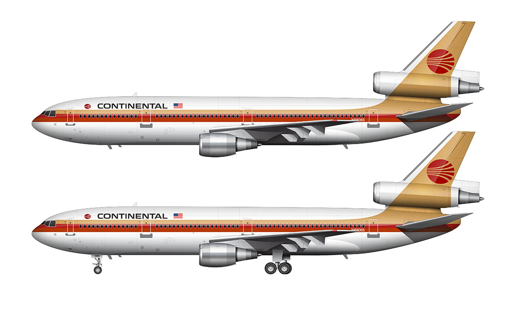
Saul Bass is the one responsible for this livery. Yes – the same guy that did a lot of other airline liveries of the time (including the British Airways livery, the Northwest Airlines livery, and the Hawaiian Airlines livery).
Just like all previous Continental Airlines liveries up until this point, stripes were a core component of the design. This time, they were blended up into the vertical stabilizer, giving the livery a much more integrated (and aerodynamic) look.
Gold was retained as a primary brand color. Red and orange stripes just below the main gold stripe mimicked a desert sunset. At least that’s what it looks like to me. Regardless, these were very “in” colors for that time period.
The Globe livery: 1991-2012
Perhaps the most significant brand image change in the history of Continental Airlines, the Globe livery launched in 1991 was a beautiful evolution of the Contrails livery that preceded it.
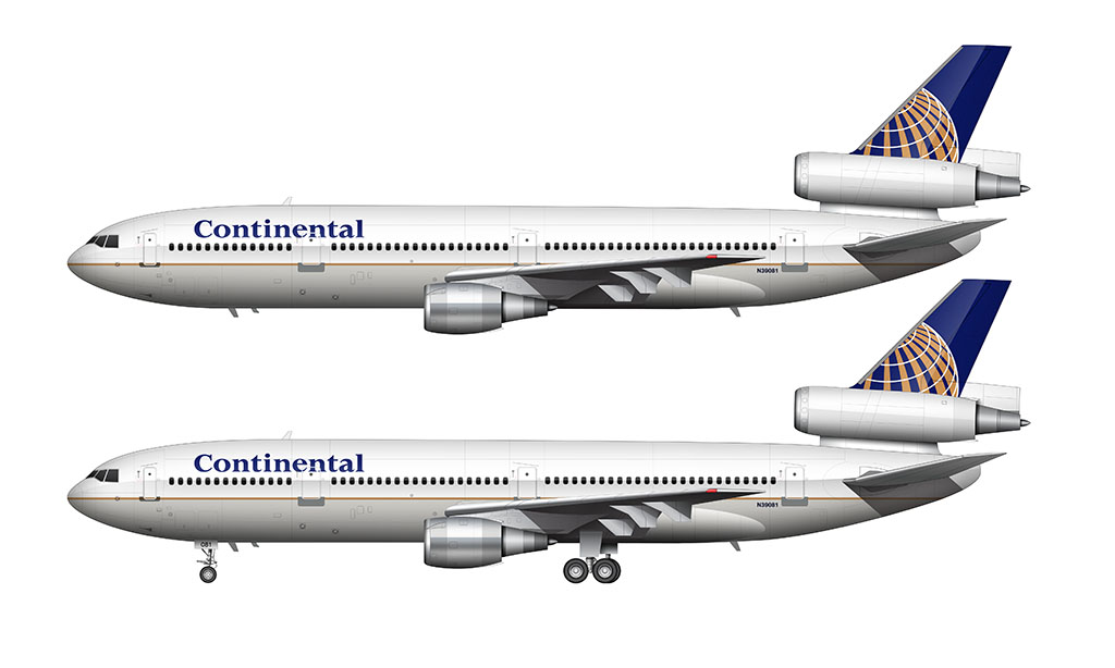
A thin gold pinstripe ran the entire length of the fuselage, with the top half of the fuselage pained white, and the lower half pained gray. The “Continental” script was changed to a serif-style font, and the color changed to blue.
The vertical stabilizer featured the biggest change. An all new “spinning” globe graphic replaced the old “meatball” logo, and it featured the same blue, gold, and white colors used on the fuselage.
This livery became the United Airlines livery in 2012 when the two airlines merged.
This looks absolutely gorgeous!
Dan, Australia
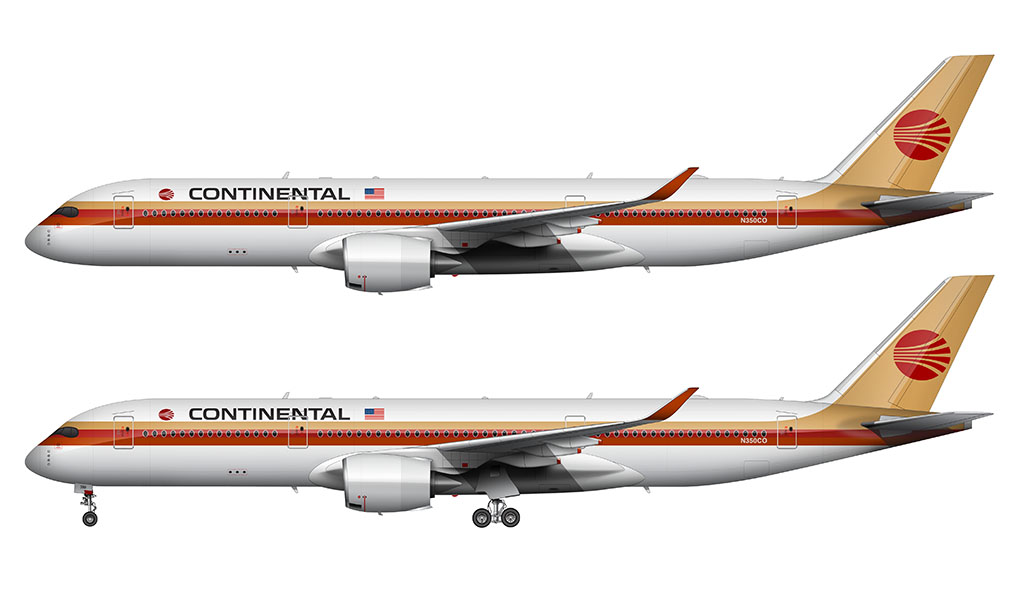
Thanks Dan! Too bad Continental isn’t still around – I too would love to see this livery (at least a one-off retro version) on the A350!
All of your work is impressive, Scott. I think you missed your calling as a Livery Designer; you certainly have the ‘eye’ for it.
Thanks Tom. Maybe in a different lifetime – I can’t ever find the time to do these kinds of illustrations anymore! Oh well…
Awesome work. This was such a cool
Livery. Continental was a great airline. The blue and gold livery was too bland. This classic version was very warm and welcoming. Sure miss this airline.
Thank you! I really miss this livery as well. Long live the meatball!
GREAT page and info …. however, the “meatball” livery should be shown with the BLACK meatball … the red represents the worst time in Continental history … in other words, Lorenzo! My Dad flew for Continental from 1964-1984 (took early retirement due to the strike … should have been able to fly until 1993) … so needless to say, the red meatball is a VERY negative symbol … plus, the Black was around many more years. Thanks!
Thanks Richard! Yeah, I’ve got a handful of other Continental livery illustrations featuring the black meatball. Those will be added to this post eventually.
Sounds good … Thanks! 🙂