I’ve always considered Allegiant Air to be one of those airlines that I’d only fly if was really desperate and there were no other options available. After all, they have never been known to be anything but a budget air carrier here in the US and quite frankly, I’m at the point in my life where I don’t mind spending a few extra dollars for a better experience on another airline.
But how bad can Allegiant really be? It’s a question I’ve been asking myself a lot over the past few years, so about a month ago I made a conscious decision to choose Allegiant over a plethora of other choices for a quick trip I needed to make to the Pacific Northwest. And you know what? It wasn’t an entirely bad experience! For the price I paid, I was pleasantly satisfied and I wouldn’t hesitate to fly with them again.
Despite being notorious for penny-pinching and cutting corners, Allegiant is making great strides to improve it’s in-flight experience with the addition of A319 and A320 aircraft to replace it’s aging fleet of MD-80’s. The MD-80’s were the backbone of the G4 fleet since the beginning, so it is a bit weird to see this livery on any other type of aircraft – even though the transition has been going on for several years now.
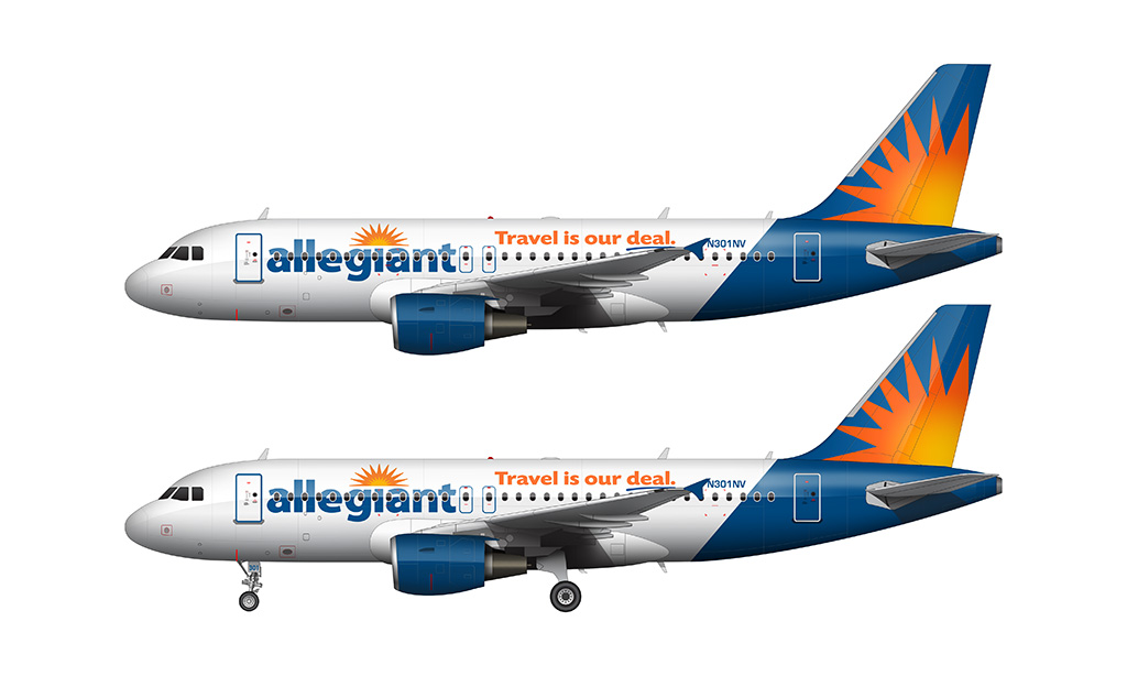
Speaking of the livery, it’s not that bad IMHO. I wouldn’t go as far as to call it as classy as something like what Hawaiian is doing these days, but I think it fits their brand ideology perfectly. Remember – this is a Ultra Low Cost Carrier (ULCC), so it’s understandable that the livery leans more towards the flashy side of the spectrum as opposed to being more reserved and sophisticated.
The purpose of this livery is to grab attention! Bright colors, high contrast, and a splash of marketing messaging help to convey the “budget” message loud and proud.
I need to point out, however, that blue and orange is my absolute favorite color combination. I’m of the opinion that it’s hard to make anything look bad in blue and orange, so it makes me wonder if I’d have a different opinion of this livery if it were anything else. I don’t particularly care for the generic typeface they used in the logo, and the sun illustration looks a bit like clipart, but the colors make up for those shortcomings in a big way.

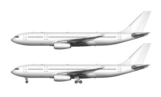
Maybe make an A319 with dual over-wing exits!
I actually had no idea those existed! I’ll add it in to the next update.