Despite how simplistic you might think that the Japan Airlines livery is, it’s a perfect example of a clean and classy design evolution. Not much has changed since the early 1950s, and that’s what makes it so great.
Every livery that Japan Airlines has ever had represents Japanese culture perfectly. They’ve all been clean, simple, and pure (without any unnecessary fluff).
It’s important to note that the history of Japan Airlines goes back further than what I’ll be describing in this overview. For now, I’m going to focus on the liveries from the beginning of the jet age until present day.
1950’s: Pinstripes livery
The livery of Japan Airlines in the 1950s was typical of its time. As you can see in the illustration below, the fuselage featured a painted white top with an exposed aluminum bottom. Separating the two sections was a thick red stripe (about the height of the windows) with dark blue end caps.
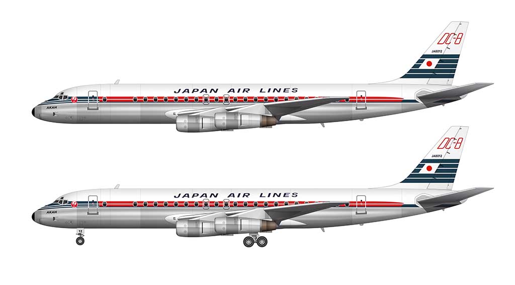
The vertical stabilizer was primarily white, although the center section was painted dark blue (which almost looked black in some lighting conditions). Inside, the were horizontal white pinstripes and a square representation of the Japanese flag.
The type of aircraft was usually displayed above the blue section in a large red font. Based on my research, there was no standard for this design element. Some aircraft didn’t feature it at all.
As was typical for the time, the engines were left bare aluminum.
1959-1989: Japan Air Lines Crane livery
Starting in 1959, the Crane logo (known as Tsuru) became a dominant element in the livery. It was the sole element on the vertical stabilizer, which (in my opinion) looked fantastic on larger aircraft such as the 747. The rest of the design elements in this updated Japan Airlines livery were an evolution of the previous version.
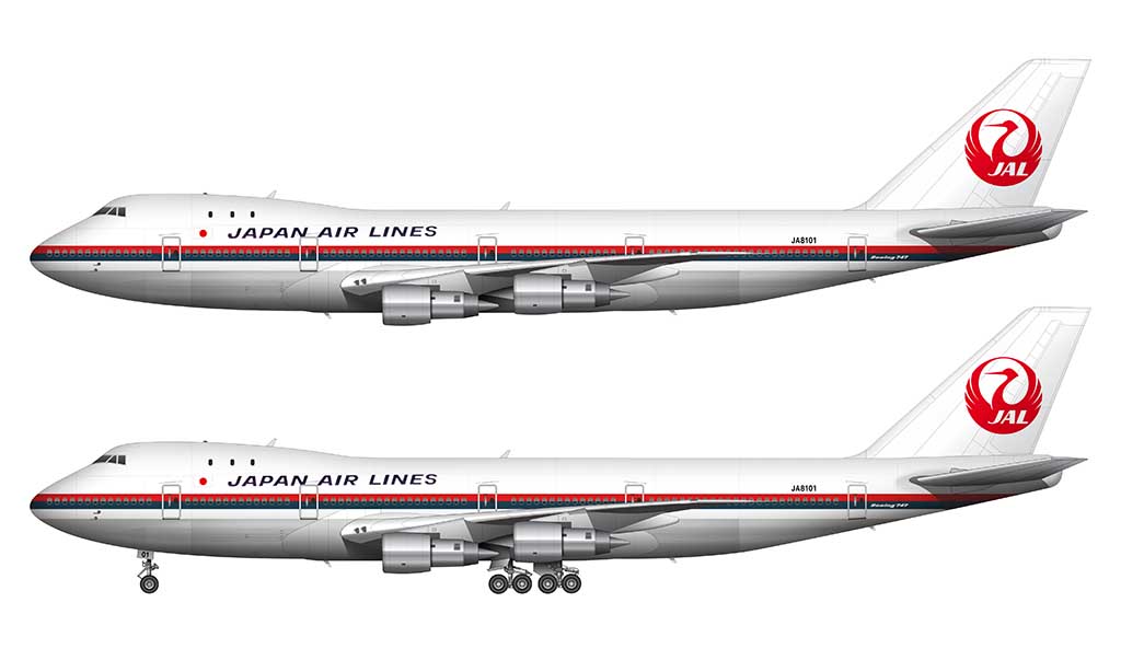
The Japan Air Lines titles were capitalized just as they were in the previous version, and the font was nearly identical. The cheat line running down the length of the aircraft remained red and blue. However, the colors were now stacked on top of one another, and they extended the full length of the fuselage.
One of the changes that I really liked was how the white top section extended below the stripes (at least more than the previous version did). The exposed aluminum bottom section was still a predominant part of the livery, but it was reduced in height.
1989-2002: JAL all white livery
Created by Landor Associates, the all new JAL livery unveiled in 1989 was a significant departure from the previous version. The Crane logo on the vertical stabilizer remained, however it was reduced in size and moved upward.
The most significant change to this livery was the elimination of the Japan Air Lines titles on the forward section of the fuselage. This was replaced by a simplified JAL graphic, which intersected a red square (an obvious representation of the Japanese flag) and a light gray stripe which extended towards the nose of the aircraft.
The exposed metal bottom typical on all JAL aircraft up until this point had been eliminated.
2002-2011: Arc of the Sun livery
Japan Airlines And Japan Air System merged in 2002, which resulted in an all new livery (again created by Landor Associates).
More formally known as the Arc of the Sun livery, the vertical stabilizer featured a large red circle with a silver outline intersecting it.
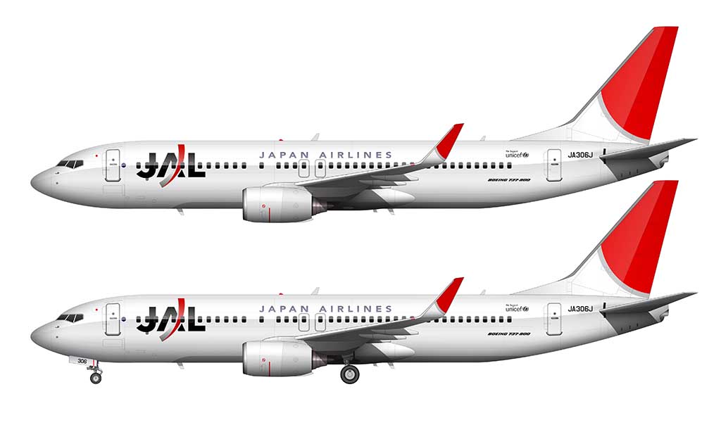
This redesign was seen as a very significant change, as it was the first time since the beginning of the jet age that the crane logo was not displayed anywhere on the aircraft.
The JAL titles remained from the previous version (with some slight modifications). A bolder typeface was used, and a curved red stripe intersected the A – which some say mimicked a samurai sword. Yeah, I can see that.
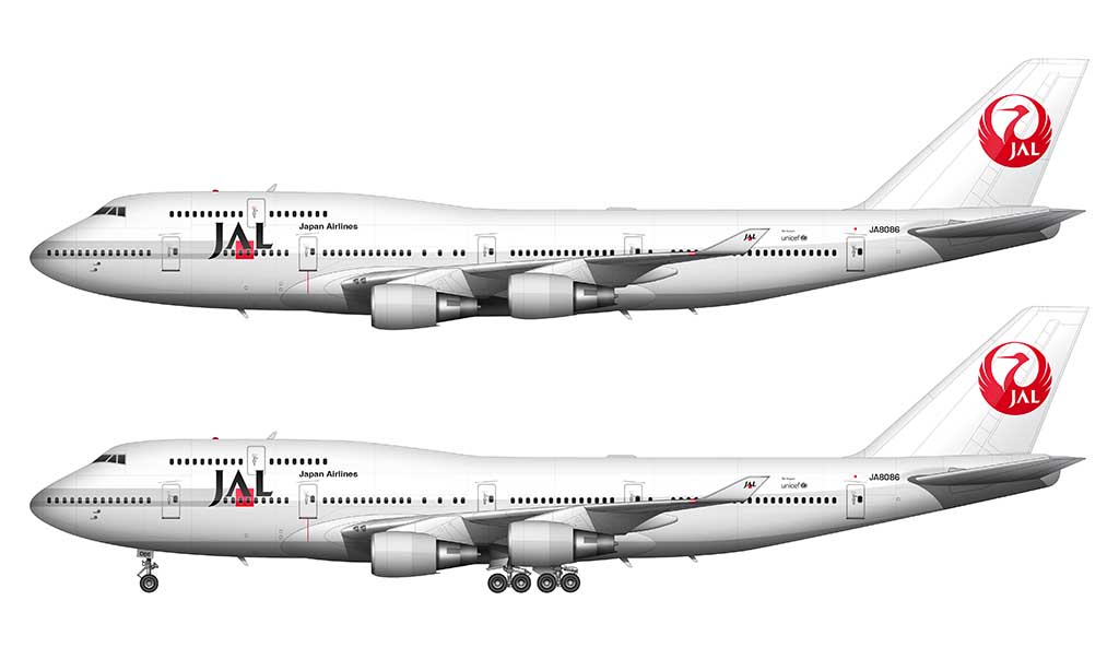
2011-present: Tsurumaru livery
In 2011 Japan Airlines reverted back to its 1950s livery with a handful of modern modifications. Most significantly, it represented the return of Tsurumaru as the predominant element.
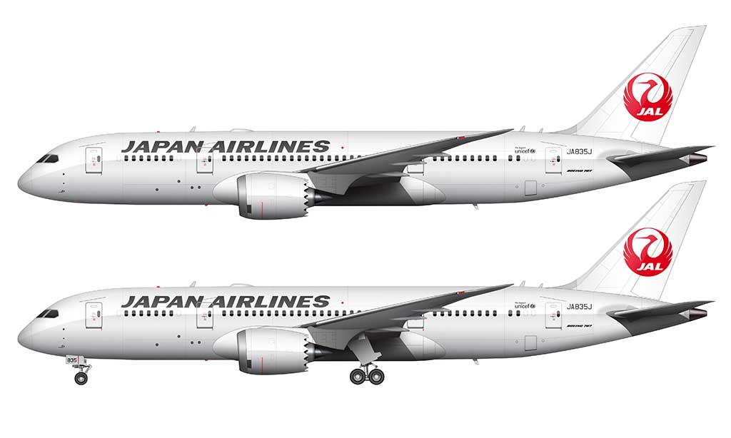
The JAL graphic used since 1989 was replaced with larger titles which spelled out Japan Airlines. The typeface used for this was much bolder than previous versions, but it was still italicized and all black (much like it was on the older liveries).
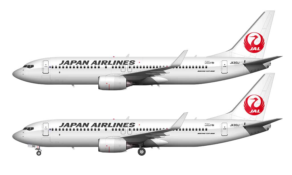
In my opinion, the most controversial part of the Tsurumaru livery was the elimination of the secondary blue and red colors. Cheat lines and pinstripes were obviously out of style when this livery was created, but it’s unfortunate they couldn’t find a way to bring back secondary design elements featuring those classic colors. Why couldn’t they have done something at least half as bold as the ANA livery?
This is a predominantly white livery. It’s clean and classy for sure, but I think it could’ve been so much better with a gray belly (as a throwback to how they used to do it).