Hi! My name is Scott, and I draw airplanes.
My roots are in product design and 3d illustration, but I’ve been mixing it in with a lot of 2d aircraft illustration these days. Check it out:
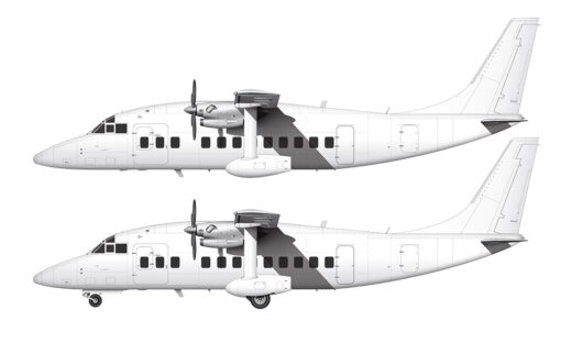
Short 360 blank illustration templates
When viewed from the side (and the front – and the back – and yeah, maybe even…
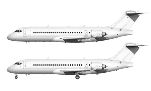
Comac C909 blank illustration templates
The feeling of déjà vu was strong as I was illustrating these blank side view templates of…
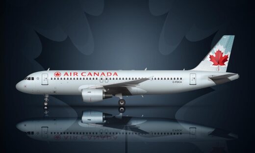
Air Canada livery history (1965-present): Mild to wild (and back!)
There have been six Air Canada liveries since 1965. All of them have used the color red…
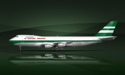
Cathay Pacific livery history (1971-Present)
Every Cathay Pacific livery from 1971 to present has been subtle and classy in a way that…

An in-depth overview of the Korean Air livery
I’ve always said that less is more when it comes to airline livery design. The two most…
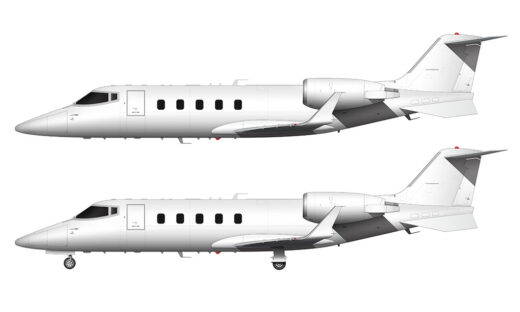
Learjet 60 blank illustration templates
The side profile of the Learjet 60 is one of the most interesting aircraft side profiles I…