The Hawaiian Airlines livery has gone through an interesting evolution over the years. Each new design has played off the best parts of the one it replaced, and they’ve all succeeded magnificently in capturing the spirt of Aloha. Here’s a closer look at some of their past liveries on a variety of different aircraft types since 1973:
The first Pualani livery: 1973-1980
Is there any better way to sell airline tickets than to plaster an illustration of a really hot island girl on the vertical stabilizers of your entire fleet of aircraft? It was brilliant (lol).
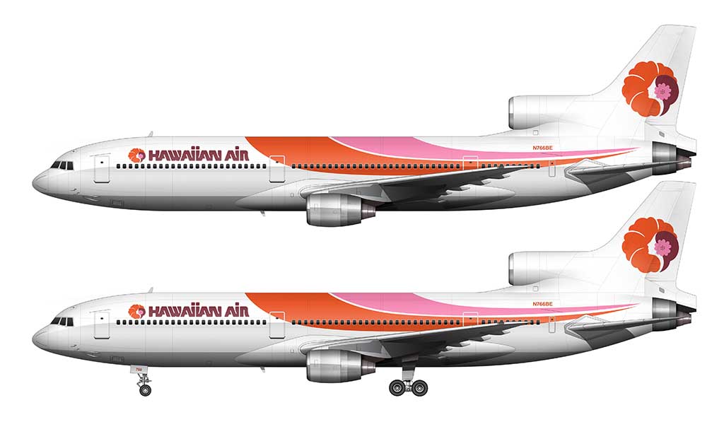
Pualani (known as “the flower of the sky”) was originally created by Landor Associates – the same branding agency that designed the Delta livery and the British Airways livery). She became the symbol of Hawaiian Airlines – which still exists to this day.
This was a very daring livery for the time. Remember – “cheatlines” (horizontal stripes running the entire length of the fuselage) were all the rage in the early 1970s. Even though this livery technically contained stripes, they were applied in a very artistic / free-flowing manner. There was definitely a laid-back / island vibe going on – especially with the tropical themed colors.
The second Pualani livery: 1980-1995
There was a major brand refresh for Hawaiian Airlines in 1980. However, looking at the illustration of this new livery applied to a DC-9 (below), I’m willing to bet that it largely went unnoticed:
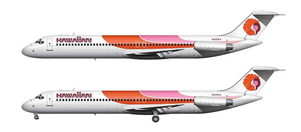
Can you spot the differences? It’s not easy! Not including the way that the dual stripes are modified to fit the shape of the particular aircraft it was applied to (notice the difference between the L1011 in DC-9), there are two fairly significant changes:
- The Pualani logo was removed from the forward fuselage. Now the title block simply consisted of the word “HAWAIIAN”.
- The Pualani logo itself was slightly tweaked to be more filled in compared to the previous version. This is easier to explain in following graphic:
The bare metal livery: 1995-2001
This version of the Hawaiian Airlines livery is one of my favorites. Launched in 1995, it features an updated Pualani logo over bare aluminum. It was a stunning update to the existing brand.
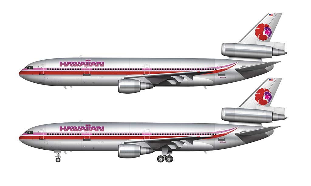
The driving force behind this livery design was the fact that Hawaiian Airlines purchased all of their DC-10′s from American Airlines. The polished aluminum version of the American Airlines livery was stunning, and Hawaiian Airlines took advantage of it.
Whenever they acquired a DC-10 from AA, all they had to do was remove the AA cheat line and tail logo and replace it with their own. Easy peasy(ish). I’m willing to bet that keeping things simple ended up being a wise financial decision(ish).
Unfortunately, this livery didn’t stand up so well to scorching sunlight. Nearly all of those Hawaiian DC-10′s were fading pretty badly (and looked downright rough) by the time they started being phased out in the early 2000′s.
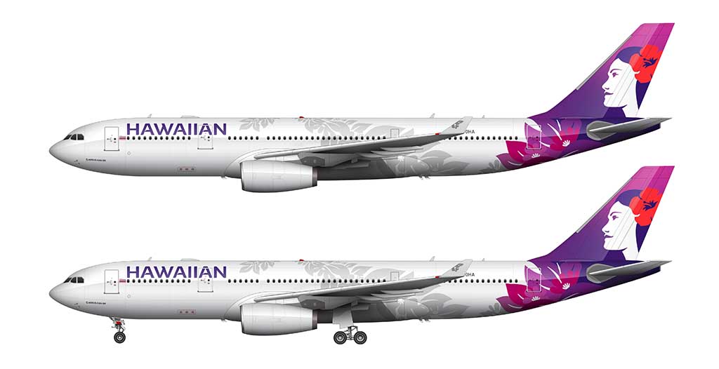
The Hawaiian Airlines Floral livery: 2001-2017
It was necessary to move away from the bare metal livery with brand new Airbus A330’s entering the fleet in the early 2000’s. The skin of modern Airbus aircraft are made of composite materials, and there simply isn’t any metal left to polish.
An all new livery was unveiled in 2001 to address that problem. It looked stunning, classy, and clean (much like the Sun Country livery of 2001). However, it wasn’t until I illustrated it on a variety of aircraft that I noticed something interesting. The 767 livery was different than the A330 livery!
The tail art is nearly identical between aircraft, but there are some slight differences in the lower section of the fuselage. I’m not really sure why the designers chose to make this livery different between the 767 and A330, as I applied the same one to both (just to see what would happen) and I didn’t encounter any issues.
Being a designer myself, I know all about unforeseen “problems” resulting in necessary design inconsistencies between products that don’t really make much sense to everyone else. There’s a reason for everything.
Hawaiian Airlines had two versions of the 767-300 in their fleet. Some had winglets, while others did not. Here is an example of the 767 with winglets in this livery:

And here is what the same livery looked like on one of their 767-300s without winglets. As you can see, it’s not nearly as interesting:
The 2001 Floral livery looks great on both the A330 and 767. And (in my opinion), it looks even better on the Boeing 717. The smaller size of this aircraft makes it easy to see all of the details the floral pattern without squinting and wrinkling your nose.

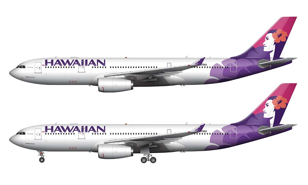
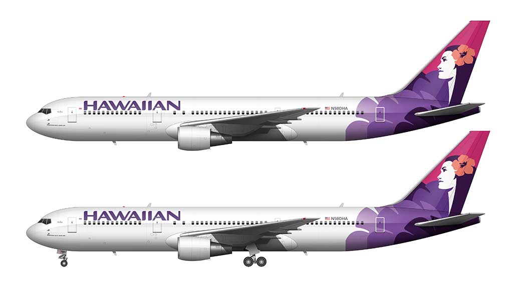
An all new Hawaiian Airlines livery: 2017-present
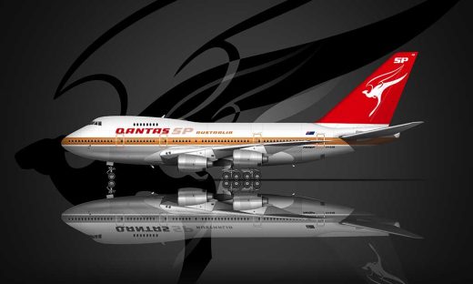
After a successful 15-year run of the Floral livery, an all new livery was unveiled in 2017. This new brand image was an evolution of the previous floral design (much how like every new Qantas livery has always been an evolution of the one that preceded it). A new Pualani logo with richer colors was the focal point, while a subtle maile lei graphic “wraps the main part of the fuselage as a way to welcome guests” (their words – not mine).

The floral graphic wrapping the fuselage appears to be a modern adaptation of the dual stripes from the 1973 livery. Perhaps this is what they were trying to do way back in the 1970s, but didn’t have the technology (or willpower) to pull it off.
A detailed demonstration of what it took to illustrate this livery
I’ve illustrated a lot of different airline liveries over the years, but this 2017 version was one of the most challenging. Here’s a quick video showing my process for creating these illustrations:
Love your airline art. I just bought a Hawaiian 767-300 ER 1/150 model and it looks great. I noticed you have the same tail number, N582HA, did you make the art for Skymarks?
http://www.amazon.com/gp/product/B001QL1X08/ref=oh_aui_detailpage_o03_s01?ie=UTF8&psc=1
Nope, I didn’t create that art. And the reason why I chose that registration was because that was one of the Hawaiian 767’s I recently flew on. So yeah, it’s very cool that there’s a 1:150 scale model with that tail number – I might have to get it!
amazing ! and very important for airliner modellers thanx
You’re very welcome Paul! Glad you’re finding the illustrations useful.